Look: I am eager to learn stuff I don't know--which requires actively courting and posting smart disagreement.

But as you will understand, I don't like to post things that mischaracterize and are aimed to mislead.

-- Brad Delong

Copyright Notice

Everything that appears on this blog is the copyrighted property of somebody. Often, but not always, that somebody is me. For things that are not mine, I either have obtained permission, or claim fair use. Feel free to quote me, but attribute, please. My photos and poetry are dear to my heart, and may not be used without permission. Ditto, my other intellectual property, such as charts and graphs. I'm probably willing to share. Let's talk. Violators will be damned for all eternity to the circle of hell populated by Rosanne Barr, Mrs Miller [look her up], and trombonists who are unable play in tune. You cannot possibly imagine the agony. If you have a question, email me: jazzbumpa@gmail.com. I'll answer when I feel like it. Cheers!

Friday, September 27, 2013

Friday Night Music

There are only a few moments of Friday night left.

Bach and Michael Hedges - a match made in heaven.


End of Season

The Tigers finish their season with a three game series against the dreadful Miami Marlins. The notable thing about this - other than the disparity between a team with over 90 wins and a team with over 100 losses - is that it is interleague.

I have mixed feeling about interleague play, but we'll let that go for now, except to say that in the past, all the interleague play happened at the same time, while now it's scattered randomly across the season, which makes it much less of an event.

The presence/absence of the DH makes game strategy very different in the two leagues. Just imagine the difference between Victor Martinez batting 5th vs Justin Verlander batting 9th, and you get the picture.  In these 3 games, the Tigers will either have to give up a big bat, or start Martinez as catcher.  That is not necessarily a bad outcome, but you probably don't want to do it for all three games. That would double his catching load for the year.

Then you get to the issue of pitchers batting and running the bases.  In the NL, they do it all the time.  For AL pitchers, this is wandering into terra incognita.  The chances of injury might be small, the the consequences could be devastating.  Imagine a pitcher in the batter's box getting hit on his hand like Jose Iglesias was recently. 

Another thing to consider is the 4 day lay-off between end of season and start of play-offs.  These gaps have not been kind to the Tigers in the past.  You could end up with several of your pitchers not having played in well over a week.

Since the outcomes of these games mean nothing, and the upcoming play-offs mean everything, if I were managing, I'd adopt a very unorthodox approach. 

I'd be reluctant to let a pitcher bat.  At all.  I'd be eager to swap out a pitcher every third inning or so and get my non-starting position players some at-bats.  Of course, in this specific situation, you might want to rest your regulars and start the bench.  That idea is pretty appealing in itself.  I'd probably mix and match over the three game series, and make sure everyone got some playing time.

If I did let a pitcher bat, and he got on base, I'd be quick to insert a pinch runner.  I don't know how likely an injury on the base paths is, but I'd bet it's higher for somebody who is not used to being there, and isn't going to be a skilled base runner anyway.

The Tigers have 16 active roster pitchers.  Eliminating the previous two starters and, Benoit reduces the available pitchers to 13.  I'd give every one of them some mound time.

Of course, this is all abstract, and in-game situations can have an influence on specific decisions.  But I'd be focused on the facts that this weeks results mean nothing and next weeks results mean everything.

But really, isn't this just about the worst scheduling gaffe imaginable?  MLB should be hanging their heads in shame.

I drafted this a few days ago, and see that Leyland is more more or less thinking along the same lines.


The Republicans of 2013

I

The split in the Republican Party is between, on the one hand, ignorant, mean-spirited ideologues with a contempt for governance who refuse to accept the legitimacy of twice elected President Obama's presidency and are willing to ruin the economy and the country as a whole to make invalid political points; and, on the other hand, totally bat-guano-insane psychopaths.

II

In case there was any doubt, if Obama or his minions do anything -- seriously, ANYTHING -- it is a priori* wrong.

* my Latin isn't too good - I think this refers to revealed knowledge.

What the Hell?!? Friday - "It's What's for Dinner" Edition


A different sort of Big Gulp

Alas, not eye of newt, but if you're up for bat wings and toad skins, you can get them both here in one swell foop.

Toads and bats seem to have a mutually destructive relationship.

I had no idea they were that human.

Thursday, September 26, 2013

Quote of the Day

I usually keep my blog slanted towards the clean side, but some things are to good to pass up.

From Gin and Tacos on Facebook.

Sarah Palin was Dan Quayle with tits. Ted Cruz is Sarah Palin with a dick. Paul Ryan is Ted Cruz with scales and a cloaca.


Tuesday, September 24, 2013

Different Views of Real Median Household Income and Recessions

Using data from Census Bureau Historical Income Table H-08 and CPI data from FRED (index 1982 to 84 = 100), I was able to calculate real median household income (RMHI) from 1984 to 2011.  Graph 1 shows the results - annual data.


Graph 1 RMHI - First View - 1982-4 $

Except for the bump during the housing bubble, it been a downward track for this century.  During the alleged recovery from the great recession, median income has dropped badly.

From this post at EconoSpeak,I found out that Census Beareau Table H-06 has a greater data range, from 1975 to 2012, and also an RMHI calculation.  So I plotted their data in Graph 2.


Graph 2 - RMHI - 2nd View - 2012 $

Instead of CPI, the Census Bureau uses CPI-U-RS, a research series based on constant 2012 dollars.  So the numbers are different, but the picture is the same.  I've added a trend channel, because I'm amused by that sort of thing.  Presumably, the Great Recession [GR] ended in 2009, but that's the year that the RMHI value fell below the trend channel lower boundary - possibly forever.  A channel violation that severe almost always indicates that the previous trend is well and truly dead.  The new trend looks pretty dismal.  Welcome to hard times.  By my calculation, RMHI is down by over 8% since 2000.

As far back as the data goes, RMHI has taken a hit in every recession.  In days past, RMHI would recover to a new high after the recession was over.  There was no recovery after the 2001 recession until the bubble years of 2005-7.  That ephemeral gain to a new lower high was completely wiped out by the GR in 2008.  Since then, things have only gotten worse.

In the Econospeak post linked above, poster Econoclast suggests that the standard way of viewing the start and end of recessions is flawed.  His alternative is to consider that a recession is occurring when and as long as RMHI is falling.  He then presents this table.

Table 1 - Two Views of Recessions

If we consider recessions as he suggests, then the oxymoronic concept of the jobless recovery can be discarded - and good riddance.

Via Mish, I found Doug Short's article on the Deflating American Dream.  He presents longer view graphs based on data from Sentier Research, who estimate RMHI on a monthly basis.  Short did a lot of homework, and was able to graph RMHI back to 1967.  He also compared the two inflation series and found that CPI-U-RS understates inflation, relative to the CPI.  The difference is miniscule in recent years back to the mid 90's, but expands quickly as you go back into earlier years.  Graph 3 shows RMHI as adjusted by these two indexes, and also a third, PCE from BEA.  There's a lot more in the linked post by Short and in this one, as well.  Both are highly recommended.


Graph 3 - RMHI Growth - Three Views

The three curves don't disagree much on the timing of declines and advances, just on the magnitudes. By my count, using CPI as the adjustment index and Econoclast's idea of recession timing, we have been in recession for 21 of the previous 46 years, or 46% of the time.

There's your great moderation - I mean stagnation - in one simple, easy to understand picture.

Krugman points out that, "Adjusted for inflation, the income of the top 1 percent rose 31 percent from 2009 to 2012, but the real income of the bottom 40 percent actually fell 6 percent."

By my calculation, based on the data in Graph 2, RMHI fell by 4% from '09 to '12.  So the folks below median got hit even harder. In the words of an old song, "There's nothing surer, The rich get richer and the poor get laid off!"

I've come to believe that greed really is the root of all evil.


Friday, September 20, 2013

The Misguided Right Wing

One of my friends invited me into a FB debate on BHO.  There is certainly a lot to criticize in this administration, but very little real opportunity to legitimately criticize from the right.  This, I believe, accounts for a lot of the birtherism, and Muslim-Commie-socialist-fascist nonsense.  With few legitimate complaints, they just make $h!+ up.

Even without getting into wing-nut fantasy land, there is a lot the right wingers simply know about BHO and how he has ruined America that simply does not stand up to the harsh light of reality.  They blame on Obama things that have been going on since Reagan.  They blame the "left" [which is laughable - there is no political left in this country] for the actions of the Rethug dominated house.   The simple fact is, their minds are made up.  They will only hear things that reinforce their views, and contrary facts will only make them dig their heels in harder.  This is epistemic closure, aka DERP.

To an extent, this is human nature.  We all love our revealed truths and most cherished concepts, no matter where they came from. But open mindedness is a specifically progressive characteristic. None of us is immune to derp, but it is inherently more deep and pervasive among those who call themselves conservative, but are in fact regressives.  Reading a bit of Russell Kirk and my own observations have convinced me that the four pillars of conservatism are ignorance, prejudice [these come directly from Kirk - and he's proud of it!], denial of reality [global warming, New Deal Denialism], and magical thinking. Conservatives generally seek simple solutions, can't be bothered with complexity, and grasp at cleverly framed right wing talking points.  This all by itself accounts for the popularity of the Reagan mythology.  And these are the GOOD conservatives.  Tea Bagging Regressives are far, far worse.

You can argue until eternity with regressives, but you can't set them straight, because they will have none of it.  A Progressive, when confronted with new data, changes his opinion. A Regressive, when confronted with new data, changes the data.

Or simply ignores it

Regressives blame Obama for a variety of real and perceived ills.

Ruining the value of the dollar.
The trade weighted dollar index declined over 30% under W, then gyrated during the Great Recession.  Since then it has been dead flat.  Still, It's Obama's fault.


Graph 1 - Trade Weighted U.S. Dollar index

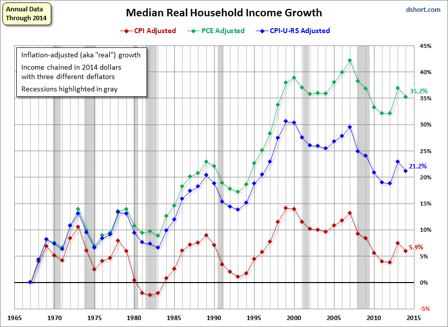
Decreasing the median income of households.

This has been going on since Reagan.  In nominal dollars, the rate of increase in median household income was lower under Bush II than under Reagan and Clinton, and has been flat since the recession.  Inflation adjusted, household income has zig-zagged to nowhere since the 70's.  The two most recent increases occurred first, and dramatically, under Clinton, and then only a bit from 2004-2007 during the housing bubble.  Recessions in '91, '01, and '08 have been devastating. The trend from 2000 on has been steeply down.


Graph 2 - Real Median Household Income

Income Data from the U.S. Census Bureau, Table H-8.  Inflation data from FRED

But to blame the recent decline on Obama rather than the decades-long assault on the middle class we call Reaganomics, the destruction of American manufacturing during the Bush regime, and House Tea Party Rethug obstructionist efforts to shut down the goverment and impose arbitrary debt ceilings takes a type and degree of blindness that simply cannot be penetrated by any wavelength of light.

Ballooning the debt

I've already put several stakes through the heart of the zombie idea that Obama is spending us into perdition - here, here, and here.  If you seriously believe that we have a debt problem due to Obama's spending, then please take the time to read and understand these three posts.

The debt results from a ledger imbalance, and both spending and revenues come into the equation.  Since the Recession ended, government spending at all levels is down.  Federal spending is dead flat and state and local govt spending is dead flat.


Graph 3 - Government Debt

Federal Debt annual growth ballooned to over 20% early in Reagan's first term, and was never less than 10% per year during his presidency.  It dropped every year under Clinton, who ran a surplus at the end of his term.  Under Bush, it was never less than 5% per year and peaked first at 10% in 2004, then over 20% in Q1, 2009.  Strangely, nobody on the right was complaining about debt growth when there was a White Rethug in the White House, and V.P. Cheney famously said, "Deficits don't matter." Which is true, as long as the Rethugs are in control.  During Obama's entire term, debt growth has been on the decline.


Graph 4 - Year over Year % Growth in Federal Debt

But debt is still growing - only at a slower rate.  If spending isn't the cause - and clearly, it isn't, then inadequate revenues have to be.  And they are.  This comes from two factors.  First, slow income growth and business activity leads to slow growth in tax revenues. We're living through the worst recovery in at least a century.   Second, tax receipts are inhibited by tax rates and policy decisions.  All things considered, progressive taxation on personal income is close to non-existent, and collections from corporations are deeply depressed because of loopholes and off-shore evasion gimmicks.  The right wing talking points that we are overtaxed and this taxation inhibits growth are simply lies.

Decimated our Credit Rating

Moody's reaffirmed U.S. debt at AAA rating in July, and upgraded  the outlook for government debt to stable from a negative watch.  Danger to our credit rating comes from Rethug debt ceiling and government shut-down threats.  But now, if our credit was bad, the interest rate on federal debt would be soaring.  It's up from about 2.6% to 3.75% since last summer, but about where it was two years ago.  This is just market fluctuation in a trend channel.  Except for a dip during the Great Recession lower, the interest rate is lower than at any other time since the 60's.


 Graph - Interest Rate on 30 Year Government Bonds

 This is just a bit of the nonsense my friend's friend spewed forth in an ignorant, but passionate, anti-Obama rant.

What took him a few seconds to blurt has taken me hours to refute.

This is why simple lies always have an advantage over the truth.

And then, the liars and their fellow travelers just move along to the next talking point.

We are so screwed. 

Thursday, September 19, 2013

The Tigers-Mariners Series

The Tigers have won 7 of the last 9, and just took 3 of 4 from the Mariners. Why am I so worried?

Taking 3 out of 4 from anybody this time of year - even the dreadful [18 under .500 coming in] Mariners is not a bad outcome.

But dig a little deeper. Two wins barely eked out, and the middle one a nail-biter into the 8th inning.

And the loss - OMG: an 8-0 thrashing in a game where Verlander had a decent, but not outstanding, start.  I don't know what I feel worse about, the 2nd most powerful offense in MLB [5.02 runs per game] getting shut out for the 11th time, vs only twice last year, or giving up 8 runs to the 25th best offensive team in MLB, with an average of 3.8 runs per game.

Plus, today's win might have been due to a bad call at the plate. None of the replay views I saw was definitive, but Prince was probably out.

[As an aside, I don't feel bad about aggressively running Prince from first on a double down into the left field corner. It takes perfect execution by three defenders {and the umpire} to get even the slow-footed Prince out.]

In the series, the Mariners actually outscored the Tigers, 16-15.

Fifteen runs in 4 games is a paltry 3.75 per.

Looking for a bright spot, 7 of the Tigers 15 runs came after inning 6 in this series, and they're at 30% for the month in late inning run production.

On the downside, the Mariners also got 7 runs after inning 6 - though 5 of them were in the 8-0 blow out.

The Tigers were really lucky to get three wins in this series against a team that they should have been able to toy with.

And that is not encouraging.

Tuesday, September 17, 2013

Tiger Tracks - The Previous 150 games

With twelve games to go, the Tigers are 6.0 up on the 2nd place Indians.  Blowing it at this point is not impossible, but would take a break down of epic proportions against a series of very weak opponents.

I just took a rear view mirror look at the rest of the season.  Though I've been following the Tigers pretty closely, what I saw surprised me a bit.  At 87-63 (.580), they're 24 games above 500.  But every bit of that came in two hot streaks.  From game 21 to game 30 (April 26 - May 5) they won 9 out of 10 to go 8 over.  They then played exactly .500 ball for the next 66 games, and after game 96 (July 20) were again 8 over.  They then went on a 16 of 17 tear, and were 23 games over after game 113 (August 8).  They were again 23 games over after game 149 (September 15).  Since taking the first of a 4 game series with the Mariners last night, they're now 24 games over .500 for the 4th time since game 130 (August 25).  If they can win 8 of these last 12, they'll end up 95-67 (.586) and 28 over.

So - except for two hot streaks totaling 27 games (16.6% of the season), the Tigers have played exactly .500 baseball for the other 124 games to date.  They dipped to only 20 games over at game 144 (September 9), and have since taken 5 out of 6 to regain the season high.

Graph 1 shows how games over .500 have tracked across the season. The two long .500 stretches at 8 and 23 over are indicated with red lines.   I've also included a projected target line in bright blue to a season end at 28 over (95-67), based on taking 2 out of three in each remaining series.  Against the Mariners, White Sox, Twins and Marlins this shouldn't (!?!) be too much of a challenge.

Also included is a linear trend line through the first 96 games.  If the Tigers had continued along that line, they'd have finished the season with 88 to 90 wins, about where the Indians will end up.

Graph 1 - Games over .500

9/18 AFTERTHOUGHT As ridiculous at this might sound, the graph traces out an Elliott Wave.  The 9 of 10 and 16 of 17 streaks are both 3rd waves one trend level down from the top.  The 16 of 17 is third wave of the top level third wave.  Sixteen is as close as you can get to 1.62 times 10 when you're dealing with integers.

The gains in the first, third and (projected) fifth waves are 9, 19 and 8.  The third wave is close to double the first wave, and the first and third are near equal. 

The wave 1 top is at game 49.  Wave 2 includes the sideways motion to the bottom at game 81.  , and Wave 3 ends at the game 130 top.  Wave 4 ends at the game 144 low.  It even exhibits long-short counter-current wave alternation from 2 to 4.  The third of third wave is the most powerful upward thrust.

The second wave retracement is from 9 over to 5 over, close to the Fibonacci 8/5 ratio.  The second retacement is from 24 to 20 over, very close to the .786 ratio that is the square root of the golden ratio .618.

The lengths of waves 1 and 2 are close to a 5/3 ratio. 

Awesome.

Graph 2 shows how the win percentage has tracked over the season.  After game 20 (April 25) they never fell to .500 again.  But during those long red line stretches in Graph 1, the winning percentage slowly regressed back toward .500.  The end of season target of .586 is indicated with a red dot.


Graph 2 - Tigers Win percentage

Scoring has been anemic in September, despite two barrages of 9 and 16 runs.  Over the remaining 12 games, they've only averaged 3.1 runs.  But - except for one horrible night in Boston - the pitching has been stellar with the opponents only averaging 2.1 runs per game.

Still, scoring efficiency needs to improve.  The September average of 3.8  runs per game results from 9.9 hits and 7 left on base per game.  A dismal 0.38 runs/hit, or 2.6 hits/run is horrendous, and will lead to a quick exit in the post season, even if the pitching holds up.

The Last 12 Games

The Tigers have 12 games left against what should be a very easy schedule: three games each against the Mariners, White Sox, Twins and Marlins.  So far against the other AL teams, their record is as follows.

Mariners (66-84): 3-1
Sox (59-91): 10-6
Twins (64-85):  9-7

The Tigers, even playing at their current .500 level, should easily be able to take 2 out of three from each of these awful teams.   But the Twins have fared better than their season record against the Tigers.  There are no sure things here.

They close out the season against the absolutely dreadful Marlins (55-95) who will have to finish way over their heads to avoid a 100 loss season.  If the Tigers can't sweep them, I will have to do some serious drinking.

They should [should!] easily win 8 of these 12 games, though continuing their season-long .580 win percentage would only give them 7 wins.  That would be enough to hold on to the Division pennant no matter what the Indians - currently 6.0 behind - do.

If they only win six while the Indians win out, the division ends in a tie.  This nightmare scenario is fortunately highly unlikely.  The Indians close out against the Royals, Astros, White Sox and Twins, and should win the majority of those games.  Winning out is not impossible, but I'd rate it as a less than 10% chance.

I always say each W you get early is one you don't have to fight for in September.  The Tigers were only 14-14 in May, when they had 7 games (6-1) against the Astros and 5 (3-2) against the Twins.  But they lost 2 to the Nationals, and 3 of 4 each to the Pirates and Rangers.

If you're going to lose to the good teams, you have to do a better job of beating up on the bad ones.

Wednesday, September 11, 2013

Revolting


But when the revolution does come, the 1% will have the tea party on THEIR side.

And them @$$ h0lz has gunz.

We're screwed.

Money Makes Dhe Vorld Go Around

Update:  Do NOT read this post.  It's a massive screw up.


But not if it's buried under a rock, or in it's nearest equivalent, a secure bank vault.

Graph 1 shows some aggregate money measures, along with excess reserves, the aptly named EXCSRESNS.

Graph 1 - M Aggregates and Excess Reserves

EXCSRESNS is placed on the right hand scale, because otherwise you have Graph 2, with all the aggregates flat-lined at 0, to a reasonable first approximation.


Meanwhile money velocity is dying a slow and agonizing death.

Graph 3 - Velocity of MZM

The Federal Funds rate has been at or below 0.20% for four consecutive years.  Add on a few rounds of QE, and you get this amazing success: unemployment now down to about the level of previous peaks.

Graph 4 - Unemployment Rate (blue)and U 6 9red)

And this is accompanied by the worst out-of-recession Real GDP growth in the history of ever.

Graph 5 - RGDP, YoY % Change

Of course, runaway inflation remains a clear and present danger.

Graph 6 - CPI, YoY % Change

Then, again, maybe not.

OK, Market Monitarists, what is the FED supposed to do?

Oh - I know - NGDP targeting.

If the Fed determined that NGDP should rise at 5% per year, businesses and households should behave with the expectation that their incomes will rise 5% each year, and by behaving in such a way they thereby generate the 5% increase. Of course, not everyone's income will rise by 5% just as not everyone's prices rise 2%. But aggregated across the economy, these decisions should produce the desired outcome for the national economy.

What is this?  Hand waving?  Dog wagging?  The almighty invisible hand?  Wishing can make it so?

Expectations, right?

People in households with flat nominal and declining real incomes are supposed to act as is they expect a 5% raise this year, and that behavior will generate real growth. 

But Winter is coming and the wolves will be hungry.  How long is that supposed to last?

Besides - do you think that most ordinary struggling people have any knowledge of what the FED is, let alone some way to modify their expectations based on tongue wagging and ineffective policy actions they are, at best, only dimly aware of?

Seriously - what is the transfer mechanism?

Tuesday, September 10, 2013

Rational Nonexuberence - Part 2

In Part 1, [here at AB] I looked at factors that tie closely with Total Capacity Utilization (TCU), and saw no reason to believe that TCU is about to surge.  In Part 2 I'll be looking at more general ideas that reinforce my lack of optimism.  My underlying assumption is that for TCU to surge, the economy has to surge and pull it along.

In this post, Edward Lambert takes a deeper look at capacity utilization, with a strong suggestion that it's more important to the economy than the 16% contribution that industrial production makes to the total.  So maybe I have my assumption backwards.

First a H/T to Mish.  Graph 1 is one He recieved from one of his readers, with the quote: "It seems rather unlikely that private economic activity is poised to accelerate under these conditions."  Mish concurs, and so do I.  The graph shows Growth in Bank Lending Per Capita (Black) and Real Final Sales Per Capita (Blue).  Both are rolling over from extremely anemic recovery peaks.


Graph 1 - Lending Growth/ Cap  and Real Final Sales/Cap

Next, a huge H/T to Stagflationary Mark at Illusion of Prosperity, who sometimes looks at data and relationships that I would never even think of, and often goads me into a different perspective.  He has graciously allowed me to use some of his graphs.   Graph 2 shows the YoY % change in capital goods orders for non-defense industries.  Mark added a twelve month moving average which is clearly sloping down, and is now at 0%.   In the following graphs, all trend lines and modifications are Mark's.


 Graph 2 - Non-defense Capital Goods Orders

Graph 3 shows Real Manufacturers' Sales per Capita.  I've added TCU in blue.  Since the beginning of this data set in 1990, it looks as if these sales have to grow in order to keep TCU constant.  Alas, though, they've leveled off.

Graph 3 - Real Mfg Sales/Cap and TCU

If TCU is going to surge, I'd expect robust hiring in manufacturing industries. Graph 4 shows the number of employees in goods-producing industries.   In what passes for a recovery in this century, it's approaching flat-line at a level equal to that of 50 to 60 years ago.

Graph 4 - Goods Producing Employment


And, lest you think non-manufacturing employment can bail us out, Graph 5 shows the employment level in sales and office occupations.  Since the GR, it has made no recovery at all, and is now at a level from 20 years ago.

Graph 5 - Sales and Office Employment


But maybe none of this matters in a service-based economy.  Graph 6 looks at the YoY % growth in personal consumption expenditures on services (PCES). Surprisingly, though, expenditure growth in that area has been declining with a series of lower lows and lower highs since 1980.  The post GR high is at the level of the previous recession's low, and the long range decline in growth rate resumed a year and a half ago.


Graph 6 - Personal Consumption Expenditures - Services

This is probably why the fraction of employees in service industries has flat-lined, as shown in Graph 7.


Graph 7 - Service Employees / Total Non-farm Employees


I'll wrap up with one last consideration.  Our economy is about 70% consumer driven.  If GDP and TCU are going to surge, it will be largely due to a surge in spending.  Contrary to what economists will tell you, spending is driven by income.  Or, more specifically, by real disposable income.  Graph 8 gives us a look at how that is going, YoY % change, semiannual data.

Graph 8 - Real Disposable Income - YoY % Change

 Not so well, as it turns out.

This doesn't mean we're going to slip back into a recession next week.  I think a Japan-style decades-long doldrums is a more realistic possibility.  All that requires, as graph 9 indicates, is to keep doing what we've been doing this century.  Graph 9 - US Real GDP/Employed person divided by Japan Real GDP per Employed Person, is dead flat this century

 Graph 9 - USARGDPC/JPNRGDPC

I'd really like to be wrong about this.

But I can't think of any reason to suspect that I am.


Rational Nonexuberence - Part 1

[Updated with editorial changes and new content, 9/12/13.]

In comments to this post, the idea is floated that capacity utilization (TCU)  is about to surge.

Mark Sadowski, in comment 5 at this post, reminds us that, "Capacity utilization only applies to industrial production, and industrial production consists of only manufacturing, mining and utilities. Thus it is not very representative of the entire economy, and it has been growing less representative over time."

Graph 1 shows employment in those three industries.  Mining and Utilities are placed on the right hand scale, because the numbers employed are much smaller than those in manufacturing.


Graph 1 - Employment in Mfg (blue), Mining (red) and Utilities 9green)

Manufacturing employment stopped growing in 1970, but didn't really fall off a cliff until the big outsourcing boom in this century.  To illustrate Mark's point, since 1970 NGDP has increased about 15 times, and industrial production now accounts for only about 14% of national income, down from about 27% in 1970. [Mark's FRED graph]

But in some small way, a surge in capacity utilization would certainly be good news.  Unfortunately, though, I don't believe it's in the cards.  Here's why.  Graph 2 shows total capacity utilization (TCU) since 1967.


Graph 2 - Total Capacity Utilization

The main trend has been down since the beginning of FRED data.  Furthermore, TCU has now stagnated for over a year and a half, and might even be ready to roll over.  It has never increased from this type of condition.  In fact, the only surges (except for one in the late 80's that followed a slight decline) have come off of deep troughs.

But - just because something has never happened doesn't mean it will never happen.  Still, things happen for reasons, and I'm trying to suss just what those reasons might be.

Graph 3 shows TCU vis-a-vis YoY % change in GDP.  As GDP growth goes, so goes TCU.  Not exactly lock-step, but the contours are generally similar as both have declined over time.  Coming into the Great Recession (GR), the decline in GDP growth led the decline in TCU, and something similar might be happening again now - and from already historically low levels in both.


Graph 3 - TCU and GDP Growth


In this post, Art suggests that private fixed investment as a fraction of total debt is a fair barometer for economic growth.  I've modified that idea to look more specifically at non-residential private investment (PNFI) as a fraction of non-financial corporate debt (NFCD, or NCBTCMDODNS in FRED-speak), since industrial activity is what I'm chasing.  Graph 4 shows that ratio, vis-a-vis TCU.


Graph 4 - PNFI /NFCD and TCU

Except for the late 80's bump that TCU and GDP growth share, the motions are generally consistent.  The PNFI/NFCD ratio is already rollng over - from by far the lowest peak on record.

As graph 5 shows, fixed investment has barely eked out a new recovery high, while borrowing, which barely slowed down during the GR has soared to unheard of highs.  I wonder where the money is going?


Graph 5 - PNFI  and NFCD

Nothing in these pictures gives me any reason to be optimistic.  With the anemic stimulus package now long gone and the FED getting ready to taper, everything looks contractionary.  Help me if I have any of this wrong.

There are several more non-encouraging factors to consider, and I'll get to them in part 2.


The Five Finger Prayer

 Saw this on a friend's FB Page

From my perspective as a fallen recovering Catholic, Francis is looking like a pretty damn darned good Pope, so far.

I'm not big on prayer, but the idea of devoting the "tallest" finger to those who have authority is very appealing.


Monday, September 2, 2013

What Else Can I Kill Today?

The bunny slayer sends Easter greetings.


H/T to Loomis at LGM.


WAR Mongering

I'd like anyone who thinks WAR is a sensible sabermetric to consider that the Tigers are now 10-2 in games that Miggy does not start.

No Miggy  ==>    .833 win percentage
W/ Miggy  ==>    .560 win percentage

Clearly, this guy has got to go.
.

MLB Scoring Efficiency

This is a simple measure of how good the teams are in turning hits into runs, rated as runs per hit and hits per run, depending on your preference.


Tigers perspective

Data Source

Tiger's Scoring

Today's opponents, the Tigers and Red Sox have the most powerful offenses in MLB, having scored 699 and 698 runs, respectively. 

Coming into today's game, the Tigers have 1390 hits to Boston's 1317.  I had a feeling that Detroit's run production was not very efficient.  So I took a look at runs/hit.  Oakland is best at .535.  Boston 2nd at .530.  The Tigers, at .503, are in 10th place behind Cleveland, Baltimore, St. Louis, Toronto, Cincinnati, Atlanta and Texas.

Too many men LOB.  Three doubles already in today's game [5th inning] and nothing to show for it. 

Back on August 24, they beat up on Mets starter Matt Harvey for 13 hits - and 1 run.  They finished the game with 3 runs on 15 hits.  Last night they were shut out on 11 hits.  Extreme examples, sure, but pay attention to all the runners who do not score.

If the Tigers had the 5th place Cardinals' .518 runs/hit, they'd have scored 20 more runs by now.

They could use a couple of them today.

Data Source

Labor Day


It's not just for Hot Dogs.  Here's Krugman.

H/T to Karlo


Sunday, September 1, 2013

The Tigers of August

The Tigers were 19-11 in August, an excellent .633 win percentage.  This is a better percentage than any division leader has maintained over the season to date.  Atlanta is best in the Majors at .615.  The Tigers end August at .588, within a few ticks of Boston at .593 and LA at .595.  From July 26th through August 8th, the Tigers won 12 straight, and 16 out of 17 back to the 21st.  But from August 9 through the end of the month, they're only 12-11.

And some disturbing things happened during those 11 losses: 1-2 against the both depleted Yankees and the hapless White Sox, scoring 1 run total in a mid-month double header against Royals, and dropping 3 of 4 at home against the A's.

After avoiding the sweep, the Tigers were glad to see the Indians come to town, and finished the month with a string of three victories.  The first of these came with Torii Hunters 3 run walk-off HR in the last Oakland game.  This one swing of the bat symbolizes something the Tigers did in August that they have done far too little of all season - score late, while shutting down the opponents late scoring.  The Tigers scored 35.5% of their runs in innings 7 or later, by far their best late-inning production, and doubling the July result.  Meanwhile, opponents 7-on scoring was only 26.5% of their total, and this is in the context of only 3.77 runs per game.

For the first time this season, I feel good about the way the Tigers are finishing games.  In fact, for August, the 9th was their most prolific scoring inning.

 Here is scoring by month for the season so far.


Here's the scoring break down by inning.  The late runs are good, since total scoring is down a bit.


And for the other guys.


It's nice to see that late inning fall-off.

 Here are some random stats.


Scoring is down a bit, and that might be a concern going forward.

But for now, I'm optimistic.