From our Up Jumped Spring Concert, April 23, 2012.
Sunday, April 29, 2012
Friday, April 27, 2012
Republicans, All Wrong, All the Time, Part 33 - Mitt Romney vs Reality Edition
Which is a polite was of saying he is still still a god damned liar. Synonymous with Rethug these days.
H/T to Randi Rhodes on Facebook.
H/T to Randi Rhodes on Facebook.
A Different Look at GDP and Inflation
At Illusion of Prosperity, Stagflationary Mark posted this scatter-graph of quarterly GDP YoY growth and CPI data from Q1, 1948 through Q4, 2011. Each point represents the differences from the medians of each data set for each of the variables, respectively. This gives you a picture of time spent above and below what might be considered normal performance.
I wondered how this would look if each point were identified by presidential administration, and if this would suggest any particular narrative. So I redid the graph, data from FRED, using mean instead of median as the determinant. It is presented here as Graph 1, with each data point (256 total) color-coded by presidential party; red for Republicans, blue for Democrats. The calendar quarter of each president's inauguration is allotted to the previous administration.
I've labeled the quadrants as follows, and indicated the frequency of data points populating each quadrant.

Here are the Mean and Standard Deviation values.


The GDP data has something close to a normal distribution, with approximate symmetry around the mean. The CPI data does not. For CPI, the highest frequency is 2 percentage points below the mean, and there is a long tail on the high side, so the distribution looks more like a Poisson type.
I've broken out presidential administrations, 3 or 4 to a graph, to avoid excessive clutter. Graph 2 shows the administrations of Truman (light blue), Eisenhower (red), and Kennedy-Johnson (dark blue.)

Results during the Truman administration were erratic, with both inflation and deflation occurring, and GDP growth widely variable as the nation made post WW II adjustments, and several million G.I.'s reentered the work force. Ike was an inflation hawk, and one of only two presidents to achieve below average inflation in every quarter of his administration. (Take your guess now as to who the other might be. All will be revealed in due time.) Still, the road was bumpy, with GDP growth highly variable, and two rather severe recessions during his term. The Kennedy-Johnson administration enjoyed superior economic performance and relatively low inflation, with only 6 quarters of below average GDP growth, and only five quarters of above average inflation during the entire 8 years. This was one of only two administrations to avoid recession for an entire 8-year term.
Graph 3 shows the Nixon-Ford (orange), Carter (blue), and Reagan (red) administrations.

Here we find three increasingly extreme excursions into stagflationary territory, two under Nixon-Ford (remember Whip Inflation Now buttons?) and one under Carter. The first and mildest was in 1970, the second in 1974-5, and the last, in 1979-80 probably played a part in holding Carter to a single term. Inflation far above average plagued both of those administrations. Each spent time above and below average in GDP growth with term averages very close to the grand average. However, Carter's last two years were consistently below average, and coupled with high inflation, earning him his moribund reputation. Early in Reagan's first term, Volker finished slaying the inflation dragon. But the cost was high in terms of depressed GDP growth, and during that time Reagan was extremely unpopular. But, as the economy recovered, so did his reputation, and he is now remembered, for good or for ill, as one of America's most beloved presidents. The remainder of his presidency resided along at least one of the two average lines, including four consecutive quarters of exceptional GDP growth coupled with only slightly above average inflation, spanning 1983-4.
Graph 4 shows the Bush Sr. (orange), Clinton (light blue), Bush Jr.(red), and Obama (dark blue) administrations.

During the Bush Sr. administration, 11 of 16 quarters had below average GDP growth, 10 quarters had above average inflation, 8 of these quarters had both. Clinton's term began and ended with below average GDP growth, but during his 8 years here were only 9 below average quarters. Four of them occurred in sequence from Q2, 1995 to Q1, 1996, but the remainder of 1996 was quite strong, and Clinton was granted a second term. Clinton was both the other president who avoided having even a single quarter of above average inflation, and the other president who avoided having a recession during an entire 8-year term. During the 8-year term of Bush Jr. there were only 4 quarters of only slightly above average GDP growth, occurring from 2003 to 2005. There were 7 quarters of above average inflation, 3 of them just barely so in 2005-6, and the other 4 in 2007-8, just prior to the economic collapse. The remainder of his term was in the mild doldrums region. The collapse ushered in the Obama administration. Within his first year, the economy was back into the mild doldrums area that has so far been typical of the current century.
Here is one more graph, showing how each administration performed, as an average over its entire term. Starting with Truman, the yellow line leads us to each successive administration, up to Obama.

Obama's position suffers from the recession he inherited. Whether he gets reelected or not, his average will move up each remaining quarter of his presidency. If he gets a second term, we can expect more of the doldrums we have experienced over the last two years.
This clearly belies the Romney claim that Obama's economic policies have failed. His policies have moved us from near-depression to mere mediocrity. That counts as some sort of success.
So, here is my narrative. First off, one can argue that the president does not directly determine the economic fate of the country, and that is partly true. The other part is that the president sets the policy and the tone, and that both of these things matter.
- The only presidents to have achieved term averages in the prosperity quadrant were Democrats.
- The only Republican to achieve above average real GDP growth was Reagan, and that was only by an increment.
- The only president since Reagan to achieve higher GDP growth than his predecessor was Clinton, other than that, it's been a downward spiral.
- Carter had below average GDP growth by a slight margin, but he beat every Republican other than Reagan, and he didn't trail him by much.
- The last 44 years have been characterized by secular decreases in both CPI inflation and GDP growth.
- They have also been characterized by Republican presidencies 64% of the time, decreasing regulation, lowered tax rates, safety net erosion, loss of labor union strength and participation, and the systematic undoing of of New Deal policies.
What I conclude is that New Deal (dare I say Keynesian?) policies were successful in generating real prosperity, and free market policies have been far less successful. Over time, Reaganomic trickle-down, free market policies have given us first, the Great Stagnation, and ultimately the worst economic crisis in 80 years. These policies were, by no coincidence at all, quite similar to those in effect when the Great Depression of the 30's happened - and also all the other earlier depressions that are no longer very prominent in people's memories.
As I said, policy matters - and it matters profoundly.
With that in mind, here is my question to the Fed: Since the average of CPI inflation since WW II is 3.7%, and there is ample evidence that we can have very reasonable economic performance with inflation in that range, why have you set an inflation target that is effectively half of that level, while ignoring high unemployment - the other half of your alleged dual mandate?
Of course, I'm being rhetorical. It's because they are bankers, and inflation favors creditors, not lenders. The fact is they don't care one whit about unemployment.
Policy.
It matters.
Update: Cross-posted at Angry Bear.
I wondered how this would look if each point were identified by presidential administration, and if this would suggest any particular narrative. So I redid the graph, data from FRED, using mean instead of median as the determinant. It is presented here as Graph 1, with each data point (256 total) color-coded by presidential party; red for Republicans, blue for Democrats. The calendar quarter of each president's inauguration is allotted to the previous administration.
I've labeled the quadrants as follows, and indicated the frequency of data points populating each quadrant.
Here are the Mean and Standard Deviation values.

Graph 1 CPI and GDP, data from FRED
The GDP data has something close to a normal distribution, with approximate symmetry around the mean. The CPI data does not. For CPI, the highest frequency is 2 percentage points below the mean, and there is a long tail on the high side, so the distribution looks more like a Poisson type.
I've broken out presidential administrations, 3 or 4 to a graph, to avoid excessive clutter. Graph 2 shows the administrations of Truman (light blue), Eisenhower (red), and Kennedy-Johnson (dark blue.)

Graph 2 CPI and GDP, Truman, Eisenhower, Kennedy-Johnson
Results during the Truman administration were erratic, with both inflation and deflation occurring, and GDP growth widely variable as the nation made post WW II adjustments, and several million G.I.'s reentered the work force. Ike was an inflation hawk, and one of only two presidents to achieve below average inflation in every quarter of his administration. (Take your guess now as to who the other might be. All will be revealed in due time.) Still, the road was bumpy, with GDP growth highly variable, and two rather severe recessions during his term. The Kennedy-Johnson administration enjoyed superior economic performance and relatively low inflation, with only 6 quarters of below average GDP growth, and only five quarters of above average inflation during the entire 8 years. This was one of only two administrations to avoid recession for an entire 8-year term.
Graph 3 shows the Nixon-Ford (orange), Carter (blue), and Reagan (red) administrations.

Graph 3 CPI and GDP, Nixon-Ford, Carter, Reagan
Here we find three increasingly extreme excursions into stagflationary territory, two under Nixon-Ford (remember Whip Inflation Now buttons?) and one under Carter. The first and mildest was in 1970, the second in 1974-5, and the last, in 1979-80 probably played a part in holding Carter to a single term. Inflation far above average plagued both of those administrations. Each spent time above and below average in GDP growth with term averages very close to the grand average. However, Carter's last two years were consistently below average, and coupled with high inflation, earning him his moribund reputation. Early in Reagan's first term, Volker finished slaying the inflation dragon. But the cost was high in terms of depressed GDP growth, and during that time Reagan was extremely unpopular. But, as the economy recovered, so did his reputation, and he is now remembered, for good or for ill, as one of America's most beloved presidents. The remainder of his presidency resided along at least one of the two average lines, including four consecutive quarters of exceptional GDP growth coupled with only slightly above average inflation, spanning 1983-4.
Graph 4 shows the Bush Sr. (orange), Clinton (light blue), Bush Jr.(red), and Obama (dark blue) administrations.

Graph 4 CPI and GDP, Bush Sr., Clinton, Bush Jr., Obama
During the Bush Sr. administration, 11 of 16 quarters had below average GDP growth, 10 quarters had above average inflation, 8 of these quarters had both. Clinton's term began and ended with below average GDP growth, but during his 8 years here were only 9 below average quarters. Four of them occurred in sequence from Q2, 1995 to Q1, 1996, but the remainder of 1996 was quite strong, and Clinton was granted a second term. Clinton was both the other president who avoided having even a single quarter of above average inflation, and the other president who avoided having a recession during an entire 8-year term. During the 8-year term of Bush Jr. there were only 4 quarters of only slightly above average GDP growth, occurring from 2003 to 2005. There were 7 quarters of above average inflation, 3 of them just barely so in 2005-6, and the other 4 in 2007-8, just prior to the economic collapse. The remainder of his term was in the mild doldrums region. The collapse ushered in the Obama administration. Within his first year, the economy was back into the mild doldrums area that has so far been typical of the current century.
Here is one more graph, showing how each administration performed, as an average over its entire term. Starting with Truman, the yellow line leads us to each successive administration, up to Obama.

Obama's position suffers from the recession he inherited. Whether he gets reelected or not, his average will move up each remaining quarter of his presidency. If he gets a second term, we can expect more of the doldrums we have experienced over the last two years.
This clearly belies the Romney claim that Obama's economic policies have failed. His policies have moved us from near-depression to mere mediocrity. That counts as some sort of success.
So, here is my narrative. First off, one can argue that the president does not directly determine the economic fate of the country, and that is partly true. The other part is that the president sets the policy and the tone, and that both of these things matter.
- The only presidents to have achieved term averages in the prosperity quadrant were Democrats.
- The only Republican to achieve above average real GDP growth was Reagan, and that was only by an increment.
- The only president since Reagan to achieve higher GDP growth than his predecessor was Clinton, other than that, it's been a downward spiral.
- Carter had below average GDP growth by a slight margin, but he beat every Republican other than Reagan, and he didn't trail him by much.
- The last 44 years have been characterized by secular decreases in both CPI inflation and GDP growth.
- They have also been characterized by Republican presidencies 64% of the time, decreasing regulation, lowered tax rates, safety net erosion, loss of labor union strength and participation, and the systematic undoing of of New Deal policies.
What I conclude is that New Deal (dare I say Keynesian?) policies were successful in generating real prosperity, and free market policies have been far less successful. Over time, Reaganomic trickle-down, free market policies have given us first, the Great Stagnation, and ultimately the worst economic crisis in 80 years. These policies were, by no coincidence at all, quite similar to those in effect when the Great Depression of the 30's happened - and also all the other earlier depressions that are no longer very prominent in people's memories.
As I said, policy matters - and it matters profoundly.
With that in mind, here is my question to the Fed: Since the average of CPI inflation since WW II is 3.7%, and there is ample evidence that we can have very reasonable economic performance with inflation in that range, why have you set an inflation target that is effectively half of that level, while ignoring high unemployment - the other half of your alleged dual mandate?
Of course, I'm being rhetorical. It's because they are bankers, and inflation favors creditors, not lenders. The fact is they don't care one whit about unemployment.
Policy.
It matters.
Update: Cross-posted at Angry Bear.
Quotes of the Day, With a Dash of WTH?!?
A man must be orthodox upon most things, or he will never even have time to preach his own heresy.
-- G. K. Chesterton
Quoted by John Holbo, at CT, where (in comment #13) Jim Harrison adds:
Rhetoric, after all, has always been about making the worse case defeat the better.
But (of course) I wholly misunderstand (you remember my definition of misunderstand) rhetoric.
Friday, April 20, 2012
WTH?!? Friday - So Wrong on So Many Levels
Really - There's nothing I can say that will make it any better.
Or any worse.
If I'm reading my Roman (the only thing appropriate in the whole clip) numerals correctly, it's from 1933.
Aaaack! Now, I must scrub my brain with a Brillo pad, then go hug a squid.
Or any worse.
If I'm reading my Roman (the only thing appropriate in the whole clip) numerals correctly, it's from 1933.
Aaaack! Now, I must scrub my brain with a Brillo pad, then go hug a squid.
Saturday, April 14, 2012
Romney Is Still A God-Damned Liar
But, unlike a few months ago, people other than rabid partisan Demorats are starting to notice, and, better yet, call him out on it.
Update: from PGL. Politifact rated Romney's comment on women's job losses as "mostly false." The Romney campaign does not take such truth telling lying down. Romneybot Lanhee Chen protesteth loud and long.
Update 2: In the spirit of Molly Ivins who admonished us to "rattle the pots and pans," I'm hoisting part of Suzan's comment.
I agree.
The core of Romney’s campaign strategy seems to be contempt for the news media (and the voters), the belief that he can say anything and pay no price — which was the way things worked for Bush. But maybe, just maybe, his calculation was wrong, and serial dishonesty will become, justifiably, part of the narrative.
Update: from PGL. Politifact rated Romney's comment on women's job losses as "mostly false." The Romney campaign does not take such truth telling lying down. Romneybot Lanhee Chen protesteth loud and long.
I guess when their mendacity gets noted – the next step for Team Romney is to bully the press. After all - truth has such a liberal bias.
Update 2: In the spirit of Molly Ivins who admonished us to "rattle the pots and pans," I'm hoisting part of Suzan's comment.
It's the unconcealed contempt that he and all his ilk (backers, cohorts, promoters, etc.) show everyday to common citizens that should be sounding the alarms at 1000-decibel levels, taking us/US back to the Nixon era when the people be damned, full-speed ahead on the policy benefitting those at the top. (Need a break-in to accomplish espionage? No prob! Call Howard's team.)
I agree.
Thursday, April 12, 2012
The Truth About Damned Liars About Social Security
Enlightenment from Dale Coberly at Angry Bear.
Further enlightenment from Bruce Webb in comments.
Check it out.
Update: More perspectives. Check them out, too.
Further enlightenment from Bruce Webb in comments.
Check it out.
Update: More perspectives. Check them out, too.
Another Look at Wealth and Consumption - Pt 2
Correlations and Slopes Over Time
In Part 1, we looked at the ratio of consumption spending to net worth, and how it changed over time. This time we'll look at the correlation between net worth and consumption.
Here is the big picture: personal consumption expenditures (FRED Series PCE) plotted against Net Worth (FRED series TNWBSHNO) Data is per calendar quarter.

The data set is divided into two segments, with a break point at the beginning of 1997, with net worth at $30,315 and consumption at $5,467. In a close up view, there is a clear slope change there. Still, the selection is a bit arbitrary, since the high point of Q3, 1994, could also have been chosen, with net worth at $25291, and PCE at $4856. But that is a detail, and no other reasonable breaks stand out.
Notably, both the slope of the data line and R^2 are significantly less after the break. Visually, it's obvious that in the later data, there is a lot more scatter. Also note that that big data moves post 1997 return to the continuation of the best fit line, pre-1997.
Slope and R^2 measurements for the entire data set and the two segments are presented in Table 1. These numbers were generated using the linear trendline function in Excel.
Table 1

Not so visually obvious are the declining slopes during the earlier portion of the data set. Table 2 presents the same characteristics for data chunks of approximately 20 year duration.
Table 2

We saw in part 1 of this series that the relationship of consumption to net worth was not stable, so this result is not surprising. And we can now see that as net worth increases, the sensitivity of consumption to increasing net worth decreases.
I can think of two contributing factors. As wealth increases, the need to spend on basic necessities captures a smaller portion of that wealth, so the propensity to spend decreases. I'll defer consideration of the other factor for now.
Here is a detailed look at how the slope of the PCE vs net worth line varied over time. Graph 2 shows the 34 quarter slope values for the data points of graph 1. The slope is plotted in dark blue, with certain time spans highlighted in contrasting colors: recessions are in orange, and the stock market and housing bubbles are in yellow.

Observations:
1) Except for the bubbles and the spike in the post-bubble recession of 2008, the values are mostly contained between a low of 0.168 and a high 0.246.
2) There was an upward trend that ended in the mid-70's, underscored with a blue line.
3) Values after the mid-70's, including the two bubbles, are contained in a down-sloping channel, outlined in green.
4) Except for the early 80's and 90's events, recessions are marked by sharp, temporary slope increases.
5) The average slope is 0.184, with a standard deviation of .038
6) The bubbles highlighted in yellow in Graph 2 correspond exactly to the data points in Graph 1 that fall below the red best fit line.
7) The post-bubble recessions brought the slope back into the range described in Observation 1. This is illustrated in Graph 1 by the returns to the blue best fit line.
If the normal relationship between net worth and consumption is described by a slope in the range of around 0.17 to 0.25, what is there about bubbles that causes drops into the range of 0.11 to 0.12 at the peaks? I think the answer is the second factor that I defered until now. The stock bubble and the housing bubble represented wealth increases that were not shared equally across the population. Specifically, as I pointed out earlier, these assets are mostly owned by the richest population segment, and growth in wealth has excessively favored the top 1% of the population. They have the least propensity to spend, and this tendency drives the PCE slope into the low range.
This FRED graph illustrates the point in a different way.

There are four lines, Net Worth in green (divided by 5 to put it on the same scale); Disposable Income in purple, PCE in red, and Disposible Income multiplied by 0.931 in blue. Note that the last two overlap almost perfectly, as I also pointed out earlier (see link above.)
The conclusions I'm drawing are
1) Since the bubbles increased wealth in a highly skewed fashion, the relationship between average wealth and consumption broke down.
2) When the bubbles burst, the normal relationship between wealth and consumption reasserted itself.
3) The underlying cause is that during the bubbles the relationship between wealth and income broke down, and afterwards reasserted itself.
4) The relationship between disposable income and consumption is robust across time and most extraordinary financial events.
5) All the foregoing suggest that if wealth distribution were more even across the population (and thus more closely tied to disposable income,) then the relationship between wealth and consumption would be more robust.
Cross posted at Angry Bear.
In Part 1, we looked at the ratio of consumption spending to net worth, and how it changed over time. This time we'll look at the correlation between net worth and consumption.
Here is the big picture: personal consumption expenditures (FRED Series PCE) plotted against Net Worth (FRED series TNWBSHNO) Data is per calendar quarter.

Graph 1 Consumption vs Net Worth, 1959 - 2011
The data set is divided into two segments, with a break point at the beginning of 1997, with net worth at $30,315 and consumption at $5,467. In a close up view, there is a clear slope change there. Still, the selection is a bit arbitrary, since the high point of Q3, 1994, could also have been chosen, with net worth at $25291, and PCE at $4856. But that is a detail, and no other reasonable breaks stand out.
Notably, both the slope of the data line and R^2 are significantly less after the break. Visually, it's obvious that in the later data, there is a lot more scatter. Also note that that big data moves post 1997 return to the continuation of the best fit line, pre-1997.
Slope and R^2 measurements for the entire data set and the two segments are presented in Table 1. These numbers were generated using the linear trendline function in Excel.
Table 1
Not so visually obvious are the declining slopes during the earlier portion of the data set. Table 2 presents the same characteristics for data chunks of approximately 20 year duration.
Table 2
We saw in part 1 of this series that the relationship of consumption to net worth was not stable, so this result is not surprising. And we can now see that as net worth increases, the sensitivity of consumption to increasing net worth decreases.
I can think of two contributing factors. As wealth increases, the need to spend on basic necessities captures a smaller portion of that wealth, so the propensity to spend decreases. I'll defer consideration of the other factor for now.
Here is a detailed look at how the slope of the PCE vs net worth line varied over time. Graph 2 shows the 34 quarter slope values for the data points of graph 1. The slope is plotted in dark blue, with certain time spans highlighted in contrasting colors: recessions are in orange, and the stock market and housing bubbles are in yellow.

Graph 2 Slope of Consumption vs Net Worth
Observations:
1) Except for the bubbles and the spike in the post-bubble recession of 2008, the values are mostly contained between a low of 0.168 and a high 0.246.
2) There was an upward trend that ended in the mid-70's, underscored with a blue line.
3) Values after the mid-70's, including the two bubbles, are contained in a down-sloping channel, outlined in green.
4) Except for the early 80's and 90's events, recessions are marked by sharp, temporary slope increases.
5) The average slope is 0.184, with a standard deviation of .038
6) The bubbles highlighted in yellow in Graph 2 correspond exactly to the data points in Graph 1 that fall below the red best fit line.
7) The post-bubble recessions brought the slope back into the range described in Observation 1. This is illustrated in Graph 1 by the returns to the blue best fit line.
If the normal relationship between net worth and consumption is described by a slope in the range of around 0.17 to 0.25, what is there about bubbles that causes drops into the range of 0.11 to 0.12 at the peaks? I think the answer is the second factor that I defered until now. The stock bubble and the housing bubble represented wealth increases that were not shared equally across the population. Specifically, as I pointed out earlier, these assets are mostly owned by the richest population segment, and growth in wealth has excessively favored the top 1% of the population. They have the least propensity to spend, and this tendency drives the PCE slope into the low range.
This FRED graph illustrates the point in a different way.
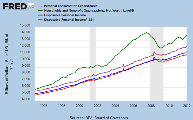
Graph 3 PCE, Net Worth and Disposable Income
There are four lines, Net Worth in green (divided by 5 to put it on the same scale); Disposable Income in purple, PCE in red, and Disposible Income multiplied by 0.931 in blue. Note that the last two overlap almost perfectly, as I also pointed out earlier (see link above.)
The conclusions I'm drawing are
1) Since the bubbles increased wealth in a highly skewed fashion, the relationship between average wealth and consumption broke down.
2) When the bubbles burst, the normal relationship between wealth and consumption reasserted itself.
3) The underlying cause is that during the bubbles the relationship between wealth and income broke down, and afterwards reasserted itself.
4) The relationship between disposable income and consumption is robust across time and most extraordinary financial events.
5) All the foregoing suggest that if wealth distribution were more even across the population (and thus more closely tied to disposable income,) then the relationship between wealth and consumption would be more robust.
Cross posted at Angry Bear.
Tuesday, April 10, 2012
Quote and/or Q and A of the Day
From an "insanely long view" perspective, by Char Weise at Creative Destruction.
In all honesty, it never occurred to me to look at it this way. The opinion seems to be uninformed by the concept of Homo Sapiens as god's chosen species.
H/T (somewhat indirectly) to Art
Q: Fifty million people don't have health insurance in this country. What can we do to give them better health care?
A: Humans are merely collections of cells through which life flows in many forms, sometimes as a happy child and sometimes as a flesh-eating virus. Who is to say that a human child has a stronger claim to life and health than a flesh-eating virus? What you call "health care" is merely the rearrangement of morbidity across life forms.
In all honesty, it never occurred to me to look at it this way. The opinion seems to be uninformed by the concept of Homo Sapiens as god's chosen species.
H/T (somewhat indirectly) to Art
Friday, April 6, 2012
Lifted Post of the Day

Coca-Cola, Intuit, and Kraft have joined Pepsi in renouncing membership in the American Legislative Exchange Council, a right-wing, corporate-funded organization that pushed — hard — for the shoot-first legislation that is hampering efforts to arrest and prosecute Trayvon’s Martin’s shooter. ALEC also is a proponent of restrictive voter ID laws; the two issues prompted progressive advocacy African-American group Color of Change to target the group this week with a petition campaign.
Lifted from The Daily What.
Wednesday, April 4, 2012
Maybe I Should Be Flattered
Business Insider republished my latest Angry Bear post. (Cross-posted here, of course.) Shame they got just the text and missed the graphs. Also, they don't link back to the original post. Odd way of doing things. Plus, they only credit Angry Bear blog, not me as author.
Mixed feelings on my part - sort of a WTH?!? - and it's only Wednesday.
Mixed feelings on my part - sort of a WTH?!? - and it's only Wednesday.
Tuesday, April 3, 2012

Subscribe to:
Posts (Atom)
![[Most Recent Quotes from www.kitco.com]](https://lh3.googleusercontent.com/blogger_img_proxy/AEn0k_ulH6RtQ9dY8ucZjvCENb0pXqkqgZSkIzV7MAITiwedDEgCt_IVvdYCwmv5-8bQYGnge3jh1763WDCQpR9htG6Xus-ewXToqWLc_qPm-opFeb9MiKVWEhXP76RsStN4dFF9=s0-d)


