Look: I am eager to learn stuff I don't know--which requires actively courting and posting smart disagreement.

But as you will understand, I don't like to post things that mischaracterize and are aimed to mislead.

-- Brad Delong

Copyright Notice

Everything that appears on this blog is the copyrighted property of somebody. Often, but not always, that somebody is me. For things that are not mine, I either have obtained permission, or claim fair use. Feel free to quote me, but attribute, please. My photos and poetry are dear to my heart, and may not be used without permission. Ditto, my other intellectual property, such as charts and graphs. I'm probably willing to share. Let's talk. Violators will be damned for all eternity to the circle of hell populated by Rosanne Barr, Mrs Miller [look her up], and trombonists who are unable play in tune. You cannot possibly imagine the agony. If you have a question, email me: jazzbumpa@gmail.com. I'll answer when I feel like it. Cheers!
Showing posts with label gdp. Show all posts

Wednesday, September 16, 2015

Household Debt Service vs GDP Growth

In conversation at Art's we wondered about the relationship between household debt service payments as a percentage of disposable personal income and YoY GDP growth.  A scatterplot of the quarterly data from FRED, covering Q1, 1980 to Q1, 2015 looks like this.


Graph 1 - FRED Plot

There's a broad hint of an overall negative slope.  But if you lop off a few points on the right and the left, the remaining central cluster is relatively shapeless.   But, there does seem to be some negative slope to at least certain line segments, so that might mean something.

My first cut at figuring this out was to download the FRED data and make a new plot - Graph 2 - with line segments separated in what I hope is a coherent fashion.  I did this by eyeball, then labeled the segments according to the dates they include.   In the process I inadvertently reversed the axes, but this shouldn't change whatever conclusions might be drawn.

Saturday, February 1, 2014

Real GDP per Capita

My last Angry Bear post generated such a wonderfully amusing comment stream that I couldn't resist posting a follow up.  One of the criticisms was that I didn't consider Real GDP per Capita.  At the risk of having anyone think I accept homework assignments from trolls, here is a look at that very thing.  I'm snowed in tonight, so what the hey.

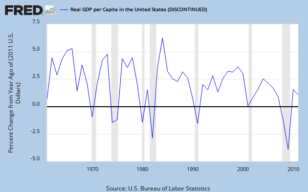
I usually like more finely granulated data over a longer time span, but sadly discontinued FRED series USARGDPC gives us annual data from 1961 through 2011, and that's plenty good enough to make a point; the point being that the American economy is dying a slow and agonizing death.  This, alas, despite enormous tax cuts enduring over decades.  For the supply-siders among you, we'll take an extra special look at the Reagan years.

Graph 1, from FRED, shows YoY RDGP growth over the span of the data series.

Graph 1 - RGDP per Capita, YoY % Change

The single most prominent feature of this trace is the downward trend over time, characterized by both lower lows and lower highs.  This should be pretty obvious, even to the causal observer; but if you cannot see it, don't be disturbed, I'm going to help.

 Graph 2 shows the same data, along with some trend indicators.

Graph 2 - RGDP per Cap, % Change, with extra colored lines

Parallel trend channel boundaries are indicated in red and green, with the center line in yellow.  The Excel generated least squares trend line is in dark blue, and a moving 5 year average in purple.  Each of these additions is a visual aide, indicating that the trend over time has, indeed, been down.  Certainly, it has not been monotonic.  The real world seldom works that way.  But what you see here, with some exceptions, are mostly worsening recessions, and increasingly anemic recoveries.

Next, let's focus in on the 5 year average.  Graph 3 gives that to us, along with it's own set of trend lines.  The vertical axis is truncated relative to graph 2, and the downward slope is therefore emphasized.  This makes it easier to see that the 1990 peak is considerably lower than the double peak of '66 - '69.


Graph 3 - 5 Year Average of RGDP per Cap Change, with extra colored lines

The 5 year average is in purple.  The base data and least squares trend line are in grey, The red, green and yellow lines are again parallel channel boundaries and midline.  The last time the average line touched the top channel border was in 2000.  After that, despite the Bush tax cuts, things went into a bit of a decline, culminating in the worst financial disaster since the Great Depression.

I know what you're thinking.  The next to last peak in Graph 3 came in 1990, the culmination of the Reagan miracle, just before his buzzards came home to roost, costing Bush Sr. his chance at a second term.  But remember that that peak is considerably lower than those of the 60's, and scarcely above the mundane years of '70 to '73.

And back in graph 2, the highest single growth year ever was in 1984, the third year of phase-in for Reagan's 1981 tax cut.  Well, sure - but note that 1984 was a one-off, and also the recovery year from an exceptionally deep Fed-induced double-dip recession in the previous 3 years.  So, beside a lot of pent up demand, there were a few other things going on that might have given RGDP a boost.

Graph 3 shows the Effective Federal Funds Rate, which made an erratic drop from a high of just over 19% in mid '81 to 15% in early '82, then to under 9% by 1984. 

Graph 3 - Effective Fed Funds Rate, 1980 to '84

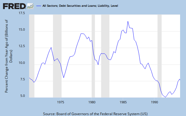
Graph 4 shows the explosion of credit that occurred coming out of 1982.  By 1984 it was close to an all time high.  It finally reached that peak in 1986, then collapsed.for the rest of the decade.

Graph 4 - Credit Expansion, 1978 to 1994

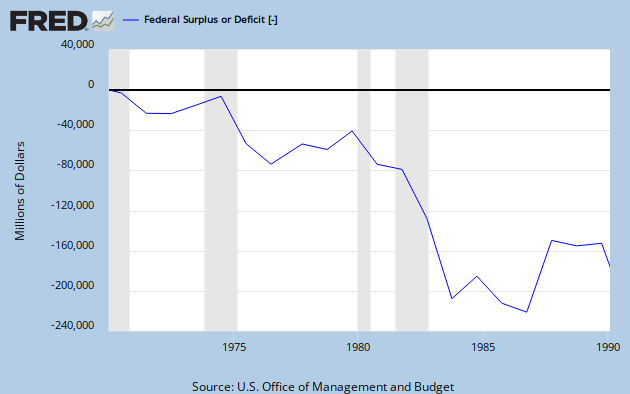
And let's not forget that Reagan was responsible for what was at that time, the most profligate explosion of federal spending ever seen, as shown in Graph 5.

 Graph 5 - Reagan's Deficit Spending

So let's recap.

Big picture: Decades of tax cuts have not led to increasing prosperity.  Quite the opposite.  The growth rate of RGDP per capita has declined substantially since the tax cuts of the 60's, and most severely since the 2001 tax cuts.  The ensuing change in RGDP/Cap growth is somewhat reminiscent of what happened from '69 to '75, but as yet without much recovery.

Focus on the Reagan years: After a long and deep recession, tax cuts plus the steepest decline in nominal  interest rates ever seen in the 20th century, plus a huge expansion in federal spending, plus an explosion in credit resulted in a single year of outstanding GDP growth, followed by four decent but less than stellar years, which incidentally also included the 1986 tax cut.  Then, alas, in 1991, there was another recession.

If you can look at this data and still have the opinion that tax cuts boost the economy, then knock yourself out.  Everyone is entitled to an opinion.  But you might want to ponder why your opinion has so little overlap with reality.

I welcome your comments, but please keep them more or less relevant to the topic, and if you are going to disagree, please bring more than assertions.  Facts and data have some gravitas. 


Thursday, October 3, 2013

A New Look at Real GDP - Part 2

Part 1 took a hard look at GDP growth after 1955.  Part 2 will take a hard look at Volatility.  The usual measure of volatility is the Standard Deviation.  Graph 1 is a scatter plot of Standard Deviation [St Dev] vs RGDP growth over an 8 year period.  The X-axis value is the average RGDP over the previous 8 years [32 quarters] while the Y-axis value is the standard deviation of RGDP growth over the identical period.  There's nothing magical about using an 8 year period, you get a similar picture using a 15 year period.


Graph 1 - RGDP Growth and Volatility

When I looked at the 15 year graph I noticed something that made me want to use an 8 year period, and that is the data trend over presidential terms.  The last data point in the term represents the performance of a given 8-year administration, and the trend over the term can offer contrast to other administrations.

Since the major trend over time has been decreases in both RGDP and St Dev, the data set starts at the upper right, and moves generally down and to the left over time.  The blue points at the start of the data set represent the Kennedy-Johnson administration from 1963 on.   JFK inherited high volatility from Ike, and during the Democratic term, RGDP growth increased while volatility decreased from 2.95 to 2.09.  During Nixon-Ford [purple], volatility jumped back up to the 2.5 range while average RGDP growth plummeted from 4.8 to 2.7%.  During the Carter administration [light blue], RGDP growth increased to 3.6%, then fell again, while volatility remained fairly constant in the 2.5 to 2.7 range.  Interestingly, the moribund Carter administration at it's best gave us average RGDP growth equal to Reagan's, at it's best, with much lower volatility.

During Reagan's term [red], RGDP growth fell, then rose. Both RGDP growth and volatility reached their maxima in Q4, '84 at 3.5% and 3.06, respectively.   During George H. W. Bush's term [yellow], average RGDP and St Dev didn't change much, despite the sharp RGDP drop in 1991.  By Q2, '95, RGDP growth stabilized, and grew slowly from there for the rest of Clinton's term [blue] while volatility dropped dramatically from 2.5 at the begiining of the term to 1.3 at the end.  During the George W. Bush term, volatility remained low while average GDP growth took a nose dive from 3.8 to 2.3%.

Then the Great Recession happened, and during Obama's term we've seen RGDP growth and volatility both stabilize.   While the Std Dev has settled in at an intermediate level, average RGDP growth has never been lower during the period under study.

This demonstrates what I've believed for a long time:  the Great Moderation is a myth.  The only meaningful declines in St Dev took place during the Kennedy-Johnson and Clinton administrations - what I call the two little moderations.  You can attribute this to good policy or good luck.  But the Great Stagnation is real.  Only during the Kennedy-Johnson and Clinton administrations did we experience increasing GDP growth along with falling volatility.

Now, I'm gong to introduce the concept of Relative Standard Deviation [RSD] this is simply the standard deviation divided by the average of the data set on which it is based.  You might think this is a novel concept, but analytical chemists and quality engineers use it all the time.  Think about it this way.  If the St Dev is two and the data is clustered around 10 that's one thing, but if its clustered around 2, that's something quite different.  The denominator provides context for the numerator.

Graph 2 shows the RSD of RGDP growth, again based on a moving 8 year kernel.

Graph 2 - Relative St Dev of RGDP Growth

I've included the grand average [0.735] in yellow and some trend lines. At the beginning of the series, RSD falls sharply to a low of 0.418 in Q4, '69.  From there it's a bumpy rise to the top at 1.35 in Q4, '82.  But the value remains below the average for 9 years from Q4 '65 to Q4, '74.  Following the peak, there is no meaningful breach of the average again until Q1, '97.   In other words, after the peak, volatility remained high for 7 years, and at or above average for 15.  From 1990 through '96, the values cluster close to the average line.  After that, values stay below average until Q4, '98, 12 years later.  What we have are two roughly symmetrical, approximately decade long periods of low volatility - the little moderations - surrounding two above average decades that include two volatility bumps and one brief excursion into ultra-high high volatility in 1982-3.  The low volatility of the little moderations results from avoiding recessions - periods when volatility goes up while GDP growth declines.  The 1982 peak is an artifact of the double dip recessions of  '80 and '82. The whole key to having low volatility has been, up until recently, to avoid recessions.

As I said, I think the Great Moderation is a myth.  It's entire existence is predicated on 2 things: 1) a brief ultra-high volatility blip due to a double dip recession; and 2) completely ignoring the existence of the first little moderation. 

But what's happened since is truly remarkable.  We now have what some people consider to be [and applaud as] remarkably stable GDP growth.  But what we actually have is the lowest non-recessionary GDP growth ever recorded, coupled with historically high RSD.  This is a truly ugly economic environment.  Anyone graduating now is the unluckiest of all.


Wednesday, October 2, 2013

A New Look at Real GDP

At Art's Place, Marcus Nunes presents his argument that 1982, despite being the all time high in unemployment, was a great time to enter the work force, "just as the Volcker adjustment took effect, ‘eradicating’ inflation from the system and stabilizing the economy, paving the way to the Great Moderation."  He presents some charts with trend lines that I think are conceptually incorrect.  Putting a single straight trend line through a data set that clearly has an inflection point near 1982 obliterates the change resulting from that inflection.  The right method, in my opinion, is to connect peak to peak and trough to trough, as I did here in My Graph 1.1, for a more extreme example.

But for this post, I want to focus on RGDP, the basis for part of Marcus' Argument.  His claim is that, taking 1982 as an inflection point, volatility was high in the early period and low in the later period, while both periods exhibit the same mean.  There is certainly a volatility difference, with standard deviations of 2.789 and 2.000 for the early and late periods, respectively.

But, the mean is only the same [3.42 vs 3.39] if you truncate the late period at the end of 2007, and eliminate the Great Recession.  One could argue for this, I suppose, if there is an assumption that the Great Recession were an aberration and not the end game of the Great Stagnation.  But I don't believe that is true.  In fact, RGDP growth was already faltering by Q2 of 2004, and had dipped to 1.4% by the beginning of 2007.  Plus, this all follows a rather anemic recovery from the 2001 recession.

Graph 1 shows YoY RGDP growth from 1955 thought Q2 of 2013.  The grand average of 3.37, is shown in pink.  The '55 to '82 average of 3.42 is in yellow, the late period average of 2.94 is shown in bright blue.

Graph 1 - RGDP - YoY % Change

Aside from the post recession spike of 8.6% in Q1, '84, and the bump from Q4, '95 through Q2, '01, the entire post-82  period up until the Great Recession looks rather bland. 

One way to tame jumpy data is to take a moving average.  Graph 2 zeros in on 13 [purple] and 21 year [blue] moving averages from 1967 on.

 Graph 2 - RGDP - YoY % Change with Avgs

The averages reach their all time highs in Q2, '74 and Q1, '79, respectively.  I've placed a trend channel in brown around around the 13 yr average line.  The orange mid-channel line turns out to be the lower boundary for the 21 year average line.  There's basically sideways motion from the late 80's through the early naughts in both lines, then drop-offs starting in 2003 for the 21 yr averages and 2007 for the 13 yr average.  These declines begin before the onset of the Great Recession.

There's always more than one way to look at data. Two years ago, I charted the the YoY % change in the 5 year average of quarterly RGDP data.  That is shown in graph 3.

 Graph 3 - YoY % Change in % Yr Avg of RGDP Growth

The line is color coded by presidential administration.  Make of that what you will.  I didn't put a trend channel on this graph, but you can eye-ball one easily enough, with a clearly downward slope.  Also included in yellow is a 13 year average of the red-blue line.  Clearly, there are two regimes, with an inflection near 81-82, and lower growth after.

The point of all this is to demonstrate that there is more of a difference between the pre- and post 1982 periods than simply a volatility reduction.  There is also a decline in RGDP growth, if you dig into the numbers to find it.  The Great Moderation really was the Great Stagnation.  And it culminated in the Great Recession.


Wednesday, September 11, 2013

Money Makes Dhe Vorld Go Around

Update:  Do NOT read this post.  It's a massive screw up.


But not if it's buried under a rock, or in it's nearest equivalent, a secure bank vault.

Graph 1 shows some aggregate money measures, along with excess reserves, the aptly named EXCSRESNS.

Graph 1 - M Aggregates and Excess Reserves

EXCSRESNS is placed on the right hand scale, because otherwise you have Graph 2, with all the aggregates flat-lined at 0, to a reasonable first approximation.


Meanwhile money velocity is dying a slow and agonizing death.

Graph 3 - Velocity of MZM

The Federal Funds rate has been at or below 0.20% for four consecutive years.  Add on a few rounds of QE, and you get this amazing success: unemployment now down to about the level of previous peaks.

Graph 4 - Unemployment Rate (blue)and U 6 9red)

And this is accompanied by the worst out-of-recession Real GDP growth in the history of ever.

Graph 5 - RGDP, YoY % Change

Of course, runaway inflation remains a clear and present danger.

Graph 6 - CPI, YoY % Change

Then, again, maybe not.

OK, Market Monitarists, what is the FED supposed to do?

Oh - I know - NGDP targeting.

If the Fed determined that NGDP should rise at 5% per year, businesses and households should behave with the expectation that their incomes will rise 5% each year, and by behaving in such a way they thereby generate the 5% increase. Of course, not everyone's income will rise by 5% just as not everyone's prices rise 2%. But aggregated across the economy, these decisions should produce the desired outcome for the national economy.

What is this?  Hand waving?  Dog wagging?  The almighty invisible hand?  Wishing can make it so?

Expectations, right?

People in households with flat nominal and declining real incomes are supposed to act as is they expect a 5% raise this year, and that behavior will generate real growth. 

But Winter is coming and the wolves will be hungry.  How long is that supposed to last?

Besides - do you think that most ordinary struggling people have any knowledge of what the FED is, let alone some way to modify their expectations based on tongue wagging and ineffective policy actions they are, at best, only dimly aware of?

Seriously - what is the transfer mechanism?

Wednesday, July 3, 2013

The Standard Deviation of NGDP Growth Since 1950 - Revised

This is a follow up to The Standard Deviation of NGDP Growth During the Great Inflation.  In that post I showed this 100 point scatter graph of the 12 Quarter average Compounded Annual Rate of Return [CARC] of NGDP vs 12 quarter Standard Deviation [Std Dev] of CARC from 1954 to 1978.  It then occurred to me that some of those red dots that have fallen down close to the yellow trend line might be misallocated.  What they represent are 3 quarters in 1957 when Std Dev had a chance to settle down between recessions, and the tumble down of Std Dev in the early 60's as the high Std Dev values of the the 1960 recession fell out of the 12-point data kernel.

This is illustrated in Graph 1.


Graph 1 CARC vs Std Dev 1954-78, With Points Reallocated

The red dots are data points from 1954 through Q1 '62.  The yellow dots are from Q1 '64 on. The blue dots are the three low Std Dev points from 1957, and the pink dots represent the transitions in and out of the 1957 blue-dot data, and the tumble down in Std Dev from Q2 '62 to Q4 ''63.  The original blue trend line is retained for comparison.  Note that removing these three blue and 8 transitional data points from the pre-1964 data set causes the negative correlation of that period to completely evaporate.

This might seem a bit arbitrary; but now we can observe a more tightly packed red data set, and the behavior of the pink data points does seem to be unusual.  The string of high side outliers in the yellow data set occurs in 1971-2, and is associated with the 1970-71 recession.

This piqued my curiosity, so I took a look at the bigger picture - all 253 quarterly data points from Q1 1950 through Q1 2013, shown in Graph 2. 


 Graph 2 - CARC vs Std Dev 1950 to 2012

I see the great majority of these points clustering or stringing out along imaginary upward sloping lines that suggest coherent data subsets, and a relatively small number of points [39, or 15.4% of the total] where the data is in transition between sets.

I parsed it out as shown in graph 3.


Graph 3 - CARC vs Std Dev 1950 to 2012 - Parsed Data


The data points are color coded to correspond with the straight lines that best fit each subset of data, describing 5 distinct realms.  Equations for the lines and R^2 values are also presented in corresponding colors.

The 39 light green dots represent the lowest Std Dev to CARC relationship.  The 72 dark green dots represent a slightly higher relationship. These two subset occur across all decades from the 60's on in times of stable NGDP growth, i.e times outside of recessions.  There are 41 blue points, representing a medium-high relationship.  These occur when the economy is either in or coming out of a recession.   The 53 yellow points represent a high Std Dev to CARC relationship.  This has occurred during especially severe recessions, or when recessions repeat within the 12 quarter data kernel.  The 8 red dots at the top of the graph are ultra-high.  They demonstrate the severe economic instability of the early post WW II years.  Four of these subsets exhibit extremely high R^2 values, above 0.91; and the fifth  [yellow] is quite respectable at 0.74.  The 39 pink dots occur in discrete short periods when Std Dev rises or falls sharply.

This is an unusual way of looking at GDP data, but I feel pretty good about it, because the linear subsets sort themselves out quite reasonably, and to my eye do not look contrived.  Also, the data points of each subset generally follow the trend lines, in either clusters or strings, for several consecutive quarters.  These subsets are trend stationary along the entire time span of the FRED data set, irrespective of inflation or disinflation; high or low levels of NGDP growth; and whether CARC is rising or falling.  This suggests that the relationship between CARC and Std Dev is not random.  Rather, it is deterministic, and also quantized.  I'm reminded of the chart of nested Phillip's curves Noah Smith posted, and the quantization of electron energy levels diagram shown here.

To draw an analogy, recessions provide the activation energy to boost the Std Dev from a low level trend line to a higher level trend line.  When the recession ends, the Std Dev naturally decays down to a lower level.

To bring this back into the real world, Graph 4 shows the 12 period CARC average from 1950 to 2013, with the CARC data points color coded to correspond with graph 2.


Graph 4 - CARC Color Coded to match Graph 2

The color coding is indicative of the economic conditions as described for Graph 3.   Note that each of these data sets is coherent, irrespective of the inflationary environment or the long trend NGDP growth level.  It is the presence or absence of recessions that mainly determines the realm in which the Std Dev of CARC resides. Outside of recessions, the data resides along one of the green lines.  When not following any of these lines, the CARC - Std Dev relationship is transitional, moving into and out of recessions.

What strikes me is that I simply eyeballed straight lines through this scatter of data as an exercise in curiosity, and it wound up making some sort of coherent sense. Each of the realms associated with the best fit lines is trend stationary in a way that is robust across time and varying economic conditions.

But NGDP growth, per se, tells you absolutely nothing about either the rate of inflation nor the Std Dev realm.  So - the big question in my mind is this: how can NGDP targeting be expected to lead to controlled, relatively stable economic growth at any desired level, unless you can also control not only the underlying rate of inflation, but also which Standard Deviation realm you end up in?

For anyone who's curious, Graph 5 shows the CARC - Std Dev scatter, color coded this time by decade.

Graph 5 - CARC vs Std Dev by Decades

Red - 1950-59
Yellow - 1960-69
Light Blue - 1970-79
Purple - 1980-89
Orange - 1990-99
Green - 2000-09
Blue - 2010-13

Note three things. 1) As the data moves across time, when it gets to one of the realms described by Graph 3, it tends to linger there.  These trend stationary realms have real traction.  2) Transitions generally take a short, quick route to the next trend line.  3) Since 1980 there has been a choppy but relentless migration to lower and lower NGDP growth.  We are now stuck in the worst recovery on record, and the lowest growth period ever to occur outside of a recession.  In fact, NDGP growth is now lower than that which has occurred within most recessions.

Whether fiscal policy, monetary policy, trade policy or something else I can't think of  is to blame, this is, to borrow a phrase from my seven-year-old granddaughter Emily, a "total epic fail" of economic policy.  It is grim on a scale unprecedented in the post WW II period.


Monday, July 1, 2013

The Standard Deviation of NGDP Growth Since 1950

This is a follow up to The Standard Deviation of NGDP Growth During the Great Inflation.  In that post I showed this scatter graph of 12 quarter Std Dev vs the 12 Qtr average Compounded Annual Rate of Return [CARC] of NGDP for the period.  It then occurred to me that some of those red dots that have fallen down close to the yellow trend line might be misallocated.  What they represent are 3 quarters in 1957 when Std Dev had a chance to settle down between recessions, and the tumble down of Std Dev in the early 60's as the high Std Dev values of the the recessionary '50's fell out of the data kernel.

This is illustrated in Graph 1.


Graph 1 CARC vs Std Dev 1954-78, With Points Reallocated

The red dots are data points from 1954 through Q1 '62.  The yellow dots are from Q1 '62 on. The blue dots are the three low St Dev points from 1957, and the pink dots represent the transitions in and out of the 1957 blue dot data and the tumble down from Q2 '62 to Q4 ''63.  The original blue trend line is retained.  Note that removing these three blue and 8 transitional data points from the pre-1964 data set causes the negative correlation of that period to completely evaporate.

This might seem a bit arbitrary; but now we can observe a more tightly packed red data set, and the behavior of the pink data points does seem to be unusual.  The string of high side outliers in the yellow data set occur in 1971-2, and are associated with the 1970-71 recession.

This piqued my curiosity, so I took a look at the bigger picture - all 253 quarterly data points from Q1 1950 through Q1 2013, shown in Graph 2. 


 Graph 2 - CARC vs Std Dev 1950 to 2012

I see the great majority of these points clustering or stringing out along upward sloping lines that suggest coherent data sets, and a relatively small number of points [39, or 15.4% of the total] where the data is in transition between sets.

I parsed it out as shown in graph 3.

Graph 2 - CARC vs Std Dev 1950 to 2012 - Parsed Data


The 112 green dots represent the most common subset and also the lowest Std Dev to CARC relationship.  There are 42 blue points, representing an intermediate relationship, and 50 yellow points representing a high relationship.  The purple dots at the top are ultra-high.  Each of these subset exhibits a very respectable R^2 value.  The 32 pink dots occur in discrete short periods when Std Dev rises or falls sharply.

This is an unusual way of looking at GDP data, but I feel pretty good about it, because the linear subsets sort themselves out quite reasonably, and to my eye do not look contrived.  Also, the data points along each line follow the lines pretty closely, and are robust along the time span of the entire FRED data set.  Now that I squint at it a little harder, it might be that the green set is further divisible.

 To bring this back into the real world, Graph 3 shows the 12 period CARC average from 1950 to 2013, with the CARC data points color coded to correspond with graph 2.

Graph 3 - CARC Color Coded to match Graph 2

The yellow points occur, unsurprisingly, when recessions are clustered, as in the 50's, or especially severe.  The blue points occur during and following less severe recessions.  The pink points occur duirng transitions in or out of recessions.  The dark purple line is at the far left and results from the economic instability in the aftermath of WW II.   The green points represent the quasi-normality of non-recessionary times.

Note that each of these data sets is coherent, irrespective of the inflationary environment.  It is the presence or absence of recessions that dominates the realm in which the Std Dev of CARC falls.  In each of the three recessionary/non-recessionary environments described, the Std Dev of CARC is strictly linear with CARC.

When not following one of these lines, the CARC - Std Dev relationship is transitional,  moving into and out of recessions.

What strikes me is that I simply eyeballed straight lines through this scatter of data, and it wound up making some sort of coherent sense.

Now - the big question in my mind is this: how can NGDP targeting be expected to lead to controlled, relatively stable economic growth at any desired level, unless you can accurately predict not only what the underlying rate of inflation will be, but also which Standard Deviation realm you end up in?

For anyone who's curious, Graph 4 shows the CARC - Std Dev scatter, color coded by decade.

Graph 4 - CARC vs Std Dev by Decades

Red - 1950-59
Yellow - 1960-69
Light Blue - 1970-79
Purple - 1980-89
Orange - 1990-99
Green - 2000-09
Blue - 2010-13

Note two things. 1) As the data moves across time, when it gets to one of the realms described by Graph 2, it tends to linger there.  These realms have traction.  2) Since 1980 there has been a choppy by relentless migration to lower and lower NGDP growth.  We are now stuck in the worst recovery on record, and the lowest growth period ever to occur outside of a recession.

Whether fiscal policy, monetary policy, or trade policy is to blame, this is economic failure on a scale unprecedented in the post WW II period.


Friday, June 28, 2013

The Standard Deviation of NGDP Growth During the Great Inflation

This post is a side bar to the Remarkably Stable GDP Growth series.

Part 1
Part2
Part 3

Once again I have to thank Mark Sadowski for goading me into digging deeper, staring longer, and thinking harder about this topic than I otherwise would have.  In comments to Part 3,  Mark informs us that: 

In three year periods ending in 1954 to 1978, which overlaps with the Great Inflation, the 12 quarter standard deviations of the compounded annual rate of change in NGDP are significantly *negatively* correlated with the average rate of change in NGDP. In other words NGDP became *less volatile* as its average rate of change *increased*.

Let's have a look.  Graph 1 is a scattergram of 12 Qtr average NGDP growth from this FRED page, measured as Compounded Annual Rate of Change [CARC] vs Std Dev for the years 1954 through 1978.  A linear trend line is included.


 Graph 1 - 12 Q Avg CARC vs Std Dev

At first glance it appears that Mark is right.  But there is something strange about that data distribution.  Do you see it?

Let's look back to one of my earlier graphs showing the change in Std Dev over time for a moving 13 quarter kernel.  I see a broad sweep up in St Dev from the mid 60's to the early 80's.  Can a 12 Q kernel be very different?  No, it can't, as Graph 2 indicates.

Graph 2 - 12 Q Avg CARC and Std Dev

Twelve Qtr average CARC is in yellow, St Dev in blue.  The basic CARC data is in grey.  What we observe are 5 different realms, with Average CARC and Std Dev moving broadly together: a sharp up and down from '50 to the early 60's; up from '64 to '81; down '82 to 87; flatish '88 (or '90) to '08, and then the Great Recession.   How can we have Std Dev negatively correlated with average CARC when they exhibit similar movement?   That's at the gross level.  The small magnitude undulations, however, are in contrary motion.  This is easiest to see in the wiggles from 1954 to '60, and again in the great recession, but actually occurs throughout.  It happens mainly because recessions bring CARC values down while boosting the Std Dev.  But -- this is not the explanation.

To understand what's going on, consider the big drop in Std Dev from 6.51 in 1960 to 2.47 in  Q1 1964. Remember that 1964 date, it's important.  Now, let's have another look at the CARC data from 1954 to 1978, presented in Graph 3.

Graph 3 CARC and STD Dev, 1954 to 1982

The CARC data from FRED is in dark blue. It moves up over the period, but not in a regular manner.  There are two flatish periods from Q2 '61 to Q3 '70, and from Q2 '72 to Q1 ,78.  Averages for these periods are indicated with yellow horizontal lines.  The data packet spans for the two periods are outlined in red.  Std Dev is in bright blue.  I've included a trend channel in green, just because it amuses me.  Data for the two periods is summarized in the table below.


A higher CARC range leads to a slightly wider data packet, and hence a higher Std Dev.

The 60's were recession free, and in that decade we observe that after Std Dev hits bottom in 1964, it moves in near lock-step with average CARC for the rest of the decade [easiest to see in Graph 2.].  After the 1970 recession, CARC stepped up into a new range.  There was a recession in 1974, yet the data envelope only widened slightly. This is because inflation at the time kept NGDP values high, even in the trough, as this FRED graph illustrates. 

Now, lets have another look at the scattergram of average CARC vs Std Dev, this time with the data properly parsed around that significant 1964 date I mentioned earlier, shown in Graph 4.


Graph 4 - 12 Q Avg CARC vs Std Dev

The values from 1954 to Q4 '63 are in red, and from Q1 '64 on in yellow.  The original trend line is shown in blue, trend lines for the two sub sets are color coded with their respective data points.

The conclusion is that the apparent negative correlation between CARC and St Dev over the period of 1954 to 1978 is specious, and wholly due to the high recession-driven Std Dev values of the 50's.  The Std Dev drop of 1960 to '64 occurs when the last of these gyrating data points fall out of the moving 12 quarter kernel.

After that, Std Dev is positively correlated with CARC, as I claimed in the first place

There's a lot more to dig into here, and I'll do that in a follow-up post.

Friday, May 31, 2013

More on Ineffective Fiscal Policy

This is a companion piece to Steve's AB post from earlier today, where he points out the specious reasoning of  "the likes of Scott Sumner, David Beckworth, Lars Christensen, et al., claiming that fiscal austerity has obviously had no effect on GDP growth."

I wrote Sumner off a few years ago due to a highly unfavorable chaff/wheat ratio.  I've tried really hard to like Beckworth, but these guys simply wallow in confirmation bias.  I've repeatedly criticized Beckworth for cherry picking short-term time series data to make his points.

Comparing 2013 to '12 is an example of time series cherry picking used to justify absolutist dogma.
Back on Feb 10, Beckworth said: "despite this austerity happening at a time of high unemployment and a large output gap, a slowdown in aggregate demand growth has failed to materialize."

And also:  "we should at least see aggregate demand faltering over the past few years while this unfolded. But in fact, we see relatively stable aggregate demand growth, as measured by NGDP"

He does admit in the end that, "the Fed has failed to restore NGDP to its pre-crisis trend." but uses this to get in a dig at the Fed for not following his preferred agenda.

Despite the admission, this is absolutist thinking.  Austerity and demand growth in this view each have an on-off switch.  There is a refusal or unwillingness to recognize matters of degree.  GDP growth is slower than before the crisis, and the slowest of any alleged recovery period ever.  Blaming the Fed willfully ignores the part played by fiscal austerity

My comment, which he also ignored, is as follows. [Graphs added, in place of links.]

__________________________________

Yes, your graphs all show relative austerity. Except for total government expenditure/GDP - yes falling rapidly, but still higher than any pre-2007 number. And relative is relative. I still think you are considering austerity in absolutist terms.  [Afterthought - total government expenditure as a direct measure is basically flat, not falling over the past three years.  Another example of using a denominator to skew the view.]

We now have the slowest growth in real personal consumption expenditures, % change YoY, of any non-recessionary period in the WW II era. In fact, by that measure, this is the most anemic recovery on record.  [Graph 1]


Graph 1 - Real Personal Consumption Expenditures, YoY % Change


If you prefer GDP growth, this "remarkably stable" measure [% change YoY] has plateaued at or below the level of troughs in the last 8 recessions, going back to 1960. [Graph 2]  So, by that measure, this is the most anemic recovery on record.


Graph 2 - GDP, YoY % Change

Unemployment has fallen, but remains at a level above that of most recessions.[Graph 3]


Graph 3 - Civilian Unemployment Rate

The worst recovery in my life time is pretty dismal success. Plus, wealth and income disparity continue to increase. With sequester looming, I think we're in for a very rough ride.

_______________________________________

There are legions of economists who simply refuse to recognize that fiscal policy can make a difference, and are willing to torture data in an attempt to validate this point of view.

If you want to make a point using time series data, you really need to consider what is a valid context.  Is it this year vs last year, or vs long range historical trends? 

If you need to cherry pick or engage that ol' devil denominator to make your point, then your point has questionable validity.


Tuesday, April 16, 2013

Two R's Missing 'Rithmatic

Wow - via Steve Benin at Maddowblog and Jared Berstein we discover that the oft-cited Reinhart and Rogoff study that "indicates" that a country's debt level leads to economic contraction at levels above 90% of GPD has been shown to be totally bogus.

They made an error setting up their Excel spreadsheet for the calculations, and the math came out wrong. [This is really inexcusable sloppiness]

Not only does this matter, it is REALLY important, because their study has been used as the justification for austerity by people like Paul Ryan who want to gut social programs in the U.S., and the economic union authorities in Europe who are destroying themselves with austerity.

It's still true that with correct math the data really does show higher debt *correlating* with lower [but still significantly positive] growth.  Here is Bernsein's graph showing the R&R results along with the corrected results.


However, even if R&R had gotten it right, the austerians are making two other fundamental [and ideologically driven] errors in judgment. First off, when you do a data mash-up like they did, it's easy to get the causation reversed. It's quite likely [and realistically seems very sensible] that slow growth causes the need for high debt, not the other way around.

Second, if a high debt to GDP ratio were really a problem, it would make more sense to grow GDP rather than go into an austerity mode that is likely to shrink GDP. [Exactly what happened in the U.S. to cause the "golden age" after WW II] This is the denominator effect. Make the denominator [here, GDP] larger, and the ratio becomes smaller.

This is really very simple. But it is way beyond the capability of somebody like Paul Ryan.

Critical analysis leads to the truth. But that will not matter to Ryan. His mission is to kill social security, not solve any of the nation's problems, and, as Bernstein points out, "It’s not like facts are driving this debate."

Monday, October 15, 2012

GDP Growth Caused By Tax Cuts Has Never Happened

Mike's post here got me thinking.  I'll telegraph my conclusion.  He dramatically understated his case.

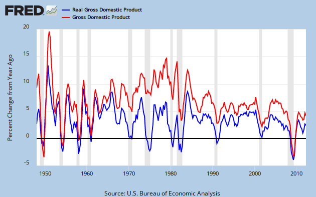
You can see the long range view of nominal and inflation adjusted GPD growth in Graph 1 of FRED quarterly YoY percent change data.


Graph 1 YoY growth Nominal and Inflation Adjusted GDP

Nominal GDP Growth was in a secular up-trend from 1960 through 1980.  However, inflation adjusted GDP growth quickly peaked after the Kennedy-Johnson tax cut, reaching a maximum value of 8.5% in Q4 of '65 and Q1 of  '66.  It then dropped dramatically for the next four years.  This peak value has been matched only once since: in 1984, during a sharp rebound from the double dip recession of 1980-82.

Since then, in the wake of numerous tax cuts, the rate of GDP growth has been anemic. To get a look at the rate of growth, I took an 8 year average of the annual percent change data presented above, and then plotted a 5 year rate of change for that data.  This is essentially the 2nd derivative of GDP, or GDP acceleration, as shown in Graph 2.


 Graph 2  GDP Acceleration

 Inflation Adjusted GDP acceleration peaked in Q3, 1966.   Fueled by the inflation of the 70's, NGDP acceleration stayed high until Q1, 1980, then plummeted for 9 years.  It has been relentlessly negative since.

Inflation adjusted GDP acceleration has not done quite as badly in this disinflationary era, but has been below zero more than half the time since 1970.  This is a little bit worse than coasting.

This all might seem a bit abstract, but the message is clear.  If tax cuts were good for the economy, then GDP growth would be increasing.  In other words, acceleration would be positive and most especially so after a tax cut.  The data is not consistent with this notion.

Clinton's famous tax increase preceded increased GDP growth by either measure, and an upturn in acceleration.  The Bush tax cuts preceded decreasing GDP growth.

I'm not going to get into a correlation vs causation discussion.  I'll simply say that tax cuts over 5+ decades have been an utter failure at stimulating real economic growth in any inflationary environment.  Since the real world data correlation is counter to the received conservative wisdom, it might be worth trying an anti-conservative approach.

It might also give the NGDP targeting enthusiasts something to ponder.

Cross posted at Angry Bear.

Thursday, October 11, 2012

Debt and Growth

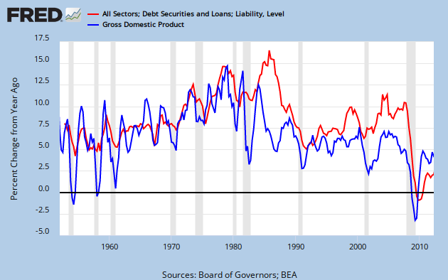
Art at The New Arthurian Economics and I are looking at the relationship between debt and economic growth.  Art started with an observation of two FRED series, total credit market debt owed (TCMDO) and Gross Domestic Product (GDP,  nominal or GDPC1, inflation adjusted - take your pick.)

Graph 1, from FRED, shows these data series.  I've chosen nominal GDP and, for reference, also included the total Federal Debt.


 Graph 1 TCMDO, GDP and Total Federal Debt

In 1950, TCMDO was about 1.3 times GDP, but growing a bit more quickly.  By 1980, the ratio was 1.6, and by 1987 it was greater than 2.  Now that ratio is approaching 4.  Note that TCMDO is also close to 4 times greater than total public debt.  This is why Art and I agree that private, not public debt is the problem that needs to be addressed, but is largely ignored.

Linked here are Art's posts with graphs of YoY growth in both factors, pre 1980 and post-1980.  Pre 1980, their moves are similar in magnitude, and pretty well coordinated. Post 1980 there is still some occasional similarity of motion, but the coordination breaks down and debt growth is generally quite a bit higher than GDP growth.  The 80's in particular stand out as being starkly different from the previous period.

Graph 2 shows the entire data set, since 1952.


Graph 2 YoY % Growth in TCMDO and GDP

These observations led Art to the reasonable hypothesis that, "Output growth slowed when debt became excessive."  This, in fact, might explain the great stagnation.

I suggested, and Art accepted two corollaries to his hypothesis.

1) There is a non-excessive amount of debt. Let's call it "just right."
2) Below the "just right" amount, there might also be "not enough."

Actually, there is a lower level hypothesis, to which Art's is corollary: That there is a functional relationship between debt and growth, in which growth is the dependent variable.

This is what I will explore in this post.

Graph 3 is a scatter plot of GDP vs TCMDO YoY % change for each, FRED quarterly data from Q4, 1952 through Q2, 2012, with a best fit straight line included.


Graph 3 GDP vs TCMDO, YoY % Change

The relationship is quite clearly positive.  The R^2 value at .39 is rather low, but not terrible.  There is quite a bit of scatter in the data.  Note the circle of data points around the left end of the line.  More on that later.

Next, I divided the data by decades, frex, 1961-1970.  This admittedly simplistic data parsing reveals that the slope and R^2 values are strongly variable over time.  Graph 4 shows the scatter plot along with the slope and R^2 values for each decade.  These data values are arranged in the chart in chronological order and color matched with the corresponding data points.


 Graph 4 GDP vs TCMDO, YoY % Change by Decade

I've added a brown line connecting the dots for the first decade of this century.  The chronology proceeds from a cluster near the center of the graph into a clockwise circular spiral.

Graph 5 shows how the slope and R^2 vary over time.

 Graph 5 Slope and R^2 Over Time for GDP vs TCMDO

After the 60's, the slope plummets, and by the 80's R^2 is a laughable 0.035.  Though the slope has remained low, R^2 has since recovered to 0.38, which is near the whole data set value of 0.39, and only slightly less than the 0.40 to 0.44 of the first three decades.

The slope changes can be interpreted as generally less GDP bang for the TCMDO buck, as the TCMDO/GDP ratio increases.  This is totally consistent with Art's hypothesis.

I have more to say about the GDP -TCMDO relationship, but this post is getting long, so I'll save it for a follow-up.

For now, I'll close with a few questions.

1) Do you think we're on to something?
2) What do you think of the methodology?
3) "Excessive debt" is suggestive, but non-specific.  How should this concept be quantized?
4) How should I go at exploring corollaries 1 and 2 mentioned after Graph 2?
5) Any thoughts on what was there about the 80's that blew up the prior debt - GDP relationship?
6) Is there such a thing as productive vs non-productive debt, and how would they be characterized?

I look forward to your constructive comments.

Cross-posted at Angry Bear.

Sunday, September 9, 2012

Yes, The Right Wing Lies When They Say Obama is a Profligate Spender

Part III - How to think about time series data.

For reference:
Part II  Federal Spending as a Fraction of GDP

Part I  Federal Spending Growth

Some commentors to the previous posts have rightly concluded that I consider spending under Obama in the context of historical trends.  In fact, if you don't consider historical trends, you are ignoring the most important element of context that is available.  I only mentioned trends briefly in Part II, but the directional changes in the graphs of Parts I and II implicitly suggest them.

Time series data that relate to the size of the population, the government, or the economy generally follow a quasi-exponential growth pattern.  I say quasi- because a perfect exponential growth pattern  results from a continuous constant rate of growth, while real world growth rates vary from year.  Graph 3 of Part II shows how these variations have occurred over several decades.  Usually this does not result in a large or permanent deformation in the shape of a quasi-exponential curve, since the growth rate typically oscillates irregularly around a mean value that only changes slowly over time.

Graph 2 in Part II shows that the spending and GDP growth curves stay close to exponential tracks over long time spans.  It also illustrates that the recent recession was one of those rare times when growth rates deviated substantially.

Human eye-brain coordination doesn't deal well with exponential curve shapes.  Straight lines are much easier to comprehend and extrapolate.  Graphing quasi-exponential data on a log scale reduces the curve to a quasi-straight line that is much easier to use and understand.

Graph 1 shows Federal Spending and GDP, since 1995, plotted on a log scale.  Constant growth results in a straight line segment, and a higher growth rate causes a steeper slope.  Zero growth shows up as a horizontal line.   I've again included a line for 5 times spending, to get a close overlay with the GDP line.

 Graph 1.  Spending and GDP since 1995 (log scale)

There is an upward bend in the spending line in 2000.  This is most easily seen in the blue line.  During the 90's, we can see that GDP grew faster than spending.  In 2001-2, GDP growth flat-lined, as expected during a recession. Then, from 20002 to 2008, the growth rates for GDP and spending were close to identical.  Both lines twist during the most recent recession.  Curiously, spending growth was flat for a large portion of 2008.

Since the recession, the spending lines are very close to flat, and GDP growth has been anemic.  Here is a close up.


Graph 2.  Spending and GDP since 2007 (log scale)

Graph 3 provides context, all the way back to 1947.  Ponder the inflection points and slope changes at your leisure.


Graph 2.  Spending and GDP since 1947 (log scale)

Note that there are only two flat-ish spots in the spending lines: now, and during the Eisenhower administration. The current administration has, at least temporarily, broken the decades-long trend in continuous spending increases. 

To emphasize the obvious, spending growth is now very close to zero.  In context, this is remarkable.  Saying Obama is a profligate spender is a lie. 

In this post, I am not suggesting that the rate of spending growth under any president is good, bad, appropriate or inappropriate.  I am only pointing out what was and is. 

So, this is how you think about time series data.
0) Forget your preconceived notions.    (Frex:I had no idea that spending growth has essentially stopped until I looked at the data.)
1) Identify trends. The history of time series data provides meaningful context.
2) Identify break points and trend changes.  These are key data points.
3) Note the directions of these changes.
4) Think hard about what these observations are actually telling you, not what you want them to say.
5) Double down on 4) if you are looking at a ratio.  Ponder that denominator.
6) Don't cherry pick.  It's dishonest.

There are a lot of ways to look at a data set: linear and log scales, rate of change, etc.  Chose the one that gives the clearest picture of the data you want to analyze, or simplifies the analysis, or makes it easier to understand.  Studying different views can be informative, as can a comparison of different data sets. 

Here is the working page at FRED for the graphs in this post.  I encourage the interested reader to spend some time working with the capabilities of this very powerful tool.

Editorial Comment:
In case it's not obvious, I'll tell you that I write these posts because they interest me and I think they generate some knowledge, or at least information, that is worth sharing.  I have virtually no interest in the fool's errand of convincing anybody that I am right - either the data analysis convinces you or it doesn't.  So unless you have better data, or can point out some specific flaw in my reasoning [and then tell me specifically and in detail how to get it right] don't bother arguing with me.

I appreciate rational discourse, and am always willing to engage thoughtful readers. I'm also willing to be proven wrong by a cogent argument.  That said, though, I don't really care if anyone comments.  At this point, I'd almost rather nobody did.  But if you chose to, please do me the courtesy of having your comment be somewhere in the general vicinity of on-topic.  And - fair warning: naked assertions and unsubstantiated ideologically approved talking points will be scoffed at, so please check that nonsense at the door.

Friday, September 7, 2012

Why Spending/GDP is a Terrible, Horrible, No Good, Very Bad Metric For Judging Obama's Performance

A post like this really shouldn't be necessary, but part of the right wing canard that Obama has been a profligate spender is based on spending as a percentage of GDP.

It looks like this - Graph 1.


Graph 1.  Fed Expenditures/GDP

Sure enough, by the end of Clinton's term the ratio had fallen from Reagan's high of 24% to a modern low of 19%.  But note that the 19% value wasn't typical.  It was the end point of a decade-long decline.  And, yep, there's Obama with an all-time-high approaching 26%.

What otherwise intelligent, and sometimes even famous people seem to ignore though, is that every ratio has not only a numerator but also that ol' devil denominator.   Let's have a look at both of them.  Graph 2 shows GDP and Expenditures since 1980, expressed in $ Billions.  I've also added a line representing 5* Expenditures, since 20% of GDP is a reasonable rough estimate for the post WW II era.


Graph 2.  Expenditures and GDP Compared

Actually, the 5x Expenditures line runs pretty consistently above the GDP line, telling us two things that we should have already known from looking at Graph 1.  First, Expenditures greater than 20% of GDP have been the norm since before 1980, and 2) Clinton's final number is not representative of anything other than a single year.  Using it as a comparator is cherry-picking and fundamentally dishonest.

The 5x line also emphasizes that the majority of the spending increase under Obama unavoidably occurred during the officially designated recession.  The GDP line shows that, post recession, GDP growth has not recovered to the pre-recession trend line.  In fact, growth has established a new trend line with a lower slope.  This is unprecedented in the scope of FRED historical data.  My guess is that insufficient Federal spending has been a big drag on this recovery.  But it's also true that GDP growth has been in secular decline since the Reagan administration.  Note that skewing the denominator down will automatically skew the ratio up.  This is what Bill Clinton calls "arithmetic."

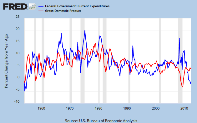
Slicing across this a different way, Graph 3 gives us year-over-year percentage growth in Expenditures and GDP, dating back to the Eisenhower administration.


Graph 3.  YoY % Change in Expenditures and GDP

A few simple observations:
- The spending increase during the recent recession was modest by any standard, and dwarfed by earlier surges.
- That increase, coupled with the most severe GDP decline since the other Great Depression gave our beloved ratio a terrible, horrible, no good, very bad double whammy.
- GDP growth during this recovery is only marginally better than it was during the 2001-2 low, and far below Clinton era levels.
- Clinton was the most consistently frugal president of the post WW II era - until now.
- Since the recession was declared over, B. Hoover Obama has been miserly.

One can legitimately argue that Obama's approach to the economy has been excessively conservative.  Krugman has made this point repeatedly.  I often say that Clinton governed to the right of Eisenhower - who was a genuine deficit hawk - and that Obama is to the right of Clinton. That is intended to be slightly hyperbolic, but using this data as the benchmark, it's dead on.

Any questions?

Cross posted at Angry Bear