In Part 1, we looked at the ratio of consumption spending to net worth, and how it changed over time. This time we'll look at the correlation between net worth and consumption.
Here is the big picture: personal consumption expenditures (FRED Series PCE) plotted against Net Worth (FRED series TNWBSHNO) Data is per calendar quarter.

Graph 1 Consumption vs Net Worth, 1959 - 2011
The data set is divided into two segments, with a break point at the beginning of 1997, with net worth at $30,315 and consumption at $5,467. In a close up view, there is a clear slope change there. Still, the selection is a bit arbitrary, since the high point of Q3, 1994, could also have been chosen, with net worth at $25291, and PCE at $4856. But that is a detail, and no other reasonable breaks stand out.
Notably, both the slope of the data line and R^2 are significantly less after the break. Visually, it's obvious that in the later data, there is a lot more scatter. Also note that that big data moves post 1997 return to the continuation of the best fit line, pre-1997.
Slope and R^2 measurements for the entire data set and the two segments are presented in Table 1. These numbers were generated using the linear trendline function in Excel.
Table 1

Not so visually obvious are the declining slopes during the earlier portion of the data set. Table 2 presents the same characteristics for data chunks of approximately 20 year duration.
Table 2

We saw in part 1 of this series that the relationship of consumption to net worth was not stable, so this result is not surprising. And we can now see that as net worth increases, the sensitivity of consumption to increasing net worth decreases.
I can think of two contributing factors. As wealth increases, the need to spend on basic necessities captures a smaller portion of that wealth, so the propensity to spend decreases. I'll defer consideration of the other factor for now.
Here is a detailed look at how the slope of the PCE vs net worth line varied over time. Graph 2 shows the 34 quarter slope values for the data points of graph 1. The slope is plotted in dark blue, with certain time spans highlighted in contrasting colors: recessions are in orange, and the stock market and housing bubbles are in yellow.

Graph 2 Slope of Consumption vs Net Worth
Observations:
1) Except for the bubbles and the spike in the post-bubble recession of 2008, the values are mostly contained between a low of 0.168 and a high 0.246.
2) There was an upward trend that ended in the mid-70's, underscored with a blue line.
3) Values after the mid-70's, including the two bubbles, are contained in a down-sloping channel, outlined in green.
4) Except for the early 80's and 90's events, recessions are marked by sharp, temporary slope increases.
5) The average slope is 0.184, with a standard deviation of .038
6) The bubbles highlighted in yellow in Graph 2 correspond exactly to the data points in Graph 1 that fall below the red best fit line.
7) The post-bubble recessions brought the slope back into the range described in Observation 1. This is illustrated in Graph 1 by the returns to the blue best fit line.
If the normal relationship between net worth and consumption is described by a slope in the range of around 0.17 to 0.25, what is there about bubbles that causes drops into the range of 0.11 to 0.12 at the peaks? I think the answer is the second factor that I defered until now. The stock bubble and the housing bubble represented wealth increases that were not shared equally across the population. Specifically, as I pointed out earlier, these assets are mostly owned by the richest population segment, and growth in wealth has excessively favored the top 1% of the population. They have the least propensity to spend, and this tendency drives the PCE slope into the low range.
This FRED graph illustrates the point in a different way.
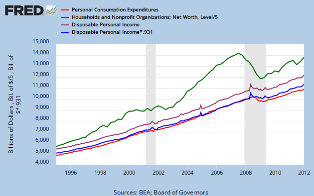
Graph 3 PCE, Net Worth and Disposable Income
There are four lines, Net Worth in green (divided by 5 to put it on the same scale); Disposable Income in purple, PCE in red, and Disposible Income multiplied by 0.931 in blue. Note that the last two overlap almost perfectly, as I also pointed out earlier (see link above.)
The conclusions I'm drawing are
1) Since the bubbles increased wealth in a highly skewed fashion, the relationship between average wealth and consumption broke down.
2) When the bubbles burst, the normal relationship between wealth and consumption reasserted itself.
3) The underlying cause is that during the bubbles the relationship between wealth and income broke down, and afterwards reasserted itself.
4) The relationship between disposable income and consumption is robust across time and most extraordinary financial events.
5) All the foregoing suggest that if wealth distribution were more even across the population (and thus more closely tied to disposable income,) then the relationship between wealth and consumption would be more robust.
Cross posted at Angry Bear.
![[Most Recent Quotes from www.kitco.com]](https://lh3.googleusercontent.com/blogger_img_proxy/AEn0k_soQUksX12tQyFhxjG-Ae1W0UQ1u4T4te0X2D5Y_rw9KXoY2lzZudsAhnhyWHFEKtTG_tgt8_R4ddxuaWYgwP2to57ka6mG7CjaIAxl6Ae4r2KrVrnm_DCOyAmSjtT79T3-=s0-d)


2 comments:
yeezy shoes
yeezy shoes
curry 7 sour patch
yeezys
jordan shoes
yeezy
kyrie shoes
moncler coat
yeezy shoes
off white hoodie
kyrie 9
yeezy 350
golden goose slide
curry 8
yeezy 350 v2
jordan 1 low
a bathing ape
hermes belts
golden goose sneakers
kyrie irving shoes
Post a Comment