In comments to this post, the idea is floated that capacity utilization (TCU) is about to surge.
Mark Sadowski, in comment 5 at this post, reminds us that, "Capacity utilization only applies to industrial production, and industrial production consists of only manufacturing, mining and utilities. Thus it is not very representative of the entire economy, and it has been growing less representative over time."
Graph 1 shows employment in those three industries. Mining and Utilities are placed on the right hand scale, because the numbers employed are much smaller than those in manufacturing.

Graph 1 - Employment in Mfg (blue), Mining (red) and Utilities 9green)
Manufacturing employment stopped growing in 1970, but didn't really fall off a cliff until the big outsourcing boom in this century. To illustrate Mark's point, since 1970 NGDP has increased about 15 times, and industrial production now accounts for only about 14% of national income, down from about 27% in 1970. [Mark's FRED graph]
But in some small way, a surge in capacity utilization would certainly be good news. Unfortunately, though, I don't believe it's in the cards. Here's why. Graph 2 shows total capacity utilization (TCU) since 1967.
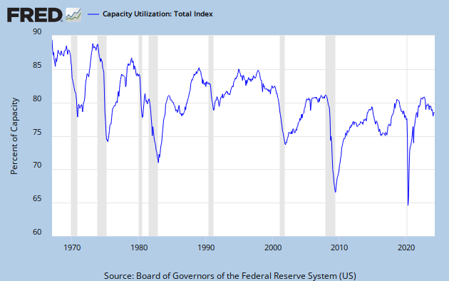
Graph 2 - Total Capacity Utilization
The main trend has been down since the beginning of FRED data. Furthermore, TCU has now stagnated for over a year and a half, and might even be ready to roll over. It has never increased from this type of condition. In fact, the only surges (except for one in the late 80's that followed a slight decline) have come off of deep troughs.
But - just because something has never happened doesn't mean it will never happen. Still, things happen for reasons, and I'm trying to suss just what those reasons might be.
Graph 3 shows TCU vis-a-vis YoY % change in GDP. As GDP growth goes, so goes TCU. Not exactly lock-step, but the contours are generally similar as both have declined over time. Coming into the Great Recession (GR), the decline in GDP growth led the decline in TCU, and something similar might be happening again now - and from already historically low levels in both.

Graph 3 - TCU and GDP Growth

Graph 4 - PNFI /NFCD and TCU
Except for the late 80's bump that TCU and GDP growth share, the motions are generally consistent. The PNFI/NFCD ratio is already rollng over - from by far the lowest peak on record.
As graph 5 shows, fixed investment has barely eked out a new recovery high, while borrowing, which barely slowed down during the GR has soared to unheard of highs. I wonder where the money is going?

Graph 5 - PNFI and NFCD
Nothing in these pictures gives me any reason to be optimistic. With the anemic stimulus package now long gone and the FED getting ready to taper, everything looks contractionary. Help me if I have any of this wrong.
There are several more non-encouraging factors to consider, and I'll get to them in part 2.
![[Most Recent Quotes from www.kitco.com]](https://lh3.googleusercontent.com/blogger_img_proxy/AEn0k_vA2Iu7R2kWdj0YK8qtG7RrgKSVrrLwEDG3w0ej2BPvmkOWftt9cEJm49iS8pYNmSw9zatXCVTYMy-obqX6t9g36GSCN7BFN9M54YJM--BzlDhLROeOgSZYRCVNzOgQAWZ6=s0-d)


2 comments:
It's from a textbook, I think, the relation between investment and growth.
Interesting theme for the post, to challenge the idea "that capacity utilization is about to surge."
My first impression was that Part 2 hammers the point hard. Part 1 makes a good intro for it. Your evidence is strong.
supreme new york
westbrook shoes
golden goose outlet
longchamp handbags
nike react
retro jordans
golden goose
jordan 6
converse shoes
golden goose sneakers
Post a Comment