Look: I am eager to learn stuff I don't know--which requires actively courting and posting smart disagreement.

But as you will understand, I don't like to post things that mischaracterize and are aimed to mislead.

-- Brad Delong

Copyright Notice

Everything that appears on this blog is the copyrighted property of somebody. Often, but not always, that somebody is me. For things that are not mine, I either have obtained permission, or claim fair use. Feel free to quote me, but attribute, please. My photos and poetry are dear to my heart, and may not be used without permission. Ditto, my other intellectual property, such as charts and graphs. I'm probably willing to share. Let's talk. Violators will be damned for all eternity to the circle of hell populated by Rosanne Barr, Mrs Miller [look her up], and trombonists who are unable play in tune. You cannot possibly imagine the agony. If you have a question, email me: jazzbumpa@gmail.com. I'll answer when I feel like it. Cheers!

Sunday, June 26, 2011

Unemployment

Here are a  couple of charts, and less verbiage than I usually spout.

First, Unemployment (population survey) from the BLS.  I've averaged the monthly data to get a series of annual numbers.


This is color coded by president's admin, red for Rethug, blue for Demo.   Also included are term averages for each admin.  The first thing to note is an incoming Rethug ALWAYS gives us an immediate and sharp increase in unemployment -- ALWAYS!.  Obama is reaping what Shrub has sown, but I have no sympathy for him, since he has continued the idiocy, paid no attention to the unemployed, and meanwhile the "Tough Shit" Rethugs have had their way with them.

Ponder that for an hour or a month.

Next, Kennedy-Johnson and Clinton gave us essentially monotonic decreases in unemployment for the entire span of an 8-year term.  Is anyone surprised by this?

Next note that term averages don't really tell the story.  You have to look at the beginning and end points.

Here is a different presentation of the same data.


Busy as hell, I know.  Let's sort it out.  The pink line is an 8-Yr moving average.  The slanted blue line is a linear best fit provided by Excel.  The yellow line is the average of the entire series, with green and red parallel lines one Std Dev above and below.  Speaking of parallel lines, I threw a trend channel bottom across the  1953 and 2006 extremes, and a parallel line projecting from the 1958 top. They are very close to parallel to, and equidistant from, the blue trend line, which I find to be astonishing.

This makes an intriguing picture that tells a very ugly story.

I don't see any way unemployment will ever get as low as 5% again.
.

A Different Look at GDP Growth Since the 50's

Art posted a bar graph of average GDP growth by decade.  I was struck by the nearly identical performance of the 70's, 80's, and 90's.  Remember the 70's?  Oil price shocks, stagflation, the misery index.  The 80's - St. Ronnie, Morning in America, voodoo supply side economics.  The 90's - Poppy's recession, Clinton's temporary hiatus in fiscal insanity, budget surpluses. 

Decade increments are tidy and convenient, but miss the story told by presidential administrations.  While time marches on, policy matters, and different regimes have different policies - or at least they did until the current administration.

I happen to have average GDP percentage growth rates by president at my fingertips.

It looks like this.


Like Art, I've put a best fit power line on the graph, that tells essentially the same story.  But now that we've separated Poppy from Billy-Bob, and Jimmy from the first Cheney administration, we get some interesting detail.  Reagan is only marginally better than Carter, who makes all other Rethug Presidents look like fools.  Clinton stands over Reagan, and achieved this while balancing the budget - pure Keynesianism!  B. Hoover Obama follows the Shrub playbook on economics and foreign policy, to his and our detriment.

Here is the same data, plotted along with standard deviation.


This time the power trend line is based on the Std Devs.  Yep - there' yer Great Moderation.  I explain it like this:

Big changes in short time spans cause Std Dev to increase.  The biggest variations come from recessions and quick, strong recoveries.   There were three recessions in the 50’s so Std Dev never had a chance to decline.  The 60’s and the 90’s were both recession-free, so Std Dev could decline in the one case, and stay low in the other.  The recessions of the 70’s were deep, but the recoveries were strong, so volatility climbed.  The back-to-back recessions of ’80 and ’82, with sharp recoveries in ’81 and ’83 kept Std Dev high.  The Great Recession took Std Dev to the highest level since the 80’s.  All of the volatility jumps (see detail at the Great Moderation link, above) can be explained in terms of recessions.  Avoid recessions, and Std. Dev. will be low.

How, then, do we explain the two Bush administrations, with their recessions in 1990 and 2001, but no jump in volatility?  In each case, the fall into recession was not sudden – it followed a period of declining GDP growth.  Similarly, in each case, the climb back out of recession was slow, faltering, and failed to generate even a single quarter where GDP growth topped 7%.  From WWII until 1983, top recovery quarters typically exceeded 10%.

What this indicates is that the Great Moderation really is a data artifact – though not quite in the way I expected.  Reduced GDP growth numbers play a part, but the real key is understanding how recessions contribute to observed Std Dev.  Recession-free times have low Std Dev values, and tepid recoveries from recessions that occur in a low growth context will also have low values.  While the Great Moderation is real, the standard explanation is inadequate, and comes from failing to look at the data with a critical eye.
.

Friday, June 24, 2011

The Life - and Death - of the American Dream

Here is a 10 minute You-Tube video that encapsulates the message of my blog.

UpdateI should point out that this is NOT my vid.   It is from Realitybase Journal.   Source link below. The fact that it encapsulates my message is simply due to the author, Roger Chittum, looking at a lot of the same data that I look at.


Source.
.

What the Hell?!? Friday - Making the Case that Inflation Was a Bubble That Burst

The economic landscape, like the topographical landscape, has different realms.  Just as there are mountains, plains, deserts, frozen wastes and swamps, there are times of prosperity, boom, bust, chaos, and depression.  (This list is intended to be illustrative, not exhaustive, and no specific analogies to topographic features is expressed or implied.)

An intelligent mountain climber does not go to work in scuba gear; nor does one explore the desert in a parka.  Appropriate actions at any given place in time take into account the season, general environment and local conditions.  Austerity at a time of disinflation teetering on deflation is not only stupid, it is willfully ignorant.

Anyway, end of lecture.  Here, I make my case that inflation is a dragon long dead.  Whether Volker actually killed it or not, he was standing there at its side, sword in hand, when it's flame was snuffed.

Illustrating the Bubble.

Commodity Shocks, A key difference, then vs. now. 

Response to deficits, another key difference.

Ditto.

Where we are now.

Ditto.

Reditto.  From Beckworth, referenced here.

I rest my case.
.

Thursday, June 23, 2011

Where Has All the Money Gone - Part 3 - Dividends

We've already seen that as GDP growth has faltered, corporate profitability has soared.   The next thing to consider is - what have corporations done with all that money.   There is a limited selection set: pay taxes, distribute as dividends, pay down debt, invest, speculate, and hold as cash.

Here is a look at dividends and taxes, through 2008, from this source which cites BEA as primary source.  They divide profit among dividends, taxes, and undistributed earnings with the three totaling 100%.  Here is a graph of these two as percentages of earnings, and it's stunning.  Taxes in blue, dividends in red.


The 1978 inflection point in dividend payout is as sharp as any I've seen in any data set.  The trend lines tell the story.  The taxation picture is not so simple.  The percentage of earnings was above 50% from 1950 to 53, than dropped to 35% in 1965, then generally rose to 43% in 1980.  It's been down, down, down since, reaching an all time low of 21.5% in 2008.   Trend lines through the data sets are not greatly different, though the recent one slants down more.

The percentage dividend payout increase is actually greater than the tax payout decrease.  The net result is a funneling of money from the government into the hands of dividend recipients - and we all know who they are.

This is not only "Starve the Beast" in action, it is a massive redistribution of wealth into the hands of those who already have the most.   Say what you will about the relative efficiencies of the private and public sectors in using resources, the public sector places money into the hands of people who will spend it and keep the economy moving.  The private sector funnels it into rent seeking.

We are SO screwed.
.

Link of the Day

I don't actually have a Link of the Day feature, but why let that stop me?

Here is Mish, making a whole lot of sense.  As I've said before, he's a smart market guy.  It's his politics (and the economic views that are thusly driven) that are screwed up.

At the link, he talks about dismal stock market scenarios for years to come.   I see no reasons to disagree.
.

GDP Growth since the 50's

Here is a table of average GDP growth,* by presidential administration, since Ike.

PREZ                                Ave GDP Growth (%)   Std  Dev
Ike                                            2.85                        5.33
Kennedy/Johnson                       5.27                         2.95
Nixon/Ford                                 2.83                         4.44
Jimmy                                      3.31                         5.33
St Ronnie.                                3.47                         3.49
Poppy                                      2.16                         2.36 
Billy-Bob                                    3.85                         2.04
Shrub                                       2.03                        2.09 
B. Hoover Obama (to date)        1.54                         2.89

______________________________________________
This is Table 1.1.1. Percent Change From Preceding Period in Real Gross Domestic Product,   Seasonally adjusted at annual rates, last revised 6/24/11.
.

Wednesday, June 22, 2011

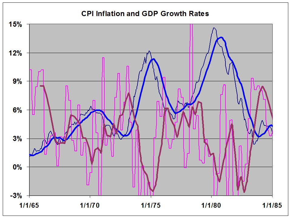
Stagflation in the Modern Age

Stagflation is an unusual economic condition characterized by low growth and high unemployment (stagnation) coupled with generally rising prices and wages (inflation.)  This condition existed, persisted, and worsened throughout the 1970's.  Inflation during the 70's (1970 to 1980, inclusive) averaged a hefty 7.7%, while Real GDP growth averaged 3.2%, which is actually not too shabby, per se.  But - 1970 was an erratic growth year with two dips into negative territory; and both 1974 and 1980 were ravaged by deep, deep recessions.  Growth spurts were steep, but short lived. This roller coaster ride was all whiplash and few thrills.

This is what it looked like, inflation in blue, GDP growth in purple.


The lighter lines are the actual data, the heavier lines are annual averages.   Note the striking contrary motion.

The point of this post is to emphasize how different now is from the 70's.  Real growth over the last 8 years has averaged under 1.8%.  CPI inflation has averaged 2.5%.

Getting the two data sets on a single graph is a real pain in the ass, so here they are separately.

Here is monthly CPI data, with a 12 month average in blue and an 8 year average in yellow.


Here is GDP growth over the same period, with a trend channel.


The two data sets are now displaying something close to similar motion - I believe this is what most economists - or at least the Keynesians - would expect.

Here is the contrast.

70's
High inflation.
Wild gyrations in Real GDP growth, with a moderate average.
Recessions led to sharp recoveries.
Strikingly contrary movement between the data sets.

This Millenium
Low inflation.
GDP growth not changing much, except for the Great Recession trough, and clearly trending down across the period.
Recessions led to tepid recoveries.
Generally similar movement between the data sets.

A criticism against Keynesianism is that it couldn't account for stagflation.  Fair enough.  Does classical economics?  Does Austrian economics?   Not only no, but these schools of thought were rendered obsolete 80 years ago, when they couldn't account for an aggregate shortfall in demand.  What we have now is unlike the the 70's, in every respect I am aware of.

It is not unlike the 30's though. 

This is not a situation where Kenesianism needs to offer anything new.  This is a situation that Keynes understood very well, and the prescriptions that worked the first time around will work now as well.

There is no threat from stagflation. There is no threat from inflation.  There is a real threat from deflation, which is now seeming inevitable, both here and in Europe.

But people everywhere are worried about inflation.

We are SO screwed.

Sunday, June 19, 2011

Labor's Share

Here is a link to the FRED graph of Labor's Share that I mentioned earlier.

I'm going to have a close look, which may or may not lead to any conclusions.

Observations, from the FRED graph:
1 - Peaks.
1-a.  Labor's share is almost always rising immediately before and then into the first part of a recession.  Exceptions are 1949 and 2008. 
1-b.  Labor's share always declines during a recession.  That decline might or might not continue for some time after the end of the recession, but in each case, a recession leads to a new local bottom in Labor's share.
1-c.  Therefore, Labor's share always peaks after a recession has started, and the recession leads into the next cyclical bottom in Labor's share.

Now, lets have a look with a different emphasis.


Here, we have the quarterly data, color coded by President's party, an 8-Yr moving average, and an envelope defined by the averages of peaks and valleys from '47 to '85.

2 - A Secular Change.
2 - a.  Prior to 1985, the oscillations were approximately contained between the values of 104.3, and 110.3
2 - b.  During that period, both D and R administrations were characterized by gyrations.  If anything, the R admins might have fared a bit better.
2 - c. During the period, oscillations of the 8-Yr Avg were damped, stabilized at 106.6 by late 1977, and didn't budge for 8 years.
2 - d.  After that, there was a bit of a decline.

3 - The Great Stagnation.
3 - a.  During the entire Bush I admin and Clinton's first term, labor's share plummeted, broke out of the old channel, and reached a new low of 101.11.
3 - b.  By the end of Clinton's admin, labor's share was back to 107.6 - slightly above the former average.
3 - c.  Since then it's been constant decline, except for a quivvering pause in 2005, the index base for this data set.  The Shrub admin gave us the first near-monotonic drop in the history of the data set.  In many ways, Obama's first term might as well have been Shub's third, so the decline continues unabated.

Here is yet another look.


The average for each president's term is indicated with a heavy horizontal color-coded line.  Kennedy-Johnson and Nixon-Ford are each taken a single admins.  Reagan and Bush I are considered separately.    The average of the entire data set is 105.13, just slightly above Poppy's 104.71

The green lines are 2 standard deviations above and below the moving average, and based on the same 8 year moving data packet

 4 - Slide into the abyss.
4-a.  Through Carter, term averages are between 106.5 and 107.85.  They do seem to be stepping down slightly over time,  but who can say if that means anything?
4-b.  With Reagan, the average slumps to 106.0 - a new low that looks oh, so high from here.
4-c.  Poppy gave us 104.7, Clinton 103.3, but look at that peak at the end of Clinton's term- an 18 year high!
4-d.  Which was obliterated completely and immediately by Shrub.
4-e.  Then came B. Hoover Obama.  Alas and alack.

5 - Data behavior.
5-a.  Despite telling a sad story, this is very well behaved data set, almost perfectly contained by the green lines, which seem to be acting as control limits.
5-b.  Every excursion to a limit results in a rebound that eventually reaches either the opposite limit, or the average line.   The limits really are limiting, and both the moving average and the presidential term averages seem to have some reflective power.
5-c.  After bouncing off the upper limit in '82, the slide to the lower limit took 15 years.  The rebound to the upper limit took only 4 years.
5-d.  But, because of the near-monotonic nature of the slide, the standard deviation had declined from 1.6 to 1.0, so the channel was much narrower on the way up.
5-e.  Standard deviation peaked at 2.5 in 2007, has not gone below 1.8 since, and is now at 2.2 and rising.
5-f.  The data and the lower limit have been clinging vines declining together since Q2-09, with no end in sight.
.
Decades of low taxes and deregulation have allowed wealth to flow away from labor into profits, which have been misallocated into financial tail-chasing, rather than real investment.  There isn't anything here that we didn't already know.  This is just more confirmation of the real nature of the Great Stagnation.
.

Father's Day


Here is a picture of my dad with his only son.  Yep, that bespeckeled tyke is the past tense of crusty old Bumpa.   I look to be about 4 or 5 here, which would make it 1951 or '52 - the Truman Administration.  My sister would arrive in '53.

The original was badly off-center, so I cropped the right-hand half, which showed his vegetable garden.  That's right folks, I cropped his garden.  You just can't let an opportunity like that go by.


So many years have
Passed; a man long gone, his son
Looks back . . . across time.
.
 

Low Interest Rates and the Rentier Class

I borrowed the title from Philipji, where commenting is not enabled.

Philip, it seems, is an iconoclast who apparently thinks that all theories of economics are wrong.  In principle, I cannot disagree.  This however does not make Philip right.

In the subject post, Philip shows the graph of labor's share of nonfarm business income that Thoma and Frum had recently displayed.  He also shows a graph of the Federal Funds rate, a topic in which I have some interest.   Even an old man in bifocals can see the two lines falling, though not in lock-step.  These are similarly moving secular trends.   He sees cause and effect, and his argument makes sense.

Actually the explanation is quite simple. The entities who really benefit from low interest rates are hedge funds and traders of financial instruments. Typically, they take advantage of mispricings of securities amounting to a few cents. And how do they parlay such tiny mispricings into incomes amounting to tens and hundreds of millions of dollars? By leveraging their equity ten, fifty or a hundred times. And of course they can do that only if money is dirt-cheap. 

Equally important, this hurts the producers of real goods and services who are looking for loans. At present the prime rate is around 3.25%. What self-respecting bank would lend at 5% or even 10% and wait a whole year when they can earn more in just a few weeks by trading in financial instruments? If nothing else, the bonuses currently being paid to bankers should make this obvious -- to all but those rendered blind by ideology.

Again, I do not disagree.  But there is a lot he leaves out.   First, he assumes (I assume) that interest rates are determined by the Fed.   As my post (linked above) indicates, empirical evidence suggests otherwise.  Secondly, he sees low rates as the root cause, where it is really only an enabler.

In my view, the root causes are low taxation and lax regulation.   As I've stated before, futures markets serve a vital function.  The same might also be true of other financial instruments, such as options, but I haven't thought it through and my gut feeling is negative.

If I'm right about root causes, then solutions are obvious: not high interest rates which will hurt everyone who is struggling, but tax and regulation aimed at curtailing the rentiers.   Others have suggested a small transaction tax that will reduce the small gains.  I concur, and also recommend severely limited margin to minimize the effects of leverage, and minimum holding periods, in the range of hours, days, or weeks to eliminate the opportunity to have a dedicated computer respond to momentary imbalances.

To summarize, low interest rates aren't the problem.  They are a symptom of the current economic malaise.  The solution set does not include interest rate hikes, which would send the economy into even more of a tail spin.

While I appreciate Philip's chutzpah  and original thinking, his thinking on this issue stops at the surface.
.

Wednesday, June 15, 2011

Where has all the Money Gone, Part 1.5.2 - A More Even Closererer Look at Corporate Profits - Finance Sector

In Part 1.5.1, I said this:

I wondered it there was a break point around 1980.  I don't think there was. 

I was wrong.

To make a point about the increase in the Finance share of corporate profits over the post WW II period, I took a 13 year moving average of the data.   This is what it looks like.


6/16 UpdateUnderlying quarterly data is in the thin purple line. Long averages are in green, through 1985, and red from 1986 on.   Upon rereading, I see how I could have caused some confusion, without this information.    I want to be clear, not confusing.  Sorry that this post does not meet that standard.

A long average filters out the hash, and reveals the underlying trend.  Or, I should say, trends, since there are two, with a sharp break at the beginning of 1986.  A trend line on the data through  '85 is a near-perfect match to the average line, which barely even wiggles.  We see a bit more action in the post-85 segment, but the new trend is still very clear, indeed.  The earlier trend line in green is now the lower channel support line. 

Well, as I always say, policy matters.  Was there anything that changed in the 80's that might have facilitated this shift?

The times of those last three peaks in the quarterly data are Q1-86; Q1- 91; and Q3-01.
.