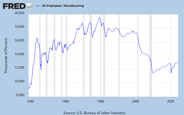
The graph of the data can be seen in FRED series MANEMP.
Art's graph's with eyeballed trend lines are here and here. I suppose one can parse a curve like this in a number of ways. All the peaks and valleys tease the eye and complicate interpretation. Math to the rescue.
I suggested the correct techniques for determining trends:
The correct way to construct trend lines is across the troughs if the trend is upward, and across peaks if the trend is downward. Each line, so constructed, points clearly to the time ca 1974-1980.
Alternatively, take a fairly long average (to smooth the variations) and look for rate of change in the average. Or wrap a +/- 1 standard deviation envelope around the average and see where the original data points fall in that envelope.
I see three regimes:
1) up to 1974/80 increasing
2) thence to 1999/2000 decreasing slowly
3) the Shrubian collapse
The three regimes were by eyeball, not any technique. I should take my own advice. The following graphs will be busy. To see the simpler versions, click the FRED link or Art's links above. The first graph below includes an 8-Yr moving average (pink), an envelope 1 standard deviation above (red) and below (green) that average, an additional line (also green) starting in 1975 at 2 standard deviations below the average, and trend lines along the peaks and troughs.
Total U.S. manufacturing employment

Looks like three regimes to me. The first, with higher highs and higher lows runs from the beginning of the data set up to 1975 (bottoms) or 1979 (tops.). From then on, there is never again a higher high nor a higher low. The lows level off until 1993, and the highs collapse. After that point, the lows get much, much lower, and peaks cease to exist.
Three regimes: 1) robust, but erratic, growth through the 1973 peak, 2) stagnation into the 90's with level lows and declining highs, 3) collapse. The data points never go any higher than a full standard deviation BELOW the moving average - an almost inconceivable decline. Note that the shrinking standard deviation envelope in the 2nd regime is due exclusinely to the loss of recoveries, as troughs remain at a constant level: the Great Stagnation.
Next is YoY rate of change for the eight year average. Also included are 8, 13, and 18 year averages of RoC, and some trend lines on tops and bottoms. The beginnings of selected presidential administrations are also indicated.
Manufacturing employment - smoothed YoY RoC

Note that with the Reagan inauguration we have the first major peak that is lower than the preceding peak. With Clinton there is a kind of quasi-recovery - though the ultimate high in 2001 is less than the previous high in 1991, and only barely in positive territory. With Bush we witness what appears to be the onset of the death of manufacturing in America - a continuously negative rate of change for a complete decade.
Again, I see this as three regimes, the first two defined more by the tops than the bottoms: 1) level to increasing tops through 1970, 2) stagnation with declining tops through the end of the century, 3) utter collapse under Shrub.
Once again, this demonstrates the great stagnation - less and less manufacturing effort in the last three decades of the previous century. Now, in 2011, there are fewer people employed in manufacturing than there were in 1949.
This is the legacy of decades of Rethug rule.
![[Most Recent Quotes from www.kitco.com]](https://lh3.googleusercontent.com/blogger_img_proxy/AEn0k_t6Ymt7OUYGK8tEUeo3CLQAC3JHx88CYu833uiYdOHozT4Brf27QLiH0Bv6smp7I9v9krVZu_ixUSYBv9_3YwO-xnUXWZcXebaHPa_6ecgHM27DhnZD3OKWUzj3H5tzwc_J=s0-d)


1 comment:
Hi Jazz. An excellent analysis
I have a post scheduled for Tuesday... You are answering some questions here that I will be asking there. Don't be confused by the timing.
In particular, I think you are answering my question, "How do we determine "how many" trends there are on a particular graph, and where the turning-points are?"
So again: Excellent analysis, and a great post. I have to read it over again in the morning.
Post a Comment