Graph 1, from FRED, shows these data series. I've chosen nominal GDP and, for reference, also included the total Federal Debt.

Graph 1 TCMDO, GDP and Total Federal Debt
In 1950, TCMDO was about 1.3 times GDP, but growing a bit more quickly. By 1980, the ratio was 1.6, and by 1987 it was greater than 2. Now that ratio is approaching 4. Note that TCMDO is also close to 4 times greater than total public debt. This is why Art and I agree that private, not public debt is the problem that needs to be addressed, but is largely ignored.
Linked here are Art's posts with graphs of YoY growth in both factors, pre 1980 and post-1980. Pre 1980, their moves are similar in magnitude, and pretty well coordinated. Post 1980 there is still some occasional similarity of motion, but the coordination breaks down and debt growth is generally quite a bit higher than GDP growth. The 80's in particular stand out as being starkly different from the previous period.
Graph 2 shows the entire data set, since 1952.
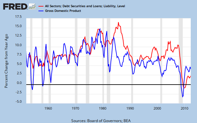
Graph 2 YoY % Growth in TCMDO and GDP
These observations led Art to the reasonable hypothesis that, "Output growth slowed when debt became excessive." This, in fact, might explain the great stagnation.
I suggested, and Art accepted two corollaries to his hypothesis.
1) There is a non-excessive amount of debt. Let's call it "just right."
2) Below the "just right" amount, there might also be "not enough."
Actually, there is a lower level hypothesis, to which Art's is corollary: That there is a functional relationship between debt and growth, in which growth is the dependent variable.
This is what I will explore in this post.
Graph 3 is a scatter plot of GDP vs TCMDO YoY % change for each, FRED quarterly data from Q4, 1952 through Q2, 2012, with a best fit straight line included.

Graph 3 GDP vs TCMDO, YoY % Change
The relationship is quite clearly positive. The R^2 value at .39 is rather low, but not terrible. There is quite a bit of scatter in the data. Note the circle of data points around the left end of the line. More on that later.
Next, I divided the data by decades, frex, 1961-1970. This admittedly simplistic data parsing reveals that the slope and R^2 values are strongly variable over time. Graph 4 shows the scatter plot along with the slope and R^2 values for each decade. These data values are arranged in the chart in chronological order and color matched with the corresponding data points.

Graph 4 GDP vs TCMDO, YoY % Change by Decade
I've added a brown line connecting the dots for the first decade of this century. The chronology proceeds from a cluster near the center of the graph into a clockwise circular spiral.
Graph 5 shows how the slope and R^2 vary over time.

Graph 5 Slope and R^2 Over Time for GDP vs TCMDO
After the 60's, the slope plummets, and by the 80's R^2 is a laughable 0.035. Though the slope has remained low, R^2 has since recovered to 0.38, which is near the whole data set value of 0.39, and only slightly less than the 0.40 to 0.44 of the first three decades.
The slope changes can be interpreted as generally less GDP bang for the TCMDO buck, as the TCMDO/GDP ratio increases. This is totally consistent with Art's hypothesis.
I have more to say about the GDP -TCMDO relationship, but this post is getting long, so I'll save it for a follow-up.
For now, I'll close with a few questions.
1) Do you think we're on to something?
2) What do you think of the methodology?
3) "Excessive debt" is suggestive, but non-specific. How should this concept be quantized?
4) How should I go at exploring corollaries 1 and 2 mentioned after Graph 2?
5) Any thoughts on what was there about the 80's that blew up the prior debt - GDP relationship?
6) Is there such a thing as productive vs non-productive debt, and how would they be characterized?
I look forward to your constructive comments.
Cross-posted at Angry Bear.
![[Most Recent Quotes from www.kitco.com]](https://lh3.googleusercontent.com/blogger_img_proxy/AEn0k_tVq2a0UR2wkAjfaXKf92RcZLFhYsINIQZm3kIEc2fZ5i7PlGjLgdCyd0dhjCeSEWwUQJrBEdjT8d_p-x8jHcEOJkNDfyVPOEP2bBnKlxnw6Ble8G0FODxbF0TyFvc2ntjp=s0-d)


1 comment:
Sweet!
I have to read it again. But you are *definitely* good at this kind of analysis.
I found a scatter graph I did a few weeks back. I'll put it up as soon as I get it blog-ified.
Post a Comment