Look: I am eager to learn stuff I don't know--which requires actively courting and posting smart disagreement.

But as you will understand, I don't like to post things that mischaracterize and are aimed to mislead.

-- Brad Delong

Copyright Notice

Everything that appears on this blog is the copyrighted property of somebody. Often, but not always, that somebody is me. For things that are not mine, I either have obtained permission, or claim fair use. Feel free to quote me, but attribute, please. My photos and poetry are dear to my heart, and may not be used without permission. Ditto, my other intellectual property, such as charts and graphs. I'm probably willing to share. Let's talk. Violators will be damned for all eternity to the circle of hell populated by Rosanne Barr, Mrs Miller [look her up], and trombonists who are unable play in tune. You cannot possibly imagine the agony. If you have a question, email me: jazzbumpa@gmail.com. I'll answer when I feel like it. Cheers!
Showing posts with label money. Show all posts

Monday, November 5, 2018

Income inequality Over Time

Some people think that other people, like Krugman, Piketti, Saez, and - well - me have it all wrong about income inequality. I might take a deep dive into that link at some future date, but for now here are quick graphical looks at reality.

I plotted data from the Census Bureau Historical Household Income Tables to get these graphs.

First, here are the upper income limits for the bottom 4 quintiles, along with the lower limit for the 95th percentile for years from 1967 through 2017.


Graph 1 - Income limits per population slice

Clearly, the spread between quintiles has increased, and by larger amounts as you go up the income ladder.

Looking at it in constant 2017 dollars in Graph 2 makes this picture even more stark.

Graph 2 - Income Groups in Constant 2017 Dollars

The modest nominal gains in the bottom two quintiles have been largely obliterated by inflation. The spread between groups has widened.

What is the mechanism for increased disparity?  The data shows that it is income captured by each group.  This is presented in Graph 3.

Graph 3 - Aggregate share of income

Even into the 4th quintile, the aggregate share of each lower group has declined, while the top quintile has captured more than 100% of the gains, almost every year over the last 50 years.

Graph 4 shows the 1st and 4th quintiles along with the top 5%.

Graph 5 - Including the Top 5%

The top 5% have gained a significantly increasing share of the pie, and now are receiving about as much as the entire 4th quintile.  The pie is growing, but the rich are taking an increasingly larger slice.

I haven't taken a hard look yet at the article I linked at the beginning of this post.  We'll see what kind of arguments are put forth to counter the reality I have presented here.
.

Wednesday, April 15, 2015

Max Scherzer

Among AL starters in 2014 with more than 59 innings pitched, Max Scherzer had the 21st best ERA at 3.16, way below the average in that group of 3.94 [St Dev = 0.9].

His WHIP was 1.18, also well below the group average of 1.29 [St Dev = 0.2].

By that reckoning, Max was better than average by more than half a standard deviation in each metric.

So far this year, in two starts for the Nationals, he's 0-1, with 13 2/3 innings pitched, an ERA of 0.66 and WHIP at 1.02.  So - despite the W-L total, he's doing very well.

I don't bear him a lot of animosity, but I wish he would have been up front enough to say he left the D for the money, instead of hedging.  Therefore, i don't want his contract with the Nats to be a total bust.  But I would like it to be a historically bad deal.

What I wish for Max is to be a slightly above average pitcher, so that the Nats will have paid a super-premium price for only slightly above average performance.   My track record with this kind of wishful thinking is pretty poor, and this is a long shot, because I think the AL in general has better hitting, so he should mow down the opposition.

But, here's what I'm hoping for:  W-L = 14-12; ERA = 3.87; WHIP = 1.42.

Really though - what are the chances?

Tuesday, November 5, 2013

Inflationary Derp

Once again, Krugman takes on the inflationistas, aka your typical derpy Republicans.  Their tired story goes this way:

Vice Chair Yellen will continue the destructive and inflationary policy of pouring billions of newly printed money every month into our economy, and artificially holding interest rates to near zero. This policy has been in place far too long.

Of course, it's nonsense.

PK shows this from FRED, here as graph 1.


Graph 1 - Monetary Base and Inflation since 2009

Sure, enough, a big, big change in Money and a pretty flat non-response in Inflation.

But this is only short term, since the Great Recession [GR].  Lets take a longer view in Graph 2, using the same FRED database.  Here the two data sets are on opposite axes, to let Inflation more visibly inflate.

Graph 2 - Monetary Base and Inflation since 1970

Aside from the Great Inflation Dragon, ca.1980, it's been a rather steady and featureless climb for Inflation up until the GR wiggle.  The Monetary Base had a slightly faster than linear rise, until the three recent big steps up.  

PK's point, then, is well taken.  Let's look at it a different way.  Here in Graph 3 is Inflation as a function of the Monetary Base.

Graph 3 - Inflation vs the Monetary Base, 1970 on

Pretty dramatic.  In the past, it would have seemed that increasing the Monetary Base correlated with rising Inflation. Suddenly, though, when the GR arrived, that stopped and stayed stopped.   More likely, though, both variables just trended up over time, each for its own reasons.

Here is the same graph, with the GR truncated.

Graph 4 - Inflation vs the Monetary Base, 1970 through 2007

But if you look at annual changes, a somewhat different picture emerges, as seen in Graph 5.


Graph 5 - Inflation vs the Monetary Base, Annual % Change

 It's hard to see an overarching pattern here, but at a detail level, it seems that the movements are contrary.

That appears to be an illusion, though.  The scattergram in Graph 6 below, with Inflation on the vertical axis, suggests that there is no relationship at all.  Note that this data set is truncated at 2007, so there is no effect from the GR.


Graph 6 - Annual Change in Inflation vs Annual Change in Monetary Base, Through 2007

There are big changes in the Monetary Base with almost no change in Inflation; and big changes in Inflation when the change in Monetary Base is small.   In post WW II America, there is no broad correlation between Monetary Base growth and Inflation..

Including 2008-13 in Graph 7 emphasizes just how different those years really are.


Graph 6 - Annual Change in Inflation vs Annual Change in Monetary Base, Through 2013


Just to demonstrate that the money measure doesn't matter much, Graph 7 shows the annual Inflation rate vs the change in MZM.


 Graph 7 - Annual Change in Inflation vs Annual Change MZM, Through 2013

Now the Christmas tree shape is leaning hard to the left, suggesting, if anything, that the relationship between Money supply growth and Inflation might be negative.

What this leaves us with is very few things inflating these days, other than the money supply and Republican derp.


Wednesday, June 20, 2012

Epic Win

It's rare for me to have a post whose entire raison d'etre* is to simply point to another post, but, as is pointed out here, Keiran Healy has "strategically leveraged his dynamism successfully" and, as is further pointed out in comment #5 of the post that I will eventually link, "is now hors concours** in all future Internets-winning competitions."

Beyond that, it is simply all kinds of awesome.

___________________________________
* I believe this is French for "sun dried grapes," or some such, but I've seen it used in similar contexts by lucid and literate people, so it must be somehow relevant.
** More French, but you're on your own with this one.

Saturday, March 3, 2012

Andrew Schiff Responds

Since posting this, I found that Ed was left close to speechless, though his commentors had plenty to say.

Andrew Schiff responds.


Does he have a point?  I'll let you decide.


Monday, February 6, 2012

Where Has All The Money Gone, Pt IV - Dividends

Note:  This will go up at Angry Bear Tomorrow morning, so I'm using the numbering system and links to this series at that location.  Originally I posted it here at RB, though in substantially different form, but the data source for my graph has disappeared into the ether.  I rebuilt the graphs using data from the primary source.

We've already seen in previous installments of this series that since about 1980, I, corporate profits have soared, II, the slice of profits going to finance has soared even more, and III, wages have stagnated.  Here we see what corporations have done with all that money.   There is a limited selection set: pay taxes, distribute as dividends, pay down debt, invest, make acquisitions, speculate, and hold as cash.

Here is a look at taxes through 2008 and dividends through 2010, as percentages of profits; data from BEA table 7.16, lines 19, 20 and 38.   For my purposes, profits are divided among taxes, dividends, and all the other things mentioned above, which I'll call the Residual.


Dividends/ Profits are in green; Taxes/Profits in red.  I've added 13 year moving averages to clarify the trends over time.  The Dividend percentage bottomed in 1978 at 20.6%.  I've marked that year on both curves with a yellow dot.  After that, dividend payments took off sharply and have been mostly in the 40 to 50 % range since 1989.  The tax rate on dividends was reduced to 15% in 2003, also marked with a yellow dot, but I don't think that change has had much effect on dividend payout.  The gyrations in the payout percentage since 2003 are largely due to the denominator affect, as profitability increased after the 2001-2 recession, and plummeted during the recent Great Recession.  Notably, 2010 profits are the highest ever. 
 
The tax payout drop lagged the dividend increase by several years, and didn't start dropping until 1987.   In 1986, the tax payout rate was 45.2%.  After a sharp drop to 27.7% in 1992, the payout rate increased throughout the Clinton administration, topping at 34.5% in 2000.  Then, there was another sharp drop.  It has since leveled off, averaging 25% since 2004.

In 1978, the 13 year averages were 24.2% for dividends and 42.4% for taxes.  Those averages are now 28.3, and dropping; and 45.7 and rising, respectively  45.7 and rising for dividends; and 28.3% and dropping for taxes - essentially a reversal of positions.  The net result is a massive funneling of money from government to dividend recipients who now are paying only 15% tax on their dividend income.

This is not only "Starve the Beast" in action, it is a massive redistribution of wealth into the hands of those who already have the most.   Say what you will about the relative efficiencies of the private and public sectors in using resources, the public sector places money into the hands of people who will spend it and keep the economy moving.  The private sector largely funnels it into rent seeking.

For the sake of completeness, here is a look at the Residual - as defined above - with a 13 year moving average and a best fit straight trend line.


This provides a partial explanation for Jon Hammond's observation that net corporate investment has been down over the duration.  There is less residual to invest.

Bottom line:  Corporate profits have been skewed to dividend payments, to the detriment of worker salaries, government tax revenues, and corporate investment.

Update:  Cross posted at Angry Bear.

Thursday, October 20, 2011

Held in Reserve

Art points out what has happened to all the QE money.

It is in excess reserves.  Not exactly every last penny, but the great vast majority.

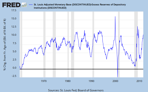
His comment to graph #3 at his link:  "Base money less excess reserves shows a gradual uptrend. Almost like normal growth."  This got me wondering what normal growth actually is.  The graph below illustrates YoY % growth in {base money - excess reserves} (FRED series AMBSL - series  EXCRESNS)


First observationThe growth number varies a lot, but is between 5 and 10% most of the time since the mid 60's.

Second observationWithout prior knowledge, there is absolutely no way to detect any QE event on this graph - exactly to Art's point.

Third observation: The rate of change always increases during a recession, from the very minor uptick in 1974 to the quite dramatic upticks of 2001 and 2009.  But there's also a big, narrow spike in the late 90's, and significant bumps in the mid 80's and early 90's - all non-recessionary times.

Fourth observationThe rate of change increased steadily from zero to about 6% during the 60's.  Since then it looks like about a 7.5% average, BUT - with an increasing standard deviation.

I don't know what to make of this history, but the clear message of more recent events is that the apparent big cash infusions of QE (see Art's graph #1) were no infusions at all.  The net result is that banks, by drawing a small but real return on excess reserves have further enriched themselves while doing no good at all to the economy at large.  This is just one more - and very subtle - form of rentier activity.

Bottom line:  We are so screwed.

Update:  Just for Kicks, here are the monetary base and the monetary base less excess reserves for the period 1960 through the end of 2007.  Both lines are plotted, but they overlap completely.

Now, here they are for 1/1/2008 on.  Not so much overlap now.

Update 2: In comments, Nanute says: "Does it not seem that all the QE money has had the perverse effect of slowing down the velocity of money? By paying interest on excess reserves the Fed is basically allowing banks to profit from borrowing from the government. It's like free money."


Indeed.   A look at this FRED graph (normalized to 100 at 1/1/2005) shows how velocity for all the money measures has tanked since 2008.  From Art's earlier post, QE initiation dates are Sept. '08 and Nov. '10.   In fairness, we have to note that velocity for M1 and M2 had been sliding since early '06.  Not so for MZM, though, which rose steadily until late in 2007.

Correlation isn't causation, but we can safely say that two rounds of QE did nothing to increase money velocity, for any money measure.


Thursday, August 25, 2011

Where Is the Dollar Going

A couple of weeks ago I foolishly boldly made a number of predictions about certain economic indicators.   One of these was the dollar index.   We haven't looked at it since the beginning of the year.  This is a good time, since Menzie Chin has a long post on the subject today.   Menzie wishes for continuing depreciation "to effect global rebalancing."  He includes a lot of graphs, but none of them provide a detailed look at the results this year.  FRED to the rescue.


We see a not-particularly-neat down-slanting trend channel (green) to an all-time low in April.  After that point there's a jump to the top of the channel, and a dance along the top line through mid-Summer.  In the last few weeks, the Buck has drifted sideways, with most of this action happening in a new trend channel (purple)  that I am imagining

Menzie's post includes an excerpt from a paper by Catherine Mann of Brandies University. She concludes that a variety of factors, including "a long-run chartist view, suggest that the trend dollar depreciation has reached an end."

Well, there's the chart, I guess.  At least I'm not alone in my assessment.  If the dollar pops convincingly through the top of the purple channel, it could rise for quite some time.
.

Sunday, November 28, 2010

Tuesday, November 23, 2010

Synchronicity

As a companion piece to my last post, here is a rather too-long, nicely performed, moderately amusing, and totally wrong-headed take on the Dollar.  H/T to Naked Capitalism.


.

Dollars to Euros

I may have more to say about this later.  For now, here is a historical look at the Dollar to Euro exchange rate, from every graphers best friend, FRED, at the St. Louis Fed.


The dollar lost ground between the two most recent recessions.  Now it is strengthening, though in a rather choppy sort of way.  My prediction is that the dollar will continue to gain for at least another year or two, and eventually hit a bottom no higher than about $1:05 per Euro.  The next leg down for the Euro is just beginning.
.

Sunday, November 7, 2010

A Closer Look at Commodity Prices

Yesterday I took a sardonic look at commodity prices.  Let's dig in a bit deeper.

Update: In the original post I forgot to give a H/T to Krugman.  Better late than never.

There are cool graphs, and pointed opinions below the fold.

Sunday, October 10, 2010

Mankiw goes Galt

Well, not really, but a guy can hope.   While we're hoping, lets hope the entire cadre of Chicago school econoninnies and austerian econostrangulators would go with him.  Megan McCardle, too, along with the tea-baggers.  Exit stage right, folks.  I still want a pony, though.  Oh heck, with Bad Tux in mind, let's make it a unicorn.

This is unbelievably rich.  Mankiw says that if the Bush tax cuts expire, then writing his column for the N Y Times just won't be worth it any  more.   Go and read the whole thing.  No excerpt can do it the justice it deserves.

I'll just point out that Mankiw makes the comparison of his tax situation vis-a-vis an imaginary tax-free world, NOT vis-a-vis the current real situation where the increased tax rate and phase out of loopholes will effect him to the tune of about 5%*, not the almost 50% number he uses but doesn't bother to either calculate or note for us.  Also, it includes his state taxes which are unaffected and irrelevant to the discussion.  {UPDATE**} Worst of all, he adds in the medicare portion of FICA, which is not going to be effective because he is far above the ceiling.**  All things considered, it is a thoroughly disgusting exercise in sophistry, mendacity, and narcissism.  Extraordinarily impressive - Wow, and more WOW!

Delong pretty thoroughly dismantles him, then his commenters carve the chunks into little bloody bits and jump up and down on them in heavy, steel-toed boots.  Check it out.

This is no less than such an ass-hat deserves.  (He was one of president George W. Bush's economic advisors, and therefore one of the architects of the current unpleasant situation.)

_____________________________
* And, lest there be any misoverestimating, that only applies to the portion of his income in excess of $250,000.
** UPDATE - I am wrong about the medicare portion of FICA. There is no ceiling on that tax.  So Mankiw is incrementally less of an asshat than I thought.  Big FICA Whoop!


.

Thursday, September 16, 2010

Still Lazy Money

A couple of months ago I posted the chart on the M1 Money Multiplier, from the St. Louis Fed.

Here is an update.  Though the prefix UP, in this context, is a bit of forlorn hope.  This metric is going nowhere.


H/T to Karl at MB.

Wednesday, September 1, 2010

"PAYPAL IS THE WORST COMPANY IN THE WORLD"

Or so I have been told.

This might be my only googlebomb participation ever.

But then again, one can't really be too sure about such things.

Anyway, John is over-reacting at least a little bit.


Many, many other companies are at least as bad, though not necessarily in the same way.

.

Sunday, July 11, 2010

Quote of the day

FDR was on the right track, but didn't have it quite perfect when he said the only thing we had to fear was fear itself.  They real bogeyman is deflation.

On this topic, Kruman's blog today is a must read. (Plus - he has graphs!  You know I love graphs.) To save you a couple of click throughs, here is the very Krugmanesque-sounding also must-read article by conservative economist John Makin, from the American Enterprise Institute (!?!) which prompted his post. 

It is also the source of today's quote:

In fact, banks have virtually ceased to function as financial intermediaries since 2008, preferring to use the zero cost of money provided by the Fed to finance purchases of Treasury securities instead of supplying loans to households and small businesses. After a financial crisis, banks become much more risk averse, as is manifest in their willingness to lend only to the government instead of to households and businesses. That development is deflationary because it means that a sharp boost in the monetary base engineered by the Fed does not translate into faster monetary growth at a time when the precautionary demand for money has been boosted by elevated uncertainty.

I can't say for sure that the dysfunction of banking is the cause of the M1 multiplier collapse, but the timing is impressive, and it could hardly be mere coincidence. Maybe its the other way around, or they have some common cause.

While I love having both Krugman and Makin agree with me, I seriously fear things will become far, far worse before they get any better.   B. Hoover Obama is not a progressive, and there is no political will to correct the ongoing depression.  Meanwhile, Repugnicants and lots of other conservative economists, along with the E.U., are preaching austerity, which will be the ruin of us all.

There is no comfort in being right about this stuff.

Tuesday, July 6, 2010

Idle Money

I read somewhere in the early naughts that corporations were sitting on record piles of cash - hoarding rather than investing or hiring.   I can't say that this has or hasn't been a constant over the decade*, but I've suspected for quite a while that this is the case now - either still or again.

Krugman confirms my suspicion, and even suggests a remedy.

He didn't even mention that the Gov't could borrow now at historically low rates - but I guess that does go without saying.

* If anyone knows how to track down this information, I'd be grateful to know about it.

Friday, July 2, 2010

Lazy Money

 The M1 Money Multiplier, after a slow 23 year decline, fell off a cliff in Oct 2008.


Since then, it has gone nowhere.


Looks like a very, very sick economy.

Sunday, May 23, 2010

Sunday Music Blogging, Pt 2 - "Feeling like a foolish child"

H/T to Calculated Risk.


Singer-songwriter Tim Miller captures the anger and despair of a victim of predatory lending in "Love, Your Broken Home" (some rough language). Click here for YouTube.