Look: I am eager to learn stuff I don't know--which requires actively courting and posting smart disagreement.

But as you will understand, I don't like to post things that mischaracterize and are aimed to mislead.

-- Brad Delong

Copyright Notice

Everything that appears on this blog is the copyrighted property of somebody. Often, but not always, that somebody is me. For things that are not mine, I either have obtained permission, or claim fair use. Feel free to quote me, but attribute, please. My photos and poetry are dear to my heart, and may not be used without permission. Ditto, my other intellectual property, such as charts and graphs. I'm probably willing to share. Let's talk. Violators will be damned for all eternity to the circle of hell populated by Rosanne Barr, Mrs Miller [look her up], and trombonists who are unable play in tune. You cannot possibly imagine the agony. If you have a question, email me: jazzbumpa@gmail.com. I'll answer when I feel like it. Cheers!

Sunday, June 30, 2013

The Tigers in June

They continue to be a good, not great team.  There are some serious problems here, as we'll see.  Here's a look at scoring.


June was the lowest month for Tigers scoring and the highest month for opponents scoring. It's all incremental, but leaning the wrong way.   Season average to date has been dropping pretty steadily for the past 30 games, from 5.41 in game 49 to the current 4.95, with 80 games played.

The other day Jim Leland said  the offense needs to get going.  Excellent point.  The Tigers played one more game in May than in June, but scored 25 more runs.  That's huge.  Meanwhile, the opponents scored only one more run in May than in June.

Tigers starting pitching deteriorated badly from April to May with run totals higher for every one of the first 7 innings.  This only translated into an extra 0.15 runs per game, though, since relief pitching was marginally less awful in May.  In May the first three innings were bad, in June it was innings 4 and 5.  But relief pitching has been a problem from the beginning, and has gotten worse again.  In June, the Tigers gave up 16 ninth inning runs - more than in April and May combined.  This season, the Tigers have lost 10 games in which they were leading in the 7th inning or later.   Relief pitching is a big part of the reason why.  The lack of a closer is looming large. The other part is the inability to score late.  The only worse team in that regard is the Seattle Mariners who can't score at any time.

 Graphs 1 and 2 show scoring by inning in June for the Tigers and opponents, respectively.


 Graph 1 - Tigers Runs Scored per Inning in June

Compare April and May.

Graph 2 - Tigers Runs Allowed per Inning in June

Compare April and May.

Graph 3 shows Tigers scoring per game in June.

Graph 3 - Tigers Runs Scored per Game in June

Blue line is runs per game, green line is the down-sloping season average to date, yellow line is average over the last 5 games.  

The Tigers are 6 games over .500, but only 1 over .500 since the beginning of May.  Closing out April with 5 straight wins is the only thing separating this year from last, when the Tigers struggled for months to get to .500.

They need for Rondon to mature fast into a real big league closer.  But that's only half the story.  They still need to get beyond being a 6 inning offense.  Here are some random stats.


April Summary.

May Summary.


Friday, June 28, 2013

The Standard Deviation of NGDP Growth During the Great Inflation

This post is a side bar to the Remarkably Stable GDP Growth series.

Part 1
Part2
Part 3

Once again I have to thank Mark Sadowski for goading me into digging deeper, staring longer, and thinking harder about this topic than I otherwise would have.  In comments to Part 3,  Mark informs us that: 

In three year periods ending in 1954 to 1978, which overlaps with the Great Inflation, the 12 quarter standard deviations of the compounded annual rate of change in NGDP are significantly *negatively* correlated with the average rate of change in NGDP. In other words NGDP became *less volatile* as its average rate of change *increased*.

Let's have a look.  Graph 1 is a scattergram of 12 Qtr average NGDP growth from this FRED page, measured as Compounded Annual Rate of Change [CARC] vs Std Dev for the years 1954 through 1978.  A linear trend line is included.


 Graph 1 - 12 Q Avg CARC vs Std Dev

At first glance it appears that Mark is right.  But there is something strange about that data distribution.  Do you see it?

Let's look back to one of my earlier graphs showing the change in Std Dev over time for a moving 13 quarter kernel.  I see a broad sweep up in St Dev from the mid 60's to the early 80's.  Can a 12 Q kernel be very different?  No, it can't, as Graph 2 indicates.

Graph 2 - 12 Q Avg CARC and Std Dev

Twelve Qtr average CARC is in yellow, St Dev in blue.  The basic CARC data is in grey.  What we observe are 5 different realms, with Average CARC and Std Dev moving broadly together: a sharp up and down from '50 to the early 60's; up from '64 to '81; down '82 to 87; flatish '88 (or '90) to '08, and then the Great Recession.   How can we have Std Dev negatively correlated with average CARC when they exhibit similar movement?   That's at the gross level.  The small magnitude undulations, however, are in contrary motion.  This is easiest to see in the wiggles from 1954 to '60, and again in the great recession, but actually occurs throughout.  It happens mainly because recessions bring CARC values down while boosting the Std Dev.  But -- this is not the explanation.

To understand what's going on, consider the big drop in Std Dev from 6.51 in 1960 to 2.47 in  Q1 1964. Remember that 1964 date, it's important.  Now, let's have another look at the CARC data from 1954 to 1978, presented in Graph 3.

Graph 3 CARC and STD Dev, 1954 to 1982

The CARC data from FRED is in dark blue. It moves up over the period, but not in a regular manner.  There are two flatish periods from Q2 '61 to Q3 '70, and from Q2 '72 to Q1 ,78.  Averages for these periods are indicated with yellow horizontal lines.  The data packet spans for the two periods are outlined in red.  Std Dev is in bright blue.  I've included a trend channel in green, just because it amuses me.  Data for the two periods is summarized in the table below.


A higher CARC range leads to a slightly wider data packet, and hence a higher Std Dev.

The 60's were recession free, and in that decade we observe that after Std Dev hits bottom in 1964, it moves in near lock-step with average CARC for the rest of the decade [easiest to see in Graph 2.].  After the 1970 recession, CARC stepped up into a new range.  There was a recession in 1974, yet the data envelope only widened slightly. This is because inflation at the time kept NGDP values high, even in the trough, as this FRED graph illustrates. 

Now, lets have another look at the scattergram of average CARC vs Std Dev, this time with the data properly parsed around that significant 1964 date I mentioned earlier, shown in Graph 4.


Graph 4 - 12 Q Avg CARC vs Std Dev

The values from 1954 to Q4 '63 are in red, and from Q1 '64 on in yellow.  The original trend line is shown in blue, trend lines for the two sub sets are color coded with their respective data points.

The conclusion is that the apparent negative correlation between CARC and St Dev over the period of 1954 to 1978 is specious, and wholly due to the high recession-driven Std Dev values of the 50's.  The Std Dev drop of 1960 to '64 occurs when the last of these gyrating data points fall out of the moving 12 quarter kernel.

After that, Std Dev is positively correlated with CARC, as I claimed in the first place

There's a lot more to dig into here, and I'll do that in a follow-up post.

Tuesday, June 25, 2013

Remarkably Stable GDP Growth - Part 3

Part 1

Part 2

First off, I want to thank Mark Sadowski for contributing, in a gadfly sort of way, to my thinking on this issue with his comments in Parts 1 and 2.  So, this is not the part 3 post I had intended to write.

Mark suggested using a different transformation of the FRED NGDP series I've been looking at.  Instead of taking YoY % change, he suggests using what FRED calls Compounded Annual Rate of Change [henceforth CARC.]  Check the linked graphs and you'll see there's both more fine grain movement and swings to greater extremes in the CARC graph, and, as expected, the Standard Deviation values are higher.  This is a different way of looking at the data.  But is it a better way?  I have no idea.  If you have a convincing argument either way, let's see it in comments.

Graph 1 shows the 13 Qtr Std Dev of CARC.  It's gross features are generally similar to the those of the graph of Std Dev of YoY Change.  There's the steep fall bottoming in 1964, the rise into a broad double peak in 1981-3, followed by a steep drop to a bottom in 1987. Then we see the humps caused by the '91 and '01 recessions, and finally the sharp rise and fall due to the Great Recession. [In the YoY graph some of these extremes are displaced by about a year.]

Graph 1 - 13 Qtr Std Dev of CARC

The major difference between the two graphs occurs after the 1987 bottom.  While the YoY  Std Dev graph continues to slope down, the CARC Std Dev graph moves in a generally horizontal direction between the two red lines drawn from the Q4 '90 high of 2.95 and the Q3 '12 low of 1.17.  Note however, that if the '91 recession had been worse or the '01 recession milder, we would still perceive a downward tendency to the peaks.

The two most recent Std Dev readings are 1.27 and 1.22, so the precipitous fall following the great recession has ended.  Note that similar lows occurred in Q3 '98 and Q3 '99 at 1.29 and 1.25, respectively and Q3 '87 at 1.27. So - yes, we have recently observed the lowest Std Dev reading on record; but, no, it is not the lowest by any kind of great margin.

What accounts for the high Std Dev readings of the 70's and 80's - or, alternatively, what accounts for the low readings now?  To explore this question, let's indulge in a couple counter-factual exercizes.  But first, let's ponder what causes the Std Dev to be high, in general.

The main factors, in no particular order are
- The magnitude of the data values- frex, are they closer to 2 or to 22.
- The data spread envelope - frex, is it closer to +/- 10% or 110%.
- The data irregularity within the envelope - frex, does it gyrate wildly from extreme to extreme, or meander in a more leisurely fashion.

In the context of NGDP growth these factors become
- Average NGDP growth over a period of interest.
- The presence or absence of recessions.
- The growth variablilty in non-recessionary times.

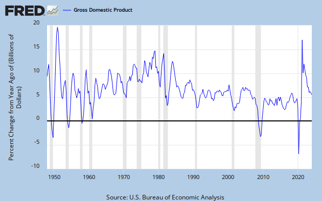
Let's explore the recession factor first.  As it turns out, there are two features that come into play here: the depth of the recession, and the nature of the recovery.  The deeper the recession, the greater the change in growth from the preceding period.  The snappier the recovery, the greater the change in growth from the recessionary trough.  Both of these things turn out to be important factors.  Note in the FRED Graph of CARC that the recessions of the 70's and 80's had sharp, short rebounds in which NGDP growth was unusually high for one or more quarters.  So both the recession and the recovery contributed to high Std Dev values.  Now note the recoveries from the last three recessions.  Very little snap back from '91-92, only a little from '01-02, and none at all from the Great Recession.

Here's where our first counterfactual comes in.  Suppose that the steep double dip recession of 1980-82 had never happened, or that it had occurred, but with only gradual recoveries from the troughs.  These possibilities are illustrated in Graph 2.

Graph 2 - CARC with Counterfactuals


The blue line is actual CARC, The green line is a made-up version of CARC without the recessions.  The pink line shows the recessions, but with smoothed recoveries and no snap back.  Graph 3 shows the the 13 Qtr Std Devs for these data sets, with the same color coding.

 Graph 3 - Std Dev of CARC with Counterfactuals

Simply eliminating the snap back recoveries brings the Std Dev down by 2 to 2.5 points.  Eliminating the recessions entirely brings the Std Dev down from just over 6.5 to just over 2.5, a reduction of almost 60%.

Note also the sharp jump in Std Dev at Q2 '78, and the following plateau.  This is entirely due to a single quarter of ridiculously high NGDP growth during the moribund Carter administration, and illustrates how a single anomalous data point can distort the Std Dev calculation for an extended period. The plateau ends at Q3 '81 when this point falls out of the 13 Q data kernel.

In comments to Part 1, Mark Sadowski asked if lower volatility isn't a good thing.  My answer is -- only maybe.  If it's caused by avoiding recessions, then yes.  But if it's caused by lopping off the potential tops of recoveries, such as what we have experience these last three years, then no - not at all.

Here's another counterfactual to ponder.    What would the Std Dev of CARC have been in the period we just looked at if NGDP growth were at the current level, but the relative volatility had remained the same?  From Q2 '78 through Q3 '84, CARC averaged 9.93%.  Suppose a counterfactual of 4.01% average CARC, which is what we have experience from Q3 '09 through Q1 '13, the recovery from the great recession.  This is illustrated in Graph 4.

Graph 4 - Early 80's Counterfactual

The dark blue line is the actual CARC data.  The horizontal blue line is the period average of 9.93.  The brown line is the counterfactual CARC data, constructed by having each point be above or below the average of 4.01 [brown horizontal line] by the same percentage as the corresponding real data point. The light blue and red lines show the 13 Q Std Dev values for the two data sets, respectively.  The Std Dev value for the entire real data set is 5.92.  The Std Dev for the counterfactual data set is 2.39.  This is again a reduction of just about 60%. 

So, if you take the early 80's data and eliminate the recessions, Std Dev for the flatish period from Q3 '81 to Q1 '84 drops by 58% from 6.34 to 2.65.

Also, if you consider the volatility level of Q2 '78 to Q4 '84 along with the CARC level following the Great Recession, the Std Dev drops by 59.7% from 5.92 to 2.39.  So this gives me another answer to Mark's question:  If the low Std Dev is an artifact of low NGDP growth, then no, it's not a good thing at all.

These examples suggest that both the occurrence of recessions and the high level of NGDP growth just before the start of the alleged great moderation were about equally as important in contributing to the high Std Dev of that era.

So I have to modify my idea about the relative importance of these two factors in making Std Dev high or low.  A low NGDP growth rate is only AS important, not MORE important than avoiding recessions

Remember, the point of this exercise is to show that the low volatility of current NGDP growth is neither remarkable, nor necessarily a particularly good thing.   I think I'm getting there.

Next, In Part 4, I'll look at what I originally intended to look at in Part 3.  Stay tuned.


Thursday, June 20, 2013

The JzB Martini

Yesterday was National Martini Day.   Alas - I missed it.   But I had places to go, and don't drink and drive.  Maybe I'll catch up tomorrow.

Meanwhile, as a public service, I will reveal the recipe for The Jazzbumpa Martini.

3 oz Gordon’s London Dry Gin
1 oz New Amsterdam Gin
1 oz Martini and Rossi dry vermouth
2 or 3 ginormous pimiento stuffed olives
Some sort of a small skewer (a toothpick works)
Ice - approx. 6 or 8 cubes

Put the ice in a stainless steel cocktail shaker.  Pour in the gins.  Get your martini glass, skewer the olives and put them in the glass.  Don't rush.  Add the vermouth to the shaker.   Stall a little.  Put the lid on the shaker.  Swirl it around for a while.  Swirl it around some more.   Stop just before the moment when your fingers get frostbitten.  Pour the mixture into the glass and onto the olives. 

Sip.

Close your eyes and imagine you are in a pine forest.

Ooohh - that is nice.

Wednesday, June 12, 2013

Remarkably Stable NGDP Growth - Part 2

The low standard deviation of GDP growth is simply an artifact of low GDP growth numbers.

OK - that's a bit over stated.   The low standard deviation of GDP growth is primarily an artifact of low GDP growth numbers

Suppose you have a data set with values hovering around 13, with a range of +/- 20%.  The entire packet width is 5.2.  Now suppose you have another data set with values hovering around 3, with a range of +/- 20%.  The entire packet width is 1.2.  Does this suggest that the second data set is more steady than the first?

The graph shows the 13 quarter standard deviation of GDP growth since 1947.  Data is from this FRED page, Gross Domestic Product, 1 Decimal (GDP), Quarterly, Seasonally Adjusted Annual Rate, 1947-01-01 to 2013-01-01.  GDP growth graph can be seen here.  

I like 13 because it's a Fibonacci number, but it's also the duration in quarters of the current remarkably stable GDP growth, so let's see how it works over time.

Yes the standard deviation is dropping like a rock for the last 5 quarters.  It dropped like a rock from 1952 to 57 [with three separate stages that were each comparable to what we are seeing now,] from 1961 to 1965 in two stages, and from 1984 to 88 in two stages.  It always drops after a recession - sometimes like a rock and sometimes in a more leisurely fashion.  The reason that the bottom values were higher in those earlier periods than what we're seeing now is that the GDP numbers were bigger.


 13 Qtr Standard Deviation of GDP Growth

A red line connects most of the local minima.  A parallel green line is rather arbitrarily projected from the 1991 maximum.  An orange horizontal line is projected forward from the 1999 minimum of 0.46.  The standard deviation stayed in the range of 0.47 to 0.48 for the next three quarters.  Along with the last two quarters of 2006, at 0.47 and 0.45, respectively, these are the 6 quarters since 1947 with lower standard deviation values than the current 0.53.  The current value is, in fact, only at the mid range of the trend channel.

A purple horizontal line is projected forward from the 1988 low of 0.90.  The reading immediately prior to the current one, at 1.11, was above that level.  So we find the current reading is the 7th from the lowest on record.  Only now with the last reading, has the standard deviation fallen low enough to enter a range of values at or below 0.90 that includes 33 of the preceding 100 quarters.

I think the really remarkable thing about recent events is the steepness and height of the climb from mid '08 to mid '09, caused by the great recession.  The precipitous fall from Q1, 2012 is just one more reversion from an extreme.

Not everyone shares my fascination with trend lines, and you can certainly quibble with the width of the channel I've drawn.  But I think there are two indisputable facts.

1) The standard deviation of GDP growth has been trending down since the end of WW II.  The rate of decrease has been far lower in the great moderation than it was prior to 1965.

2) The current value of the standard deviation is not in any way remarkable over the last 25 years, or even the last 50 if you accept my trend line view.

It's certainly possible that the standard deviation will continue to drop for the next few quarters.  But it can't fall below the lower trend line, since it has already crossed the theoretical minimum of 0.00.

It's also possible that we'll slip into another recession and the standard deviation will balloon again.

The main thing to understand is that recessions cause the standard deviation peaks, and that the second most effective way to have a low standard deviation is to avoid recessions.

The first most effective way is to have remarkably low GDP growth.

In my view, this is not remarkable stability.  It is the American economy enduring a slow and agonizing death.

There's another more nuanced way of looking at the data that we'll get to it in part 3.


Remarkably Stable NGDP Growth - Part 1

In comments here, Mark Sadowski says a lot of thoughtful things, including this:

Beckworth is claiming that AD growth has been steady despite fiscal contraction which it has. In fact the standard deviation of the quarterly growth rate in nominal GDP (NGDP) since 2010Q1 is by far the lowest for any 13 quarter period on data going back to 1947. Many Fed watchers have been stunned by the amazing steadiness of the NGDP numbers despite all the various fiscal policy shifts (or cliffs) and this raises serious doubts as to the existence of a liquidity trap.

I'll admit, it's not at all clear to me how the serious doubts follow from the amazing steadiness when GDP growth is stuck in the mud, but it's that steadiness that I want to focus on - eventually.

Meanwhile, Graph 1 shows the YoY percentage growth in GDP over my life time, seasonally adjusted quarterly data.


As you can see, GDP growth has certainly been steady over the last three years, albeit at a remarkably low level.  Market monetarists argue that since monetary policy has been inept and fiscal policy has not been expansionary, this steady growth casts serious doubts on the efficacy of fiscal policy.

Why can't one simply turn this around and say that since fiscal policy has been inept and monetary policy has not been expansionary, this steady growth casts serious doubts on the efficacy of monetary policy?  Either way it makes very little sense.  And you'll note that supporters of fiscal policy never make this kind of claim.

But let's get back to GDP growth.  Remember the simplicity of Graph 1, because in Graph 2, I'm going to make it very busy.

Graph 2 - YoY GDP Growth since 1947, Decorated


The purple line is a 13 quarter moving average and the yellow line is a 13 year moving average.  Both have been in decline since the early to middle 80's.  The red line is the growth level at the bottom of the 1982 trough - effectively a lower limit to GDP growth until the 2009 collapse.   The green line is the growth level of the 1993 recovery - effectively an upper limit to GDP growth that we may never again experience.  The blue line connects peaks since 1989.  The downward trajectory is both unmistakable and disturbing.  This is the legacy of Reaganomics, deregulation, globalization, a bloated rent-collecting finance sector, and growing inequality.

Average GDP growth for the entire data set since 1947 is 6.67%, nearly identical to the peak green line value of 6.58%.

Why is this relevant?  For a decade starting in 1971 GDP growth was never below 6.58 percent.  Since 1993, it's only been above it for a brief blip in 2000.  For much of the 70's GDP growth was above 10%.  For the last 20 years GDP growth has been below the 6.67% average since 1947, and for the last 6 years, it's been below 5%.

The low standard deviation of GDP growth is simply an artifact of low GDP growth numbers.

That will be the subject of part 2.


Saturday, June 8, 2013

The Tigers in May

In the April wrap up, I mentioned that the Tigers were erratic.  That has not improved.  Runs scored and runs allowed are both up a bit, and the standard deviations are up for both, as well.


In yesterday's Freep, Drew Sharp wrote a don't-worry-be-happy article on the Tigers' impressive starting pitching.  It's been great the last few days, but also erratic over the season.  I can't really quibble much with what Sharp says. They're in first place, now at 33-26, with a far better record than at this time last year, when they spent a great deal of the season struggling to get above .500  It's what he leaves out that's troubling, and we'll get to that.  Also in yesterdays' Freep, John Lowe fills in some of the blanks.

Before yesterday's game time, the Tigers were 24-15 when they get a quality start [QS], leading the league with both numbers. [Verlander then turned in another one for a win last night.]  They're tied with KC at 15 QS losses, against the Royals mere 16 QS wins.  It's pretty clear starting pitching is not a problem for the Tigers - but a few other troubling things are.

Lowe:

The Tigers have lost eight games in which they have led in the seventh inning or later. In five of those, they have gotten a quality start. In those eight losses when leading in the seventh or later, the Tigers have scored one run in the seventh inning or later.

That's the crux of it, on the offensive side.  The Tigers are mediocre in close games, less than that in extra inning games, and have no ability to come from behind for a late win.  That's because, win or lose, tight game or blow out, the Tigers offense is anemic after the 6th inning.  I heard on the radio broadcast last night that they are in the bottom three teams in late scoring.

And this from Lowe is why it's such a big problem.

The Indians have 11 fewer quality starts than the Tigers, but only two fewer wins in quality starts (24 for the Tigers, 22 for the Indians). If the Tigers don’t win more often when they get quality starts, and if Cleveland can get quality starts more often, perhaps the Indians will give the Tigers a race.

 Scoring per inning across the game has leveled a bit compared to April, but still falls off badly after the 6th.

Graph 1 - Tigers runs per inning in May

Contrast April, when innings 4 and 5 were powerhouses.  In each case, 10 is a proxy for all extra innings.

Here's a look at scoring by game.

Graph 2 - Tigers runs per game in May

And here's April.  Same song, different verse.  Blue line is runs per game, green line is an average to date from the first game, yellow line is average over the last 5 games.

Here are opponents runs per inning.

 Tigers Runs Allowed per Inning in May

 Despite the strength of starting pitching, runs allowed in the first 2 innings has deteriorated badly, compared to April. Granted, there were three more games, but the differences are far from proportional.   The 7th inning has also gotten much worse, though most of that comes from one bad inning by Sanchez against the Pirates on 5/29.

Here are some random stats.


Relief pitching has actually improved a bit, but the closer problem still looms large.

That along with the inability to score late could be the Achilles heels of an otherwise powerful team.


Friday, June 7, 2013

What the Hell?!? Friday - Afterlife

In my fantasy of the perfect afterlife, when the Westboro Baptist Church people stand before god to receive their judgment, they're horrified to discover that the one man actually made in god's true image is Nathan Lane.

Wednesday, June 5, 2013

More on the Lying Liars at the Heritage Foundation

I've called them out a few times, here, here and here (with some help) and here.

Now, Steve Benen reports, one of their economists been caught lying to the Senate Budget Committee.  

As the occasionally reliable Matt Yglesias recently pointed out regarding a different passel of Heritage lies:

But it illustrates an underappreciated point in Washington, namely that even ideological think tanks do their movements a disservice when they do bad work. As Republican members of Congress ponder what to do about immigration, having accurate information about its fiscal impact would be very useful to them. You actually want to have a team of people "on your side" who you can trust to do good work. Heritage is not that team.

True, but MY misses a rather vital feature.  If you are trying to make points that do not comport with truth or reality, you have to lie, pretty much by default.  And you can't do good work if you are lying.

Benin replies:

That's true. If there are any Republican policymakers left who care about quality scholarship and reliable data, they'd no doubt like to rely on an institution like the Heritage Foundation as a go-to source for credible research. But as Heritage transitions from its traditional role as think tank to its new role as an activist group, and the intellectual infrastructure on the right deteriorates, GOP lawmakers no long have such a resource.

But that's not quite right, either.  Heritage has been lying to promote an agenda for as long as I've been aware of them.  If Rethug lawmakers ever had such a resource, it's been gone for a long, long time.

H/T to PK

Tuesday, June 4, 2013

JzB Smackdown with Some Thoughts on Trends and Context

[Substantially revised and updated, 6/5-6/13]

João Marcus Marinho Nunes is personally offended by my previous Angry Bear post.  


Personally I was ‘offended’ by being ‘accused’ of “using short-time series data”, ignoring “what is a valid context” and “cherry picking”.

 Which was odd, since I didn't accuse him of anything.  In fact, he wasn't even on my radar screen.  He then goes on to show a bunch of nice and interesting graphs that have nothing at all to do with my point, and concludes:


PS Maybe JazzBumpa thinks he´s a modern day Robespierre fighting against (in this case imaginary) absolutism!

Actually, I'm pretty close to agnostic on the subject of Market Monetarism, - as he identifies the subject of my (imaginary) absolutism in his comment at my post.   I thought I had made it pretty clear that what I was criticizing was the kind of confirmation bias that induces one to construct questionable data analyses that support pre-concieved conclusions.  The fact that the people doing this were market monetarists might be illustrative, but is not really central to my criticism.

I welcome disagreement, but it's more helpful and constructive if the points of disagreement have some relevance to the point I was trying to make.  I elaborated a bit in a comment at Nunez's blog, which you can read there, if you're interested.  What interested me was some piling on by Mark Sadowski, in comments both in my post and at Nunes'.  While I think Sadowski missed [or perhaps ignored] my point, he makes a couple of his own - one of which is actually Krugman's, whom he quotes.

“…To see what’s going on, you need to do two things. First, you should include state and local; second, you shouldn’t divide by GDP, because a depressed GDP can cause the spending/GDP ratio to rise even if spending falls. So it’s useful to look at the ratio of overall government expenditure to potential GDP — what the economy would be producing if it were at full employment; CBO provides standard estimates of this number. And here’s what we see:

Spending is down to what it was before the recession, and also significantly lower than it was under Reagan.


Krugman's Graph

Howler [Quote] of the day, with Derp

This is simply magnificent.

The saving grace for the conservatives on this front is that they, by virtue of being conservative, at least have an understanding into how human nature actually operates.

--  Eric Ericson

Really - could it ever get any better?  Well maybe.  There is so much more here.  Go read the whole thing, if you have the stomach for it.

Or, if you are of a more delicate constitution, you could simply read the last two paragraphs of Josh Barro's response to E.E.'s would be smack-down of Barro.

This is a strategic problem for Republicans for several reasons. One is that the party’s reliance on a resentment-based appeal has caused its policy apparatus to atrophy. Erickson is not alone among conservatives in thinking that “academic and technocratic” approaches are best left to pointy-headed liberals. Another is that people like Erickson are a declining share of the electorate.
 
Basically, Erickson is derpy. And Erickson has big appeal to conservatives because lots of them are derpy. But the country is getting less derpy, and in time the Republican party will have to get less derpy, too. That’s my project, and I don’t expect Erickson to like it.
 

This is the Republican party tearing itself apart, and it can't come to fruition soon enough.  Vacuous know-nothings like Ericson on the one hand [who evidently does not realize that Obamacare is a conservative plan put forth 20 years ago by the Heritage Foundation - hence its many flaws] and younger, less radicalized thinkers like Barro.  I haven't paid much attention to Barro, so I don't know what kind of a thinker he is. 

But what kind of thinker would remain aligned to the Republican party of 2013, when there is a much more rational conservative party available.  Is the fact that they call themselves "Democrats" really that off-putting?

H/T to Delong.