Look: I am eager to learn stuff I don't know--which requires actively courting and posting smart disagreement.

But as you will understand, I don't like to post things that mischaracterize and are aimed to mislead.

-- Brad Delong

Copyright Notice

Everything that appears on this blog is the copyrighted property of somebody. Often, but not always, that somebody is me. For things that are not mine, I either have obtained permission, or claim fair use. Feel free to quote me, but attribute, please. My photos and poetry are dear to my heart, and may not be used without permission. Ditto, my other intellectual property, such as charts and graphs. I'm probably willing to share. Let's talk. Violators will be damned for all eternity to the circle of hell populated by Rosanne Barr, Mrs Miller [look her up], and trombonists who are unable play in tune. You cannot possibly imagine the agony. If you have a question, email me: jazzbumpa@gmail.com. I'll answer when I feel like it. Cheers!
Showing posts with label inflation. Show all posts

Wednesday, September 16, 2015

Household Debt Service vs GDP Growth

In conversation at Art's we wondered about the relationship between household debt service payments as a percentage of disposable personal income and YoY GDP growth.  A scatterplot of the quarterly data from FRED, covering Q1, 1980 to Q1, 2015 looks like this.


Graph 1 - FRED Plot

There's a broad hint of an overall negative slope.  But if you lop off a few points on the right and the left, the remaining central cluster is relatively shapeless.   But, there does seem to be some negative slope to at least certain line segments, so that might mean something.

My first cut at figuring this out was to download the FRED data and make a new plot - Graph 2 - with line segments separated in what I hope is a coherent fashion.  I did this by eyeball, then labeled the segments according to the dates they include.   In the process I inadvertently reversed the axes, but this shouldn't change whatever conclusions might be drawn.

Sunday, February 23, 2014

A Look at Debt and Inflation

Here's a scatter of the YoY change in CPI inflation vs the YoY Change in the debt of households and nonprofits.  [FRED Custom Chart]  If debt drives inflation, we should see an upward slope in Graph 1.
 

Graph 1 - CPI Change vs Debt Growth


Clearly, there is no upward slope - at least not any simple or easily discernible way.   To try to make some sense of this, I color coded the points for different time periods.  That is shown in Graph 2.

Graph 2 - CPI Change vs Debt Growth, Color Coded


Once the light blue points are segregated, it's pretty easy to see that the remaining points reside mostly in a horizontal band.

Here is the arrangement.

1952 -60     Yellow - Eisenhower
1961 -68     Dark Purple  - Kennedy-Johnson
1969 -71     Green - Preamble to the Great Inflation
1972 - 82    Light Blue - The Great Inflation
1983- 92     Dark Blue - Beginning of the Great Stagnation
1993 - 00    Red - The Clinton Stability
2001-08      Dark Blue - Culmination of the Great Stagnation
2009 on       Pink - The Great Recession to now

As it turns out, the Red and Dark Purple points are hard to differentiate.  [if you right click on the graph and select "Open link in new window," you can blow up the graph by clicking "Control" and the "+" sign several times.]  The red points are more closely clustered and surrounded by the purple. There are the hearts of your two little moderations.

Originally I had the entire 1983 - 08 period in dark blue, then decided to highlight the Clinton years in red to see if anything stood out.  What we find is a short period of the greatest stability in the record, regarding both of these two variables.

So, the data tells that for the post 1952 period, there is no robust relationship between debt growth and inflation.  In fact, except for the Great Inflation period, the relationship might even be slightly negative.  The 1969-71 period, just prior to the Great Inflation, has the unique combination of lower debt growth and higher inflation than any other time in the data set.

Also, the Great Recession and it's aftermath are unlike anything else we've seen in recent decades.

Bottom line, though, is that a rate of CPI inflation of 3 +/- 1% is associated with the entire range of debt growth in the modern era.  And, if debt growth is a serious factor in health of the economy, inflation targeting is close to meaningless as a policy tool.
 

Tuesday, November 5, 2013

Inflationary Derp

Once again, Krugman takes on the inflationistas, aka your typical derpy Republicans.  Their tired story goes this way:

Vice Chair Yellen will continue the destructive and inflationary policy of pouring billions of newly printed money every month into our economy, and artificially holding interest rates to near zero. This policy has been in place far too long.

Of course, it's nonsense.

PK shows this from FRED, here as graph 1.


Graph 1 - Monetary Base and Inflation since 2009

Sure, enough, a big, big change in Money and a pretty flat non-response in Inflation.

But this is only short term, since the Great Recession [GR].  Lets take a longer view in Graph 2, using the same FRED database.  Here the two data sets are on opposite axes, to let Inflation more visibly inflate.

Graph 2 - Monetary Base and Inflation since 1970

Aside from the Great Inflation Dragon, ca.1980, it's been a rather steady and featureless climb for Inflation up until the GR wiggle.  The Monetary Base had a slightly faster than linear rise, until the three recent big steps up.  

PK's point, then, is well taken.  Let's look at it a different way.  Here in Graph 3 is Inflation as a function of the Monetary Base.

Graph 3 - Inflation vs the Monetary Base, 1970 on

Pretty dramatic.  In the past, it would have seemed that increasing the Monetary Base correlated with rising Inflation. Suddenly, though, when the GR arrived, that stopped and stayed stopped.   More likely, though, both variables just trended up over time, each for its own reasons.

Here is the same graph, with the GR truncated.

Graph 4 - Inflation vs the Monetary Base, 1970 through 2007

But if you look at annual changes, a somewhat different picture emerges, as seen in Graph 5.


Graph 5 - Inflation vs the Monetary Base, Annual % Change

 It's hard to see an overarching pattern here, but at a detail level, it seems that the movements are contrary.

That appears to be an illusion, though.  The scattergram in Graph 6 below, with Inflation on the vertical axis, suggests that there is no relationship at all.  Note that this data set is truncated at 2007, so there is no effect from the GR.


Graph 6 - Annual Change in Inflation vs Annual Change in Monetary Base, Through 2007

There are big changes in the Monetary Base with almost no change in Inflation; and big changes in Inflation when the change in Monetary Base is small.   In post WW II America, there is no broad correlation between Monetary Base growth and Inflation..

Including 2008-13 in Graph 7 emphasizes just how different those years really are.


Graph 6 - Annual Change in Inflation vs Annual Change in Monetary Base, Through 2013


Just to demonstrate that the money measure doesn't matter much, Graph 7 shows the annual Inflation rate vs the change in MZM.


 Graph 7 - Annual Change in Inflation vs Annual Change MZM, Through 2013

Now the Christmas tree shape is leaning hard to the left, suggesting, if anything, that the relationship between Money supply growth and Inflation might be negative.

What this leaves us with is very few things inflating these days, other than the money supply and Republican derp.


Wednesday, October 31, 2012

Fowl and Fishy Inflation

It has been suggested that the rapid increase in the prices of fish, fowl, meat and eggs for about two years following October, 2009 was the result of QE causing inflation in these items.  From this Calculated Risk graph, we can get the QE date line.  QE was announced on Nov 25, 2008, and expanded in April 2009.  It ended in May, 2010.  QE II was hinted at in Sept, 2010, announced in Nov 2010, and ended in August 2011.

The timing correspondence is less than stellar, since the YoY increase in prices for those food items dropped like a rock from October, '08 though Oct. '09.  It then shot up to a 7 1/2 year high in May of 2011.

This can be seen in the red line of Graph 1, which also shows the CPI for all items except food and energy (CPILFESL) in blue.


 Graph 1 YoY Price increases for Selected Food Stuffs and All Items Less Food and Energy

To assume a cause and effect relationship, you have to account for a time lag of a year from the announcement and 6 months from the expansion of QE to the turn around in those price increases from the Oct '09 bottom.  Remember, through the first 11 months of QE, the YoY change in those prices dropped dramatically.  Between May and November, 2010, while no QE program was in effect, these prices had the steepest part of their rise.  After QE II ended in August, 2011, the YoY price increase remained high for those items until the end of the year, and then fell rapidly.

A longer view reveals that the increase in those food prices oscillates continuously around the All Items Less Food and Energy line.  The trough to trough period is irregular, averaging 3.52 years with a standard deviation of 0.45 year (5 measurements).   The trough to trough time from May, '06 to Oct., '09 was a very typical 3.4 years.  It is very hard to look at that graph and see anything unusual about the 2008-2012 region, other than the depth of the trough shortly after the Great Recession.

It appeared to me that the blue line of Graph 1 might be a crude approximation of a long average of the red line.  This turns out not quite to be the case, since the two lines are measuring different baskets of goods.  What we have is the YoY increase for these food items oscillating around its own mean. That sounds like a tautology, but let's look a little deeper.

Graph 2 shows the same data, along with some long averages of the food stuffs YoY price increase line.   These are the 5 Yr (light blue), 8 Yr (yellow), and 13 Yr (purple) moving averages, and the average for the whole data set, 2.9 (bright green).  I've also included an envelope one standard deviation (3.06) above (5.96) and below (-0.17) the mean in dark green.

Graph 2 YoY Price increases for Selected Food Stuffs with Avgs and All Items Less Food and Energy

This (sort of) resembles a control chart.  The +/- Std. Dev. envelope isn't a hard barrier, but does tend to turn the data path back toward the mean, unless something strange happens.  Frex, the big rise from late '02 to early '04 followed the Iraq invasion and resulting disruption in petroleum pricing.  The '09 trough was the result of the Great Recession.  These are explainable variations.

Note also that the moving average lines tended to run below the CPILFESL line prior to late 2002, and have tended to run above it since.  This is to be expected since these items are basically the top of the food chain and have several layers of fuel dependent contributors in their cost structure.  Recall that until 2002, fuel prices were low, and since then (except for the Great Recession) have increased steadily.

I'm quite sympathetic to the idea that QE has done very little to help ease the economic doldrums following the GR.  But I see no reason at all to believe that it has contributed to the pain and suffering of ordinary citizens at either the grocery store or the gas pump.


Friday, April 27, 2012

A Different Look at GDP and Inflation

At Illusion of Prosperity, Stagflationary Mark posted this scatter-graph of quarterly GDP YoY growth and CPI data from Q1, 1948 through Q4, 2011.  Each point represents the differences from the medians of each data set for each of the variables, respectively.  This gives you a picture of time spent above and below what might be considered normal performance.

I wondered how this would look if each point were identified by presidential administration, and if this would suggest any particular narrative.  So I redid the graph, data from FRED, using mean instead of median as the determinant.  It is presented here as Graph 1, with each data point (256 total) color-coded by presidential party; red for Republicans, blue for Democrats.  The calendar quarter of each president's inauguration is allotted to the previous administration.

I've labeled the quadrants as follows, and indicated the frequency of data points populating each quadrant.


Here are the Mean and Standard Deviation values.


Graph 1  CPI and GDP, data from FRED

The GDP data has something close to a normal distribution, with approximate symmetry around the mean.  The CPI data does not.  For CPI, the highest frequency is 2 percentage points below the mean, and there is a long tail on the high side, so the distribution looks more like a Poisson type.

I've broken out presidential administrations, 3 or 4 to a graph, to avoid excessive clutter.  Graph 2 shows the administrations of Truman (light blue), Eisenhower (red), and Kennedy-Johnson (dark blue.)


Graph 2  CPI and GDP, Truman, Eisenhower, Kennedy-Johnson

Results during the Truman administration were erratic, with both inflation and deflation occurring, and GDP growth widely variable as the nation made post WW II adjustments, and several million G.I.'s reentered the work force.  Ike was an inflation hawk, and one of only two presidents to achieve below average inflation in every quarter of his administration.  (Take your guess now as to who the other might be.  All will be revealed in due time.)  Still, the road was bumpy, with GDP growth highly variable, and two rather severe recessions during his term.  The Kennedy-Johnson administration enjoyed superior economic performance and relatively low inflation, with only 6 quarters of below average GDP growth, and only five quarters of above average inflation during the entire 8 years.  This was one of only two administrations to avoid recession for an entire 8-year term.

Graph 3 shows the Nixon-Ford (orange), Carter (blue), and Reagan (red) administrations.


Graph 3  CPI and GDP, Nixon-Ford, Carter, Reagan

Here we find three increasingly extreme excursions into stagflationary territory, two under Nixon-Ford (remember Whip Inflation Now buttons?) and one under Carter. The first and mildest was in 1970, the second in 1974-5, and the last, in 1979-80 probably played a part in holding Carter to a single term.  Inflation far above average plagued both of those administrations.  Each spent time above and below average in GDP growth with term averages very close to the grand average.  However, Carter's last two years were consistently below average, and coupled with high inflation, earning him his moribund reputation.  Early in Reagan's first term, Volker finished slaying the inflation dragon.  But the cost was high in terms of depressed GDP growth, and during that time Reagan was extremely unpopular.  But, as the economy recovered, so did his reputation, and he is now remembered, for good or for ill, as one of America's most beloved presidents.  The remainder of his presidency resided along at least one of the two average lines, including four consecutive quarters of exceptional GDP growth coupled with only slightly above average inflation, spanning 1983-4.

Graph 4 shows the Bush Sr. (orange), Clinton (light blue), Bush Jr.(red), and Obama (dark blue) administrations.

Graph 4  CPI and GDP, Bush Sr., Clinton, Bush Jr., Obama

During the Bush Sr. administration, 11 of 16 quarters had below average GDP growth, 10 quarters had above average inflation, 8 of these quarters had both.  Clinton's term began and ended with below average GDP growth, but during his 8 years here were only 9 below average quarters.  Four of them occurred in sequence from Q2, 1995 to Q1, 1996, but the remainder of 1996 was quite strong, and Clinton was granted a second term. Clinton was both the other president who avoided having even a single quarter of above average inflation, and the other president who avoided having a recession during an entire 8-year term.  During the 8-year term of Bush Jr. there were only 4 quarters of only slightly above average GDP growth, occurring from 2003 to 2005.  There were 7 quarters of above average inflation, 3 of them just barely so in 2005-6, and the other 4 in 2007-8, just prior to the economic collapse.  The remainder of his term was in the mild doldrums region.  The collapse ushered in the Obama administration.  Within his first year, the economy was back into the mild doldrums area that has so far been typical of the current century. 

Here is one more graph, showing how each administration performed, as an average over its entire term.  Starting with Truman, the yellow line leads us to each successive administration, up to Obama.


Obama's position suffers from the recession he inherited.  Whether he gets reelected or not, his average will move up each remaining quarter of his presidency.  If he gets a second term, we can expect more of the doldrums we have experienced over the last two years.

This clearly belies the Romney claim that Obama's economic policies have failed.  His policies have moved us from near-depression to mere mediocrity.  That counts as some sort of success.

So, here is my narrative.  First off, one can argue that the president does not directly determine the economic fate of the country, and that is partly true.  The other part is that the president sets the policy and the tone, and that both of these things matter.

-  The only presidents to have achieved term averages in the prosperity quadrant were Democrats.
-  The only Republican to achieve above average real GDP growth was Reagan, and that was only by an increment.
-  The only president since Reagan to achieve higher GDP growth than his predecessor was Clinton, other than that, it's been a downward spiral.
-   Carter had below average GDP growth by a slight margin, but he beat every Republican other than Reagan, and he didn't trail him by much.
- The last 44 years have been characterized by secular decreases in both CPI inflation and GDP growth.
- They have also been characterized by Republican presidencies 64% of the time, decreasing regulation, lowered tax rates, safety net erosion, loss of labor union strength and participation, and the systematic undoing of of New Deal policies.

What I conclude is that New Deal (dare I say Keynesian?) policies were successful in generating real prosperity, and free market policies have been far less successful.  Over time, Reaganomic trickle-down, free market policies have given us first, the Great Stagnation, and ultimately the worst economic crisis in 80 years.  These policies were, by no coincidence at all, quite similar to those in effect when the Great Depression of the 30's happened - and also all the other earlier depressions that are no longer very prominent in people's memories.

As I said, policy matters - and it matters profoundly.

With that in mind, here is my question to the Fed:  Since the average of CPI inflation since WW II is 3.7%, and there is ample evidence that we can have very reasonable economic performance with inflation in that range, why have you set an inflation target that is effectively half of that level, while ignoring high unemployment -  the other half of your alleged dual mandate?

Of course, I'm being rhetorical.  It's because they are bankers, and inflation favors creditors, not lenders.  The fact is they don't care one whit about unemployment.

Policy.

It matters.

Update: Cross-posted at Angry Bear.

Thursday, October 6, 2011

Does Debt Cause Inflation?

Art certainly thinks so.

However, the U.S. dollar has fallen much in value since the end of World War Two. And all that time, the quantity of money in circulation was being suppressed. And all that time it was credit-use that added to the demand that was causing inflation. And all the while, the cost of using credit was creating additional upward pressure on prices. It was not printing money that caused inflation. The use of credit caused inflation.

If this is the case, then we should see a definite and specific correlation that is robust over time.  The absence of correlation is straight-forward refutation of any claim of causation.  To give a first look, I went to FRED and constructed a graph of YoY % change for two series: CMDEBT (Household Credit Market Debt Outstanding ) and CPIAUCSL (Consumer Price Index for All Urban Consumers.)


My reasoning is that if debt drives inflation, then the curves should move in some sort of similar pattern.  We see this happening during a specific period.  From the late 60's through about 1980, big increases in debt do lead to proportionally large increases in inflation.   This period is highlighted by the red oval.   But that is only one decade out of six.  The rest of the time we find a great deal of contrary motion.  I've thrown some red arrows on the graph to show this effect.

The period from 1990 to the current economic malaise is especially striking: a broad advance in debt spanning almost two decades while inflation wiggled quite a bit, but went absolutely nowhere.

Maybe this isn't the right way to look at it.  I'm certainly willing to consider other evidence.  But as of now, I'll say two things.  First, the 70's were really different with regard to inflation - as I've indicated before with another potential inflation cause.  Second, the idea that debt causes inflation, barring some other strong evidence to the contrary, is D.O.A.
. 


Tuesday, August 30, 2011

Is the Phillips Curve Valid?

In comments Art points me to this post by Noah.  I was familiar with it, because Noah is one of my favorite bloggers (see the right sidebar.)   Noah illustrates the shifting nature of the Phillips curve over time.  This made me wonder if it really is a valid way to look at the data.  I replotted the 1966 to 1981 CPI and unemployment data from my Not the 70's post, Phillips style, and looked askance at it.  Notice how Noah assigns the data points to the various curves: '75 with '80 and '81; '82  and the early 90's with the early 70's;  later 90's with the late 60's.  So the shifting seems a bit capricious.  Or maybe I'm just disorientated by the time travel.

This Philippianism strikes me as forcing the data into preconceived packets, not letting the data drive a conclusion.

My quasi-Phillipian chart has Excel-generated best fit lines through the same monthly data I plotted earlier, grouped by time, more or less per Noah's groupings.  The difference is that I kept '75, frex, in the same group as '74 and '76, rather than inexplicably plop it out with '80 and '81.  My groups are 1966-69 (pink), 1970-73 (yellow), 1974-79 (red), and 1980-81 (purple).  Note that each later time packet is farther to the right and higher.  I've also added a best fit line (blue) for the entire 1966-81 data set.  Except for the 1966-69 set, the R^2 values are pretty ho-hum, and the straight blue line, which illustrates inflation and unemployment rising together - and thus totally contrary to Phillipian thinking - is only slightly worse than the others, and actually quite a bit better than the red data set.


My point here isn't to try to disprove the Phillips curve.  It's to illustrate yet again that the late golden age period, characterized by unusually high inflation, is different from other times before or since.

Art also asks why the peaks were increasing with time in the earlier graph - an observation you can also make here.  This might be kicking the can, but I'll say they increased because underlying inflation was increasing.  The post-WW II period up through about 1980 was a time of secular inflation.   Other effects were superimposed on a rising baseline, and that might confound cause and effect relationships.   Since then, we've had disinflation, and are now at the edge of actual deflation.

Near as I can tell, nobody understands that, either.
.


Monday, August 29, 2011

This Is Not The 70's

The typical relationship between unemployment and inflation is contrary (so to speak.)  High or growing unemployment is usually associated with low or falling inflation.  Such is the case now, to an extreme level.

A historical aberration occurred in the late 70's, when we had high unemployment and high inflation together. The name for this condition was the cleverly contracted portmanteau, STAGFLATION.  This is qualitatively defined as a period of high inflation and slow growth.  I haven't seen a quantitative definition, so I made one up.

StagflationAn economic realm characterized by unemployment that is above the long term average level, coupled with inflation that is more than 1.5* the long term average level.  For the period January, 1948 through April, 2011, these average values are 5.7% and 3.72%, respectively.  The CPI benchmark value is then 5.58%.    Coincidentally, these values are so close that they collapse to a single horizontal line on the graph below.   CPI inflation, 12 Mo RoC, is in green.  Unemployment is color coded in Blue and Red, by president's political party. 


My definition is arbitrary.  Feel free to pick one you like better.  But it is easy to see that the stagflationary period of October, '74 to August, '82, is unique in the post WW II era, though there was a near miss in December, 1970, when the two criteria crossed right at the defined border.

Inflationary peaks occurred in Feb. '70, Nov. 74, and Apr. '80.   Unemployment made a high, broad peak at 5.9 to 6.1% from Nov. '70 through Dec. '71.  Other sharp peaks followed in May, '75 and Dec. '82.  During this period, the typical contrary motion did not occur.  Instead, the two measures moved more or less together, with inflation peaks leading unemployment peaks by 6 to 30 months.
 
As a side note, you can see that every Rethug administration leads immediately to higher unemployment.  It's mixed with the Dems.  Kennedy-Johnson and Billy-Bob both brought unemployment consistently down during their administrations.  Carter gave us a down-up sequence, and B. Hoover Obama might give us a down to follow his initial up, if he is extremely lucky.

But, since Obama is an Eisenhower Republican, and the Fed is powerless to fight deflation, I'm not going to hold my breath.
.

Wednesday, August 3, 2011

Inflation? No Thanks, already had some! (But not recently)

Zheng Liu and and Justin Weidner of the Federal Reserve Bank of San Francisco demonstrate that over the last couple of decades headline inflation effects have been ephemeral, and have not fed into core inflation increases.

They invoke anchored expectations, which I think might be some bastard relative of the confidence fairy.

At any rate, if you think we are in the midst of, or anywhere near to approaching an inflationary crisis, you are quite emphatically wrong.

BTW this does not mean that I refuse to recognize that headline inflation can be quite painful in the short term.  It does mean that making policy decisions based on headline inflation moves is an exercise in futility. 


H/T to DeLong.

Update (8/04):  BT left such a good comment that I'm hoisting it up to the main post.


Headline inflation since the imposition of strict money supply management starting in the 1980's is fundamentally a money re-allocation syndrome -- the re-allocation of money from other asset items to the chosen asset items. Thus why increases in headline inflation are not reflected by changes in overall inflation, prices of some things are going up, yes, but that is being accompanied by reductions in spending in other things, not by creation of new money to drive up prices across the board.

In other words, core inflation is a monetary event, and if there is no monetary event -- if there is no increase in the effective money supply because issued M2 is simply being stashed in the Fed's electronic vaults, for example -- there is no real inflation, just the actions of speculators moving their money around driving prices of a few asset types up and down according to the whims of Wall Street gambling. Making monetary decisions based upon the whims of Wall Street gamblers rather than upon hard money supply facts is thus about as reasonable as making decisions about what clothing to wear outside today based upon throwing dice. I assure you, that wearing your winter coat in August in the continental United States is rarely the proper thing to do, regardless of whether throwing a snake's eye when you throw your dice means "wear winter coat"...

- Badtux the Snarky Economics Penguin
.

Friday, June 24, 2011

What the Hell?!? Friday - Making the Case that Inflation Was a Bubble That Burst

The economic landscape, like the topographical landscape, has different realms.  Just as there are mountains, plains, deserts, frozen wastes and swamps, there are times of prosperity, boom, bust, chaos, and depression.  (This list is intended to be illustrative, not exhaustive, and no specific analogies to topographic features is expressed or implied.)

An intelligent mountain climber does not go to work in scuba gear; nor does one explore the desert in a parka.  Appropriate actions at any given place in time take into account the season, general environment and local conditions.  Austerity at a time of disinflation teetering on deflation is not only stupid, it is willfully ignorant.

Anyway, end of lecture.  Here, I make my case that inflation is a dragon long dead.  Whether Volker actually killed it or not, he was standing there at its side, sword in hand, when it's flame was snuffed.

Illustrating the Bubble.

Commodity Shocks, A key difference, then vs. now. 

Response to deficits, another key difference.

Ditto.

Where we are now.

Ditto.

Reditto.  From Beckworth, referenced here.

I rest my case.
.

Wednesday, June 22, 2011

Stagflation in the Modern Age

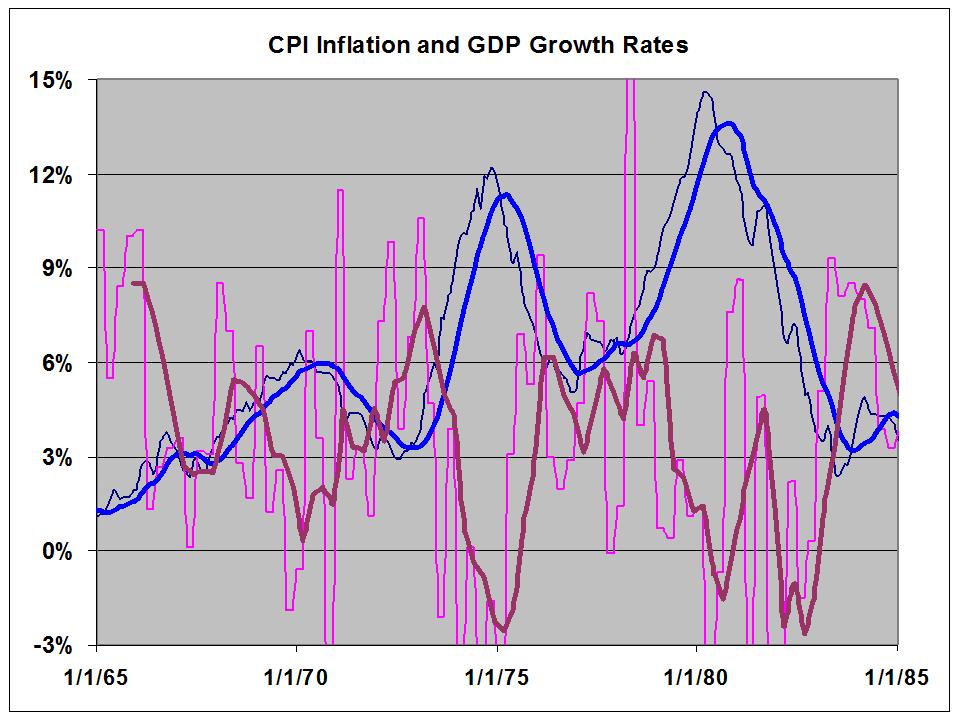
Stagflation is an unusual economic condition characterized by low growth and high unemployment (stagnation) coupled with generally rising prices and wages (inflation.)  This condition existed, persisted, and worsened throughout the 1970's.  Inflation during the 70's (1970 to 1980, inclusive) averaged a hefty 7.7%, while Real GDP growth averaged 3.2%, which is actually not too shabby, per se.  But - 1970 was an erratic growth year with two dips into negative territory; and both 1974 and 1980 were ravaged by deep, deep recessions.  Growth spurts were steep, but short lived. This roller coaster ride was all whiplash and few thrills.

This is what it looked like, inflation in blue, GDP growth in purple.


The lighter lines are the actual data, the heavier lines are annual averages.   Note the striking contrary motion.

The point of this post is to emphasize how different now is from the 70's.  Real growth over the last 8 years has averaged under 1.8%.  CPI inflation has averaged 2.5%.

Getting the two data sets on a single graph is a real pain in the ass, so here they are separately.

Here is monthly CPI data, with a 12 month average in blue and an 8 year average in yellow.


Here is GDP growth over the same period, with a trend channel.


The two data sets are now displaying something close to similar motion - I believe this is what most economists - or at least the Keynesians - would expect.

Here is the contrast.

70's
High inflation.
Wild gyrations in Real GDP growth, with a moderate average.
Recessions led to sharp recoveries.
Strikingly contrary movement between the data sets.

This Millenium
Low inflation.
GDP growth not changing much, except for the Great Recession trough, and clearly trending down across the period.
Recessions led to tepid recoveries.
Generally similar movement between the data sets.

A criticism against Keynesianism is that it couldn't account for stagflation.  Fair enough.  Does classical economics?  Does Austrian economics?   Not only no, but these schools of thought were rendered obsolete 80 years ago, when they couldn't account for an aggregate shortfall in demand.  What we have now is unlike the the 70's, in every respect I am aware of.

It is not unlike the 30's though. 

This is not a situation where Kenesianism needs to offer anything new.  This is a situation that Keynes understood very well, and the prescriptions that worked the first time around will work now as well.

There is no threat from stagflation. There is no threat from inflation.  There is a real threat from deflation, which is now seeming inevitable, both here and in Europe.

But people everywhere are worried about inflation.

We are SO screwed.

Saturday, May 28, 2011

Moron More on Short Term Interest Rates

A few days ago I drew these tentative conclusions:

1) The Fed has very little power to influence interest rates.
2) An attempt to move counter to the market might have an incalculable distorting effect.

But now, due to phantom inflation fears and the influence of zombie ideas, there are serious desires to raise short term rates both here and in Europe.

This is what 10 year bonds rates are doing.  I've posted the long term trend before.  You can see an update here.  Since peaking on Feb 8, well within the long range channel, rates have dropped from 3.725% to 3.06%.   Meanwhile, TIPS spreads have fallen from 2.66% on April 11, to  2.275% today.  The clear message of the market is that inflation expectations are low, and falling.

If the Fed succeeds in raising the Federal Funds Rate, which has been stuck at 0.25% for over two years, it will flatten the yield curve.  What will this accomplish?  With nominal rates vanishingly low, and inflation low, but still positive, we're in uncharted policy waters.  I suppose it depends on how far they go.  

Would a change of 0.25% matter to anyone?  Maybe not. But if it does, it will be harmful.

A change of 1% almost certainly would.  But with real short rates negative (nominal rate minus inflation {low, but still > 0.25%}) business is still sluggish.  What would a real positive interest rate do?

Still - the Fed usually makes it's changes in increments, not whole percentage point jumps.  Even a half percent change would be huge in the current environment.

Any attempt to raise short rates at this time would be a serious market distortion, in the direction of stifling the economy.  With unemployment high, the recovery sluggish, and no real sign of inflation, this would be insanity.

That word often gets used hyperbolically, but I am deadly serious.  It is very difficult to imagine a policy decision (short of adopting the Ryan budget plan) that would be more destructive to the economy - and more obviously so - than raising interest rates at this time.

Yet that is what very serious people want to do.

We're screwed.
.

Friday, April 29, 2011

What the Hell?!? Friday, Part 2 - "Dude, Where's My Inflation?!?" Edition

Via Krugman we find this FRED graph, showing a decade of inflation on a log scale.

Oh, and by the way: the hyperinflation types are not claiming some future event — they’re claiming that it’s happening now, and if you go back, you’ll find them predicting hyperinflation by 2010.


What those of us who are reality-based find is that we had an actual deflationary event when everything collapsed in late 2008.  Since then, inflation has returned to such a wild and extravagant extent that is has established a new trend line, with a lower slope.

But what about all that government spending, and deficits, and stuff?

Yeah -- What about it?
.

Wednesday, March 23, 2011

Food and Energy Costs

From Daniel Carroll, via Mark Thoma, via James Hamilton, a deep insight into how headline inflation affects the life styles of the poor and obscure.

Food at Home as a share of Income:

Bottom quintile -- 23.5%
Top quintile      --  3.9%

Energy Expenditures as a share of Income:

Bottom quintile -- 20.6%
Top quintile      --  3.9%

The bottom quitile spends 44.1% of income on subsistence.  And this doesn't include housing.  Or clothing. 

Sucks to be them, doesn't it.
.

Tuesday, February 1, 2011

Remember the 70's?

I'm fascinated by the differences between the period from approximately 1950 to 1980 from other periods, either before or after.  Actually, the unique period might be (and probably is) even narrower - from the mid 60's to circa 1980.  I doubt that Krugman shares my fascination, but just today he pointed out a unique characteristic of the 70's

The two big commodity price shocks of the 70s did, in fact, feed quickly into core inflation. Since then, however, nada.

Here's the picture he posted.


There's even a smaller third shock around '69-'70 that he doesn't mention.  What a stark difference: from 1968 to '80 the two inflation measures move almost in lock-step.  Since then, the sticky measure has been very unresponsive to price shocks - i. e. -- sticky.

I'm not sure I buy the COLA explanation - though I can't really say how or why.  It does seem to be at least consistent with the expectations view of inflation that David Beckworth and many other economist (including Krugman) put a lot of stock in.

Of course, in an environment where inflation expectations get unanchored, like the 1965-1979 period, nominal spending shocks will have a greater impact on the price level and less influence on real economic activity.  

Steve is ahead of me here, and thinks he's sussed it.  More to come, I'm sure.  Stay tuned.
.

Monday, January 3, 2011

Of Deficits and Inflation - Part 3

I'm going to let the cat out of the bag right up front.  Looking at 100 years of data has convinced me that over that span there is no meaningful correlation between Federal budget deficits and inflation.  To be clear, this doesn't just mean the absence of cause and effect - it means no correlation at all!

Here are the the variables we're looking at.  First, Federal Deficits, as percentage of GDP.


And CPI Inflation.  Data from the Bureau of Labor Statistics.


So far, in parts 1 and 2, we've looked at the post WW II period.  We'll get a somewhat longer view in this post.  And use a different, but related methodology.

In part 2 we saw the dramatic difference between the two periods before and after 1980, illustrated by taking the two periods as different data sets and doing some simple math - determining the slope of inflation apparently resulting from the deficit, with a defined time lag; and the correlation coefficient.   That gave us two data sets of over 20 points each, before and after the eyeballed date of 1980.   

To determine what is happening over time at a more detailed level, I took data chunks of 8, 13, and 21 years duration and swept them across the entire data set.

Here, we'll look at the slope of CPI per Deficit/GDP from 1940 on, for the 8, 13, and 21 year chunks, plotted as a function of the last year of the chunk.  The longer time periods yield smoother lines and generally later responses to changes.


Full disclosure: I also looked at the slope of a 5 year chunk, as you can see from the faint dashed pink line.  It's jumpy, makes the chart busier, and doesn't seem to add much useful knowledge, so we'll ignore it.

Sure enough, this confirms that something dramatic happened right around 1980, as all three lines took a nose dive, just about in concert.  Also note that the 8 and 13 yr lines peaked in 1971, almost a full decade earlier, and slumped though the 70's before the big 1980 fall.

What occurred next was an actual reversal.  For several years, deficits led to decreases in inflation.  Here, "led to" simply means "preceded," and not "was the cause of."  It's very hard for me to believe that there is any credible line of reasoning that would justify a negative cause and effect relationship between deficits and inflation.   Then, another reversal occurred as all the lines work their way back toward zero.  I believe these reversals to simply be secondary data artifacts, resulting from the collapse of apparent correlation through the 60's and 70's (the primary data artifact.)

Let's look at the other parts of the graph: 1940 to the early 60's and from the late 90's on.  We don't find much there: mostly flat lines, close to and roughly parallel to the horizontal axis.  There is some irregularity in the 50's, as the brief, steep post-WW II deflationary event manifests itself in the data sets.

For the sake of completion, here is the same data presented without the 3-year lag - the slope of inflation in the current year as the deficit.


What can we make of this kind of relationship?  Through the 40's, when deficits and inflation were both at extremely high levels, there was no recognizable correlation between deficits and inflation.  Over the most recent decade, when deficits have soared to Reagan era levels and beyond, and inflation was fairly steady at a relatively low level - before stumbling face-down on deflation's doorstep - there was no recognizable relationship.  Also, except for the 60's and 70's, the time lag doesn't seem to be very important.

In between, the slope went from strongly positive to strongly negative.  Here's my take.  A pair of variables that exhibit that kind of relationship, vacillating among positive, negative and  next to nothing, have no fundamental correlation.  They can exhibit, in limited time frames, some apparent temporary relationship, whether due to common cause or some exogenous environmental effect - basically, a rising tide lifting different boats.  I call this kind of ephemeral relationship "coincident correlation."   If you only looked at the 50's through the 80's, you could easily believe that deficits caused inflation.  I think that is the primary data artifact, due to coincidentally simultaneous rises in both.

Hence my conclusion: there is no stable, meaningful correlation between deficits and inflation.

But - whatever was going on in the first part of the post war period apparently slowed in the 70's and stopped around 1980.   That was a time of secular inflation, which has since passed.  It's origins now seem mysterious.

What do you think?
.

Monday, December 27, 2010

Inflation Alert!!!

OMG - LOOK AT ALL THIS INFLATION!!!

(It's the green line.  Follow the link.)

THE SKY IS FALLING.

(The green line at the bottom of the graph.)

WHAT ARE WE GOING TO DO??!?? - CALL GLENN BECK.  BUY GOLD!)

(It's crawling along the Index = 100 line.  Open your eyes.)

H/T to PK
.

Monday, December 20, 2010

Of Deficits and Inflation - Part 2

In Part 1, I took a hard look at deficits and inflation, from 1951 through 2009, and wound up with some questions.  One them was - "What does the very different look of the first chart before and after 1980 mean?"  Here, for your convenience, is the first chart.

I constructed cloud charts, as in part 1, for the data up to 1980, and after 1980.  The differences between the two time frames are striking.  The differences with different time delays are not.  I'm only presenting 3-year delay here.  Basically, all the charts up to 1980 make a pretty similar set, irrespective of time delay; and all the charts after 1980 make another similar set that is very different from the first.


As in part 1, The year over year change in CPI is plotted as a function of the deficit (as a percentage of GDP) three years earlier.  The slope is 1.73 - an increase of inflation of 1.73% CPI for each % of deficit, with a three year lag.  The correlation coefficient is an impressive .672.

Here is a similar plot for the years after 1980.


For this plot, the slope is only 0.168 - less than a tenth of the slope for the previous period.  The correlation coefficient is only .31.

Here is a plot of slopes and correlation coefficients for the two time frames, with CPI lags from 0 to 5 years.


In the earlier period, the inflation measure peaked three years later than the subject year, as did the correlation coefficient.  For this period, correlations in the two to four year range are all greater than .5 - the strong correlation region.

In the later period, the effect is slight, the response from 2 to five years flat, and the correlation coefficient low, indicating weak correlation.

The first time frame is based on 29 data points, so there is a pretty high level of statistical significance to the data.  The second time frame has a varying number of points, depending on the time lag chosen, but never fewer than 24.

The conclusion I draw from this is that from 1951 to  about 1980, and from about 1981 on represent two quite different economic environments.  The earlier period was characterized by secular inflation, and deficits led to higher inflation.  The later period was characterized by secular disinflation, and inflation has been quite insensitive to deficits.  Based on this data, I think we can make those statements with a high degree of confidence.

OTOH, I have no confidence at all about the future.  I'm afraid we've slipped into actual deflation, or something very close to it.  My guess is running deficits will do nothing to spur inflation, but that is speculative.  We shall have to see what we will see.

What this exercise suggests very strongly is the map of the economy has different regions, each having different characteristics that require different approaches (a la Keynes, frex.) I'm convinced that before and after about 1980, the post WW II era is divided into two distinctly different realms: an expansion phase followed by the great stagnation. The M1 multiplier had been sagging since the mid 80's, before it fell down in '08 and couldn't get up.

If I may editorialize a bit, the problem with Libertarians and Austerians is not that they are absolutely wrong, but they are right within a certain realm; and they let that make them think they are right in all realms - because, in their absolutism, they refuse to recognize that different realms exist.

Because of this one-concept-fits-all-circumstances mind set, they end up exploring the jungle in parkas and snow shoes. They forget (or deny) that Keynes didn't overturn classical economics (his big mistake, IMHO) he expanded it, the way Einstein expanded Newtonian mechanics.

What do you think?
.

Of Deficits and Inflation

It's part of common wisdom that Federal budget deficits are inflationary. 

Update: Here is an example.  And a direct refutation.

Well, common wisdom is a lot more common than it is wise.  Let's see how this bit of it stacks up.


Here's  a look at deficits, as a percentage of GDP, along with inflation, as measured by year-over-year change in the Consumer Price Index, since 1951.  For the graphs in the post, deficits are positive numbers, and surpluses are negative.  This trick is to allow a possibility for deficits and inflation increases to be positively correlated.  I'm not thrilled with CPI as an inflation measure, but I have the data at hand, so we'll just go with it.


It looks as if there might be two realms, from 1950 through 1980, with generally increasing deficits and inflation, and since 1980 with small or non-existent deficits and low to moderate inflation.  In 2009, we may have entered a totally different economic realm, but that remains to be demonstrated, at least with regard to these variables.

From 1950 to 1980, peaks in deficits and valleys in CPI line up almost perfectly.  Though in the big picture they are rising together, at the detail level the year to year correlation is actually inverse. Change your perspective a little, and deficit peaks seem to lead inflation peaks pretty consistently.  Since 1980, I can't see any relationship, no matter how hard I squint.

Here are some scatter plots of YoY CPI percentage change against deficit as a percentage of GDP.   First, both variables are measured for the same year.


Lots of scatter, a trend line that basically traces the 4% CPI line with a very slight positive slope, and a correlation coefficient of 0.0476 - essentially nothing.  But we are expecting the deficit increase to lead the CPI increase, so here's a look at a 1 year delay: Deficit vs CPI increase a year later.


The scatter doesn't go away, of course, but now we can see a bit of a trend; about 0.28% inflation for each percent of deficit/GDP in the previous year.  But, with all the scatter, the correlation coefficient is only .19 - very weak correlation, indeed.  So far we have a small slope, weakly correlated.  Let's look at longer lags.  Because of the lags, deficit values for recent years will fall out of the data set.  As can be see in the graph immediately above, 2009's 9.91% deficit was the first to go.


Though the scatter drifts a bit, the two and three year delays give pictures that are otherwise very similar. Here  we have a somewhat greater slope, about .4% inflation for each percent of deficit three years earlier.  The correlation, at .27, is a bit less weak, as well - but still pretty anemic.


Farther out, the trend line flattens back down, again close to a constant 4% at 5 years, and the correlation collapses to a measly .12.

What are we to make of all this?  My first thought is, with such low correlations - not too much.  But to see both the slope and the correlation rise and then fall again over a 5 year period does suggest that there might be a real cause and effect, operating with a lag of 2 to 4 years.  Here is a graph of the slopes and correlation coefficients from 0 to 5 years out.


I can think of two reason why correlations might be weak, even if the cause and effect is real:
-  Inflation is a function of more than one factor, so other things, possibly operating independently, can be equally or more important. 
-  If the time lags are meaningful, the lags from up to 5 years in the past are all operating together.  None of that is sorted out here.

Questions in my mind now are -

1) Is this correlation meaningful, or just a data artifact?

2) What does the very different look of the first chart before and after 1980 mean?

3) Do the current large deficits suggest that there may be some inflation around 2012 to 2013?

4) Or are we now in a different realm where deficits either don't correlate with inflation, or perhaps correlate in a dramatically different way?

This exercise has been rich in generating questions, but not too effective in generating answers.

What are your thoughts?
.

Sunday, November 28, 2010