Look: I am eager to learn stuff I don't know--which requires actively courting and posting smart disagreement.

But as you will understand, I don't like to post things that mischaracterize and are aimed to mislead.

-- Brad Delong

Copyright Notice

Everything that appears on this blog is the copyrighted property of somebody. Often, but not always, that somebody is me. For things that are not mine, I either have obtained permission, or claim fair use. Feel free to quote me, but attribute, please. My photos and poetry are dear to my heart, and may not be used without permission. Ditto, my other intellectual property, such as charts and graphs. I'm probably willing to share. Let's talk. Violators will be damned for all eternity to the circle of hell populated by Rosanne Barr, Mrs Miller [look her up], and trombonists who are unable play in tune. You cannot possibly imagine the agony. If you have a question, email me: jazzbumpa@gmail.com. I'll answer when I feel like it. Cheers!
Showing posts with label taxation. Show all posts

Wednesday, June 17, 2015

Effort and Reward

Jim Kwack cites Milton Friedman with the idea that inherited wealth should be taxed at the same rate as regular income.   Given a modest exemption - say a few million dollars, to avoid destroying family businesses - I concur.

I'm not sure I believe Friedman when he says this, though.
The man who is hard working and thrifty is to be regarded as ‘deserving’; yet these qualities owe much to the genes he was fortunate (or fortunate?) enough to inherit.”

This deterministic idea gives the individual no credit at all for his own hard work and dedication, and implies that twins should be equally hard working and "deserving."  Even more insidiously, though, it enables thinking about the unsuccessful in terms of a stereotyped notion of hereditary laziness for those inheriting less fortunate genes.  Down that road lies eugenics.

The lucky sperm club notion does have merit, though.  Not in terms of abilities but in terms of financial stability and backing, educational opportunities, network connections, access to health care and numerous other intangibles.

I have a different take from Friedman, more along the lines of the ideas expressed in comments to Kwack's article by Charles Broming.   Luck - and not of the genetics dice-roll type - plays a huge and generally unrecognized roll in the success or failure of any endeavor.  Two identically talented and ambitious entrepreneurs can set up identical businesses on the same day and one might succeed while the other fails due to either completely random factors like the weather, a change in traffic patterns or gentrification, or some other uncontrollable external factor; or due to unequal opportunities like available financing, suitability of location or a variety of other luck-related circumstances.

Two identical baseball pitchers can have widely different results due to the park they play in, the quality of the defense behind them, and the run support given by their own offense.   This barely hints at the notion of unequal opportunities.

Beyond that, there is the fact that rewards are not distributed linearly with respect to outcomes.  In fact, reward levels can often be quantized.  This, from the world of pro golf, is illustrative.
The difference between making it back onto the tour and being demoted to the Nationwide might only be a couple of dozen golf shots over the course of a season, but the financial repercussions are huge. Prize money on the Nationwide is only about 10% of the tour’s. Last year’s top moneymaker on the PGA Tour, Luke Donald, made $6.7 million on the golf course; the top player on the Nationwide Tour made $414,000. Most Nationwide events are not televised, and endorsement deals are one-third as big, if not smaller. If playing on the PGA Tour is like having your product stocked at Wal-Mart, competing on the Nationwide is like selling through a regional supermarket chain.

I firmly believe that a more equal society is, generally speaking, better than a society characterized by stark and growing inequality.  Whether this notion is supported by brute economics or not; a humane consideration of quality-of-life issues for the have-nots influences the equitability and stability of society in numerous non-trivial ways.

All of this lends support to my belief in high inheritance taxes and a steeply progressive income tax.


Monday, April 21, 2014

Republicans: All Wrong, All the Time, Pt. 12 - Taxes and Revenues

While mucking around in the archives, I somehow made this old post from 2/25/10 inaccessible.

So, I'm reposting it now, because it has important information.

________________________________________


 The liars at the Heritage Foundation will tell you that lowering taxes increases federal Revenues.

A New York Times article, Deficit Spending Can Help Republicans, by Daniel Altman, shows that old, wrong assumptions die hard. The article reports that:
"From the beginning of 2001 through the third quarter of 2002, the federal government leapt from a surplus (including Social Security) amounting to 2.3 percent of gross domestic product to a deficit of the same size. By itself, the current deficit is not terribly threatening. Indeed, running a modest deficit during an economic downturn can be useful, as long as the policies behind the deficit — lower taxes and higher spending — benefit consumers and businesses."
The article then claims that the 1980s Reagan tax cuts failed to increase tax revenues;
"The White House says lower tax rates will lead consumers to work more and businesses to expand, resulting in higher tax revenues and eventually closing the budget gap. That notion, chided as "voodoo economics" by critics, turned out to be false when it was last in vogue, during the 1980's."
However, the numbers, crunched by Heritage's Brian Riedl, show otherwise (see chart below). In 1980, the last year before the tax cuts, tax revenues were $956 billion (in constant 1996 dollars).
Revenues exceeded that 1980 level in eight of the next 10 years. Annual revenues over the next decade averaged $102 billion above their 1980 level (in constant 1996 dollars).


They even offer this chart as proof!  (Click the link, expressed in constant 1996 dollars.)  But the real Voodoo is in achieving an actual reduction in revenues, as they did according to the Heritage Foundation figures in 1982 and (quire dramatically) 1983, in the context of an economy that has achieved 3.7% annual growth for 200 years!

And that is key.  Every year the population grows.  Almost every year the economy grows.  There is inflation in the background, most of the time.  In fact, the compounded annual growth rate of federal tax revenues from 1970 through 2008 was just slightly over 7%.   (Current dollars, not inflation adjusted.)

Here is reality, presented in non-inflation adjusted dollars   Data from the Congressional Budget Office.


Actual revenues are shown on the broken red and blue line, with segments color-coded to indicate the party of the White House occupant.  The purple curved line is the 7% growth line, starting in 1970.   The pink line is the best-fitting straight line.  Each President's term has also been overlayed with a best fitting straight line. In retrospect, these straight lines don't tell us much of anything. 

One interesting facet of this display is that most of it lies well above the 7% growth curve.  This is entirely due to increases during the Carter and Clinton administrations, as a visual inspection reveals, and we will also prove mathematically.

Here is the compounded  annual growth rate of tax revenues, by President, over the 1970 to 2008 period.


Well, Nixon and Ford managed to top the long period average by a slight margin, but they were not under the thrall of Voodoo Economists.  Neither was Clinton.  Bush I wasn't either, but he inherited Reagan's vultures.  Look at Reagan's revenue growth rate: 5.35%.  Consider that average inflation over Reagan's years was 4.56%, and GDP growth averaged 3.4%.  Under those circumstances, revenue growth should have been at least 7.96%, not a paltry 5.35%.  The average compounded growth in constant 1996 dollars, using the Heritage Foundation table is 2.38%.  This is more than a full percentage point below real GDP growth. 

Bush II's revenue growth rate was 3.01%.  But inflation averaged 2.84% and GDP growth averaged an anemic 2.16.  Together they total 5.0%.  So, Republican tax revenue growth cannot even match the inflation adjusted level of growth in the economy.


Many years ago, my dad told me that figures don't lie, but liars sure know how to figure.  The bullshit you get from the Heritage Foundation is exactly what he was talking about.  It's another example of the conservative ploy of willfully denying reality.

Which is just one more reason why WE ARE SO SCREWED.
.


Saturday, February 1, 2014

Real GDP per Capita

My last Angry Bear post generated such a wonderfully amusing comment stream that I couldn't resist posting a follow up.  One of the criticisms was that I didn't consider Real GDP per Capita.  At the risk of having anyone think I accept homework assignments from trolls, here is a look at that very thing.  I'm snowed in tonight, so what the hey.

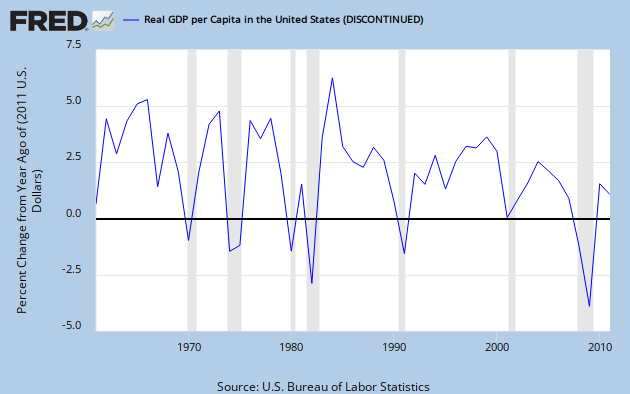
I usually like more finely granulated data over a longer time span, but sadly discontinued FRED series USARGDPC gives us annual data from 1961 through 2011, and that's plenty good enough to make a point; the point being that the American economy is dying a slow and agonizing death.  This, alas, despite enormous tax cuts enduring over decades.  For the supply-siders among you, we'll take an extra special look at the Reagan years.

Graph 1, from FRED, shows YoY RDGP growth over the span of the data series.

Graph 1 - RGDP per Capita, YoY % Change

The single most prominent feature of this trace is the downward trend over time, characterized by both lower lows and lower highs.  This should be pretty obvious, even to the causal observer; but if you cannot see it, don't be disturbed, I'm going to help.

 Graph 2 shows the same data, along with some trend indicators.

Graph 2 - RGDP per Cap, % Change, with extra colored lines

Parallel trend channel boundaries are indicated in red and green, with the center line in yellow.  The Excel generated least squares trend line is in dark blue, and a moving 5 year average in purple.  Each of these additions is a visual aide, indicating that the trend over time has, indeed, been down.  Certainly, it has not been monotonic.  The real world seldom works that way.  But what you see here, with some exceptions, are mostly worsening recessions, and increasingly anemic recoveries.

Next, let's focus in on the 5 year average.  Graph 3 gives that to us, along with it's own set of trend lines.  The vertical axis is truncated relative to graph 2, and the downward slope is therefore emphasized.  This makes it easier to see that the 1990 peak is considerably lower than the double peak of '66 - '69.


Graph 3 - 5 Year Average of RGDP per Cap Change, with extra colored lines

The 5 year average is in purple.  The base data and least squares trend line are in grey, The red, green and yellow lines are again parallel channel boundaries and midline.  The last time the average line touched the top channel border was in 2000.  After that, despite the Bush tax cuts, things went into a bit of a decline, culminating in the worst financial disaster since the Great Depression.

I know what you're thinking.  The next to last peak in Graph 3 came in 1990, the culmination of the Reagan miracle, just before his buzzards came home to roost, costing Bush Sr. his chance at a second term.  But remember that that peak is considerably lower than those of the 60's, and scarcely above the mundane years of '70 to '73.

And back in graph 2, the highest single growth year ever was in 1984, the third year of phase-in for Reagan's 1981 tax cut.  Well, sure - but note that 1984 was a one-off, and also the recovery year from an exceptionally deep Fed-induced double-dip recession in the previous 3 years.  So, beside a lot of pent up demand, there were a few other things going on that might have given RGDP a boost.

Graph 3 shows the Effective Federal Funds Rate, which made an erratic drop from a high of just over 19% in mid '81 to 15% in early '82, then to under 9% by 1984. 

Graph 3 - Effective Fed Funds Rate, 1980 to '84

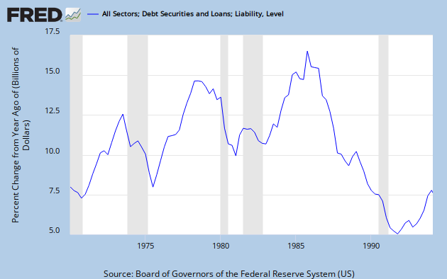
Graph 4 shows the explosion of credit that occurred coming out of 1982.  By 1984 it was close to an all time high.  It finally reached that peak in 1986, then collapsed.for the rest of the decade.

Graph 4 - Credit Expansion, 1978 to 1994

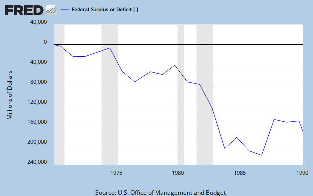
And let's not forget that Reagan was responsible for what was at that time, the most profligate explosion of federal spending ever seen, as shown in Graph 5.

 Graph 5 - Reagan's Deficit Spending

So let's recap.

Big picture: Decades of tax cuts have not led to increasing prosperity.  Quite the opposite.  The growth rate of RGDP per capita has declined substantially since the tax cuts of the 60's, and most severely since the 2001 tax cuts.  The ensuing change in RGDP/Cap growth is somewhat reminiscent of what happened from '69 to '75, but as yet without much recovery.

Focus on the Reagan years: After a long and deep recession, tax cuts plus the steepest decline in nominal  interest rates ever seen in the 20th century, plus a huge expansion in federal spending, plus an explosion in credit resulted in a single year of outstanding GDP growth, followed by four decent but less than stellar years, which incidentally also included the 1986 tax cut.  Then, alas, in 1991, there was another recession.

If you can look at this data and still have the opinion that tax cuts boost the economy, then knock yourself out.  Everyone is entitled to an opinion.  But you might want to ponder why your opinion has so little overlap with reality.

I welcome your comments, but please keep them more or less relevant to the topic, and if you are going to disagree, please bring more than assertions.  Facts and data have some gravitas. 


Wednesday, January 29, 2014

Republican State of Disunion: Taxes Edition

The Republican response to the President's State of the Union message was delivered by Washington State Rep. Cathy McMorris Rodgers.  It was personal, platitude-ridden, overtly religious, twee, and devoid of policy content or anything else of relevant substance - other than a naked assertion that BHO's policies are making life harder in myriad unspecified ways. In other words, it was the most you could expect from an intellectually bankrupt party whose only agenda item is to make the President fail.

To be fair, she did offer one concrete recommendation: to lower taxes.  The concept that lowering taxes would be beneficial at this point is one of those zombie ideas that not only won't die, but continues to eat peoples' brains.  For example, in a recent AB comment stream, this idea was put forth: "Substantial tax cuts worked under Kennedy, Reagan, and Bush. Given the much higher level of household debt, a bold tax cut was needed more than ever."

As I've demonstrated before, and shortly will again with actual facts and data, there is no reason to believe that lowering taxes improves the economy.    But first, let's remember two important details.  First, over 45% of Americans don't pay any federal income tax.  The Wall Street Journal calls them "Lucky Duckies."  Imagine the great good fortune of making so little money that you don't qualify to be taxed on your earnings.  Second, as Bruce Bartlett pointed out 4 years ago, "tax filers with adjusted gross incomes between $40,000 and $50,000 have an average federal income tax burden of just 1.7%. Those with adjusted gross incomes between $50,000 and $75,000 have an average burden of 4.2%."

So the opportunity to have tax cuts do much to promote real economic growth is somewhere between slim and nonexistent.

Let's look at the actual information we have on tax rates and Real GDP growth.*  Graph 1 shows the top marginal rate in blue and the capital gains rate in green from 1950 through 2011.  Also included in brown [right scale] is the YoY percent change in RGDP [annual data] and a linear RGDP growth trend line.  The major trend in each of these phenomena slants down over time.

Graph 1 - Tax Rates and GDP Growth since 1950

Graph 2 is a scatterplot of RGDP growth vs top marginal tax rate, same annual data as in graph 1.

 Graph 2 - Scatterplot of RGDP Growth vs. Top Marginal Tax Rate

The points are color-coded Red for Republican administrations, and blue for Democratic administrations.  Again, a trend line is included, showing a positive slope.  I find it interesting that the space below the trend line is dominated by red dots.  You might not.  The data arranges itself  in columns because the tax rates tend to remain constant for several years at a time.  There is a great deal of scatter since many things besides the tax rate influence the economy.  The simultaneous general abandonment of a Keynesian approach over the period is notable in this regard.

It might be a bit simplistic to think that a current tax rate influences GDP growth in the immediate year, so I took some long averages and redid the scatterplot.   Graph 3 is a plot of the 8-year averages of both top marginal tax rate and RGDP growth.  This has the additional advantage knocking down the data columns.


Graph 3 - Scatterplot of RGDP Growth vs. Top Rate, 8-Yr Avgs.

The 8th year of each administration that lasted that long is indicated with a red dot for Republican and a bright blue dot for Democrat.  Make of it what you will.  The general trend over time is from the top right to the lower left of the graph, and the highlighted dots appear in strict right to left chronological order, from Ike at the right though Kennedy-Johnson, Nixon-Ford, Reagan and Clinton to G. W. Bush at the left. A similar graph of 13-year averages tells the same story, but with all of the the dots landing closer to the trend line.

It does appear from graph 3 that lowering the top rate from 91% to 70% might have been associated with higher RGDP growth.  But, note from graph 2 that the spread of RGDP values at 91% is far greater, and that the highest individual RGDP values are at the higher tax rates.  The 50's, when most of the 91% values occurred, were characterized by a series of economic shocks and recessions as the U.S. returned to peace time conditions and absorbed several million WW II veterans into the work force.

Graph 4 is a close-up view of the 8-Yr average graph starting with the Reagan administration.

Graph 4 -  RGDP Growth vs. Top Rate, 8-Yr Avgs.from Reagan on

The eight years of the Reagan administration are indicated with red dots, GHW Bush in orange, Clinton in bright blue, and GW Bush in purple.  The later is most notable for making the 8 year average of RGDP growth dive off a cliff.  And before you get too excited about the transient RGDP increase in the late Reagan years, remember he also ran deficits that dwarfed anything seen up to that time.

The record of the Clinton years not withstanding, I'm not going to get into a post-hoc discussion of higher taxes causing higher growth - though the data up to at least the 70% level is consistent with that assertion.  Correlation is not causation.  On the other hand, the absence of correlation absolutely refutes causation. What one may say with absolute certainty is that in the post WW II United States, tax cuts have never led to a sustainable increase in RGDP growth.  The lone possible exception is the cut in the 60's from 91% to 70%.  It's plausible that cutting from an extremely high tax rate might be beneficial, but, due to the extreme volatility of the early post WW II period, the effect in that case is not at all clear.

So if anyone tries to tell you that cutting taxes in the current set of conditions will stimulate growth, feel free to show them this post.

_________________________________________

* Top marginal tax rates from Citizens for Tax Justice.
Capital Gains Tax rates from the Tax Policy Center.
RGDP data from FRED


Thursday, May 2, 2013

Big Illegal Alien Tax Derp

A friend sent me the link to this vid.  It's so full of po' white angst and big scary numbers.


My comment:

Without condoning any kind of tax fraud or other crime, I have to say I'm a lot less troubled about this money going to [what I assume to be] poor people in whatever country than I am about the even greater number of billions of dollars handed LEGALLY as tax rebates to filthy-rich, resource-polluting trans-national mega-corporations in the petroleum industry, and the huge number of other highly profitable corporations that pay little tax, or none at all - in part because of off-shore tax havens.

In all seriousness, 4.2 billion is a big scary number, but if you look at the problems that ought to be addressed by the U.S. in priority order, this probably wouldn't make the top 100.

And I have to suspect that the pasty-faced, oh-so-patriotic southern Indiana news hawks who put this together are more than a little bit influenced by the brownish skin of those who benefit from this situation.  Sorry, that's just ugly reality.   Meanwhile, too-big-to-fail lily-white bankers on Wall Street are robbing us blind every day.

When's the last time you saw a 6 minute news report video on that subject?
.

Monday, October 15, 2012

GDP Growth Caused By Tax Cuts Has Never Happened

Mike's post here got me thinking.  I'll telegraph my conclusion.  He dramatically understated his case.

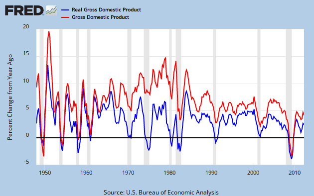
You can see the long range view of nominal and inflation adjusted GPD growth in Graph 1 of FRED quarterly YoY percent change data.


Graph 1 YoY growth Nominal and Inflation Adjusted GDP

Nominal GDP Growth was in a secular up-trend from 1960 through 1980.  However, inflation adjusted GDP growth quickly peaked after the Kennedy-Johnson tax cut, reaching a maximum value of 8.5% in Q4 of '65 and Q1 of  '66.  It then dropped dramatically for the next four years.  This peak value has been matched only once since: in 1984, during a sharp rebound from the double dip recession of 1980-82.

Since then, in the wake of numerous tax cuts, the rate of GDP growth has been anemic. To get a look at the rate of growth, I took an 8 year average of the annual percent change data presented above, and then plotted a 5 year rate of change for that data.  This is essentially the 2nd derivative of GDP, or GDP acceleration, as shown in Graph 2.


 Graph 2  GDP Acceleration

 Inflation Adjusted GDP acceleration peaked in Q3, 1966.   Fueled by the inflation of the 70's, NGDP acceleration stayed high until Q1, 1980, then plummeted for 9 years.  It has been relentlessly negative since.

Inflation adjusted GDP acceleration has not done quite as badly in this disinflationary era, but has been below zero more than half the time since 1970.  This is a little bit worse than coasting.

This all might seem a bit abstract, but the message is clear.  If tax cuts were good for the economy, then GDP growth would be increasing.  In other words, acceleration would be positive and most especially so after a tax cut.  The data is not consistent with this notion.

Clinton's famous tax increase preceded increased GDP growth by either measure, and an upturn in acceleration.  The Bush tax cuts preceded decreasing GDP growth.

I'm not going to get into a correlation vs causation discussion.  I'll simply say that tax cuts over 5+ decades have been an utter failure at stimulating real economic growth in any inflationary environment.  Since the real world data correlation is counter to the received conservative wisdom, it might be worth trying an anti-conservative approach.

It might also give the NGDP targeting enthusiasts something to ponder.

Cross posted at Angry Bear.

Wednesday, September 26, 2012

The Effect of Capital Gains Tax on Investment - Appendix

In comments to my previous post, Robert requested the unsmoothed data from Graph 3.  Here it is.   GPDI is plotted against the Capital Gains Tax Rate.


Since the Capital Gains Tax Rate (X-axis) is quantized, the result is columns of data.  Compared to the smoothed version, there is little change in either the slope or intercept of the best fit straight line.  R^2 is, of course, much lower.


Tuesday, September 25, 2012

The Effect of Capital Gains Tax on Investment

Matt Yglesias, servitor to our corporate overlords, suggests that the reduced capital gains tax rate paid by rentiers like Willard Romney is really a very, very good thing.  To wit:

The main reason Romney's effective rate is so low is that the American tax code contains a lot of preferences for investment income over labor income.
. . .
But this is definitely an issue where the conservative position is in line with what most experts think is the right course, and Democrats are outside the mainstream.
.  .  .
That's the theory, at any rate. It's a pretty solid theory, it's in most of the textbooks I've seen, and it shapes public policy in basically every country I'm familiar with. Even researchers like Thomas Piketty and Emmanuel Saez (see "A Theory of Optimal Capital Taxation") who dissent from the standard no taxation of investment income position think capital income should be taxed more lightly than labor income. Empirically, it's a bit difficult to verify that variations in capital gains tax rates and the like really are making a material difference to investment levels. But then again the data is noisy.

Scott Lemieux at LGM demurs.

Sure, if you 1)accept the premise that reducing or eliminating capital gains taxes will result in productive infrastructure investments rather than worthless accounting tricks, 2)ignore the economic benefits created by consumption, 3)assume that significant numbers of people will forgo money for doing nothing just because the profits will be taxed , and 4)ignore the fact that in most jurisdictions consumption is also “double taxed,” then reducing capital gains taxes looks good.   But since all of these assumptions are (to put it mildly) highly contestable, it’s just question-begging.

My response to Matt is that in my jaundiced opinion, you might as well consult The Necronomicon of Abdul Alhazred as an economics textbook for an issue like this; and that in a world that has on the one hand Krugman, Thoma and Delong, and on the other Fama, Cochran and Cowan, a consensus among experts is about as likely as lions lying down with lambs for some purpose other than a quick snack.

To Scott I say, why assume or ignore anything when that oh-so-noisy data is readily available?

Tuesday, September 18, 2012

Who are the 47%? Follow-up

Follow up to Afferent Input's post.

Ten states that are the highest in income tax non-payers are highlighted in (of all things) RED.

It just gets better and better


Via my former governor.

Sunday, May 6, 2012

Corporate Tax Rate and Revenues

Art directs us to this article at Remapping Debate by Craig Gurian, containing this graph of effective corporate tax rates and tax revenue as a percentage of GDP.   He also disputes the graph title's claim that as rates go down, so does the revenue share of GDP.  He has a point.  After about 1982, the tax revenue/GDP line never makes another new low, while the effective tax rate keeps dropping.

Let's have a close look.   In graph 1 below, I've added parallel channel boundaries and a few other details to both lines.  

Graph 1 Parallel Trend Channels


From the high around 1950, the effective rate line travels in a well defined trend channel.   I've imposed a parallel channel on the blue line, with less than satisfying results.   In each channel we can see two areas of more or less sideways motion, underscored in black, the first in the 70's, and the next, following a drop in both lines, begins in the early 80's.

In the 70's, the orange effective tax rate line made an excursion from the channel bottom to the channel top, while the blue revenue by GDP line stayed about in the middle third of its channel.  In the 80's, after an initial rise, the orange line had a slight downward trend, while the blue line had a slight upward trend, both indicated by brown arrows.  In the 2001 recession (green vertical line,) the effective rate took a big drop, while the blue line merely sagged a little.

Those three details account for the major discrepancies between the two lines.  In fact, the sideways motion in the blue line since 1982 can be seen as a long, slow excursion from channel bottom to top - with a bit of an overshoot.

While lines in channels can slither in a variety of ways, two characteristics we look for in declining channels are successively lower tops and successively lower bottoms.  The orange line is well behaved in this way.  Not so the blue line, which has made no new low since 1982, instead bouncing two more times off of the 2% line.  However, the major top in the blue line in 2006 is just barely below the top of ca 1979, as indicated by the horizontal green line.

Art notes that the distance between the lines has narrowed since 1982.  However, since the 2003 bottoms, the distance has been essentially constant, as indicated by the red arrows.  (FWIW, this same gap occurred earlier, in about 1966.)  He also notes the denominator effect.  GDP growth has been slower since the early 80's than it was in the earlier post WW II decades, and this would tend to give the blue line a boost.

Though graphed together, these lines have very different scopes, as indicated by the two scales.  There is no reason for the two channels to be parallel; and, since both data sets are the resultants of many factors, there is no reason to expect them to move in lock-step over long periods.

In graph 2, I've given the blue line a slightly different channel, with parallel borders aligned to its own highs and lows.  In this view, the long horizontal trek from 1982 to 2006 is an excursion from the bottom to the top of the channel.


 Graph 2 Independent Trend Channels

In a big picture sense, Gurian has it right.  Lowering the effective rate lowers tax revenues as a percentage of GDP.  But Art's point is also valid.   Thee has been no new low in 30 years.

I think the denominator effect that Art mentioned plays a part.  Another thing to think about is that each of these data sets is bounded, and can be effected by, a zero lower limit.  The effective rate is nowhere near it, but the revenue share percentage has been close to it during the entire horizontal period.  So the sideways trek of the revenue share line might be a data artifact caused by some sort of edge effect.  FWIW, the corporate percentage of total tax revenues has followed a similar path, and has been essentially horizontal since the early 80's.

Anyway, it will be interesting to see how these data sets continue over the next few years.


Tuesday, February 7, 2012

What Was America's Golden Age?

In comments at Art's place, Gene Hayward asked both Art and me to describe the characteristics of America's Golden Age.

This was the period following WW II, spanning roughly 1950 through the mid 70's, or perhaps a few years later, when the United States experienced robust GDP growth.  Though this growth was far from consistent, it was on average, considerably higher than what we have been able to achieve since.

I've looked a GDP a lot, and in a lot of different ways.  The tag list low in the right hand frame indicates over 40 posts on this blog tagged GDP.  Here is a fairly recent one with a graphic demonstration of how the Golden Age differed from the Great Moderation Stagnation that followed.  A more detailed graph with historical commentary can be found here.

The most important defining characteristic of the Golden Age is this GDP growth record.  The next questions are what were the causes and the results?

For causes, I would consider:

Steeply Progressive Tax Rates
Strong Unions
Social Safety Net
Growing Income in the Labor Force and an increased Standard of Living

Regulations on Businesses
Particularly the Strong Regulations on Banking and Finance enacted during the Great Depression, and most particularly Glass-Steagall.
Fiscal Policies consistent with Keynesian Economics

Results:

Robust middle class
Relative equality in income and wealth
Sharp reduction in the number of people in poverty
The Strong Economic Growth that characterized the period

One might consider that the results cycle back into the causes creating a virtuous spiral.  That's how I see it.

Another characteristic of this period was secular inflation.  In this environment, a commodity price shock can send inflation soaring, and that happened twice in the 70's.  I distinctly remember some time in '73 or '74 thinking that nobody would ever look back on that time as "the good old days."  Then disco music came along and sealed the deal, but that's another story.

Shortly thereafter, Volker came along and slayed the inflation dragon.  Since then, we have had secular disinflation.  As you can see in the link above, in this environment, commodity price shocks have not caused inflation spikes.

The Reagan administration vigorously continued the deregulation trend started under Carter, and dramatically changed the tax code (lowering tax receipts relative to GDP, and shifting the burden from the rich to the declining middle class.)

Since then - except for Clinton bucking the trend, at least partially - it's been all lower taxes and deregulation.  This has skewed both income and wealth toward those that already have the most.  The result has been the Great Stagnation, and the slow strangulation of the American Economy.

Monday, November 28, 2011

Repost Ripost

A slightly edited version of my post from Feb 20, Federal Government Tax Receipts, was reposted today at Angry Bear, to my great delight.  It has generated a lot of controversy.  Basically, my stating that FICA, aka "the payroll tax" is a tax is getting some hard blow back.

More heat than light, though, it seems to me.  Still, it's nice to have a wider audience.


Wednesday, November 2, 2011

Sunday, October 30, 2011

Quote of the Day

From Bill Mitchell:

In the midst of the on-going debates about labour market deregulation, scrapping minimum wages, and the necessity of reforms to the taxation and welfare systems, the most salient, empirically robust fact of the last three or more decades – that actual GDP growth has rarely reached the rate required to maintain, let alone achieve, full employment – has been ignored.

 I don't think I need to elaborate, even a little bit.  At least not beyond what I've already said.

H/T to Art.


Thursday, October 13, 2011

Quote of the Day - Lizard Attacks

A potential source for Herman Cain's 9-9-9 tax plan.


"We encourage politicians to continue to look to innovative games like SimCity for inspiration for social and economic change," said Katsarelis. "While we at Maxis and Electronic Arts do not endorse any political candidates or their platforms, it's interesting to see GOP candidate Herman Cain propose a simplified tax system like one we designed for the video game SimCity 4."
Adopting such a simple tax structure, Katsarelis said, would allow fantasy political leaders to focus their energy on infrastructure and national security. "Our game design team thought that an easy to understand taxation system would allow players to focus on building their cities and have fun thwarting giant lizard attacks, rather than be buried by overly complex financial systems."

The beauty of Cain's plan is that it is yet another conservatard ploy to transfer the burden of taxation from the wealthy to the poor.  You do realize, I hope, that between 20 and 40 % of the population pay no Federal Income tax, because they do not make enough to qualify as taxpayers.  In the middle quintile, the effective rate is only around 3%.  The Cain ploy hits the poor with the double wammy of AT LEAST tripling their Federal income tax, while also substantially increasing their sales tax, and giving huge ADDITIONAL tax advantages to to the rich.  And the more you make, the bigger the advantage.  It's freaquing BRILLIANT.

Best of all, it illustrates that Cain's plan - which is fine in an imaginary world where you need to worry about lizards - would make us all have fun thwarting the attacks of lizard people.


Monday, August 15, 2011

Quote of the Day - Warren Buffet on Taxation

Stop Coddling the Super-Rich

Back in the 1980s and 1990s, tax rates for the rich were far higher, and my percentage rate was in the middle of the pack. According to a theory I sometimes hear, I should have thrown a fit and refused to invest because of the elevated tax rates on capital gains and dividends. 

I didn’t refuse, nor did others. I have worked with investors for 60 years and I have yet to see anyone — not even when capital gains rates were 39.9 percent in 1976-77 — shy away from a sensible investment because of the tax rate on the potential gain. People invest to make money, and potential taxes have never scared them off. And to those who argue that higher rates hurt job creation, I would note that a net of nearly 40 million jobs were added between 1980 and 2000. You know what’s happened since then: lower tax rates and far lower job creation. 

Since 1992, the I.R.S. has compiled data from the returns of the 400 Americans reporting the largest income. In 1992, the top 400 had aggregate taxable income of $16.9 billion and paid federal taxes of 29.2 percent on that sum. In 2008, the aggregate income of the highest 400 had soared to $90.9 billion — a staggering $227.4 million on average — but the rate paid had fallen to 21.5 percent.

Tuesday, August 2, 2011

Investment, Consumption, and Progressive Taxtion

This is the title of a thoughtful and thought provoking post by Bruce Webb at AB.

If you go read it, as a no-extra-charge bonus you get to see me make a horrendous blunder in comments.
.

Monday, August 1, 2011

Monday, July 18, 2011

On the Other Hand Though, Perhaps . . .

.  .  .  we're Not So EXCEPTIONAL, after all.

Some history lessons, via Paul Glastris at the Washington Monthly.

As it happens, the willingness of the rich to defend their wealth from taxation to the point of national ruin is nothing new in world history, as Francis Fukuyama recounts in his magisterial new book The Origins of Political Order. The Han dynasty in China fell in the third century AD after aristocratic families with government connections became increasingly able to shield their ever-larger land holdings from taxation, which helped precipitate the bloody Yellow Turban peasant revolt. Nearly a millennium and a half later, the great Ming dynasty went into protracted decline in part for similar reasons: unable or unwilling to raise taxes on the landed gentry, the government couldn’t pay its soldiers and was overrun by Manchu invaders.

In the fifteenth century, the Hungarian King Matthias Corvinus persuaded his reluctant nobles to accept higher taxes, with which he built a professional military that beat back the invading Ottomans. But after his death the resentful barons placed a weak foreign prince on the throne and got their taxes cut 70 to 80 percent. When their undisciplined army lost to Suleiman the Magnificent, Hungary lost its independence.

Similarly, the cash-strapped sixteenth-century Spanish monarchy sold municipal and state offices off to wealthy elites rather than raise their taxes—giving them the right to collect public revenues. The elites, in turn, raised taxes on commerce, immiserating peasants and artisans and putting Spain on a path of long-term economic decline. This same practice of exempting the wealthy from taxation and selling them government offices while transferring the tax burden onto the poor reached its apogee in ancien regime France and ended with the guillotine.

By contrast, in England during the same period, the nobility and gentry didn’t conspire with the crown to exempt themselves from taxation. Instead, thanks to a number of factors—greater social solidarity, a keener sense of foreign threats, reforms that made the government itself less corrupt, and the principle of taxation only with the consent of Parliament—the wealthy of England willingly accepted higher taxes on themselves. As a result, government spending in England rose from 11 percent of GDP in the late seventeenth century to 30 percent during some years in the eighteenth century. That’s higher than U.S. federal spending today. These higher taxes on the wealthy in England, Fukuyama notes, “did not, needless to say, stifle the capitalist revolution.”

Higher taxes on the rich won’t stifle America’s economy either. Nor, I think, would most wealthy Americans object to paying more if they truly understood that the fate of the country is on the line. Unfortunately, the GOP may now be too ideologically rigid to see the real interests of its own wealthy constituents. History shows that the rich sometimes make suicidal decisions. The challenge of American democracy right now is to somehow keep ours from doing so.

Makes ya wonder . . .
 .