I usually like more finely granulated data over a longer time span, but sadly discontinued FRED series USARGDPC gives us annual data from 1961 through 2011, and that's plenty good enough to make a point; the point being that the American economy is dying a slow and agonizing death. This, alas, despite enormous tax cuts enduring over decades. For the supply-siders among you, we'll take an extra special look at the Reagan years.
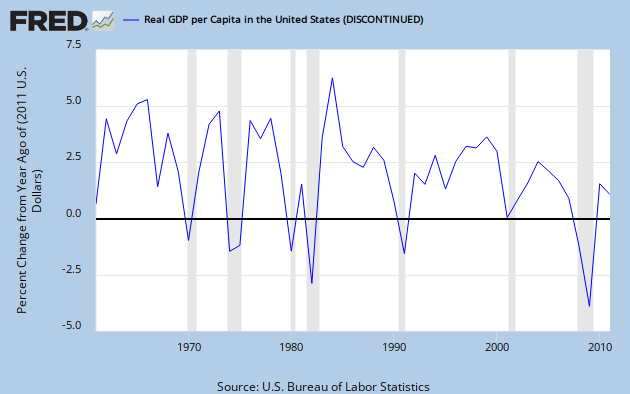
Graph 1, from FRED, shows YoY RDGP growth over the span of the data series.
Graph 1 - RGDP per Capita, YoY % Change
The single most prominent feature of this trace is the downward trend over time, characterized by both lower lows and lower highs. This should be pretty obvious, even to the causal observer; but if you cannot see it, don't be disturbed, I'm going to help.
Graph 2 shows the same data, along with some trend indicators.
Graph 2 - RGDP per Cap, % Change, with extra colored lines
Parallel trend channel boundaries are indicated in red and green, with the center line in yellow. The Excel generated least squares trend line is in dark blue, and a moving 5 year average in purple. Each of these additions is a visual aide, indicating that the trend over time has, indeed, been down. Certainly, it has not been monotonic. The real world seldom works that way. But what you see here, with some exceptions, are mostly worsening recessions, and increasingly anemic recoveries.
Next, let's focus in on the 5 year average. Graph 3 gives that to us, along with it's own set of trend lines. The vertical axis is truncated relative to graph 2, and the downward slope is therefore emphasized. This makes it easier to see that the 1990 peak is considerably lower than the double peak of '66 - '69.
Graph 3 - 5 Year Average of RGDP per Cap Change, with extra colored lines
The 5 year average is in purple. The base data and least squares trend line are in grey, The red, green and yellow lines are again parallel channel boundaries and midline. The last time the average line touched the top channel border was in 2000. After that, despite the Bush tax cuts, things went into a bit of a decline, culminating in the worst financial disaster since the Great Depression.
I know what you're thinking. The next to last peak in Graph 3 came in 1990, the culmination of the Reagan miracle, just before his buzzards came home to roost, costing Bush Sr. his chance at a second term. But remember that that peak is considerably lower than those of the 60's, and scarcely above the mundane years of '70 to '73.
And back in graph 2, the highest single growth year ever was in 1984, the third year of phase-in for Reagan's 1981 tax cut. Well, sure - but note that 1984 was a one-off, and also the recovery year from an exceptionally deep Fed-induced double-dip recession in the previous 3 years. So, beside a lot of pent up demand, there were a few other things going on that might have given RGDP a boost.
Graph 3 shows the Effective Federal Funds Rate, which made an erratic drop from a high of just over 19% in mid '81 to 15% in early '82, then to under 9% by 1984.
Graph 3 - Effective Fed Funds Rate, 1980 to '84
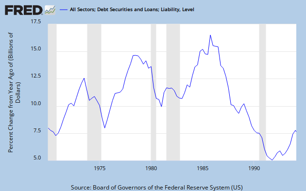
Graph 4 shows the explosion of credit that occurred coming out of 1982. By 1984 it was close to an all time high. It finally reached that peak in 1986, then collapsed.for the rest of the decade.
Graph 4 - Credit Expansion, 1978 to 1994
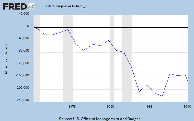
And let's not forget that Reagan was responsible for what was at that time, the most profligate explosion of federal spending ever seen, as shown in Graph 5.
Graph 5 - Reagan's Deficit Spending
So let's recap.
Big picture: Decades of tax cuts have not led to increasing prosperity. Quite the opposite. The growth rate of RGDP per capita has declined substantially since the tax cuts of the 60's, and most severely since the 2001 tax cuts. The ensuing change in RGDP/Cap growth is somewhat reminiscent of what happened from '69 to '75, but as yet without much recovery.
Focus on the Reagan years: After a long and deep recession, tax cuts plus the steepest decline in nominal interest rates ever seen in the 20th century, plus a huge expansion in federal spending, plus an explosion in credit resulted in a single year of outstanding GDP growth, followed by four decent but less than stellar years, which incidentally also included the 1986 tax cut. Then, alas, in 1991, there was another recession.
If you can look at this data and still have the opinion that tax cuts boost the economy, then knock yourself out. Everyone is entitled to an opinion. But you might want to ponder why your opinion has so little overlap with reality.
I welcome your comments, but please keep them more or less relevant to the topic, and if you are going to disagree, please bring more than assertions. Facts and data have some gravitas.


![[Most Recent Quotes from www.kitco.com]](http://www.kitconet.com/charts/metals/gold/tny_au_xx_usoz_4.gif)


No comments:
Post a Comment