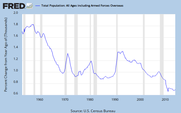
The growth rate of the U.S. population has been in a generally downward trend since the post-war baby boom peaked in 1957. Graph 1 shows the YoY percent change in the total population.
Graph 1 - U.S Population Growth since 1952
Graph 2 shows the birth rate per 100 population since 1950. [1980 - 2010 data from CDC.]
Graph 2 - Birth Rate per 100 Pop
The drop in population growth rate through the 60's is explained by this data. You can also see the mini-peak from 1969 -73, the initial wave of boomer offspring. Then there is another peak at 1990. But that doesn't do much to explain the simultaneous big jump in population growth. We'll see what does, shortly. Also note the drop after the slight maximum in 2007.
To avoid any chance of getting a mistaken impression, let's also look at the annual birth numbers, shown in Graph 3.
Graph 3 - Number of Live Births
Without the per population denominator, the post 1980 portion of the graph looks quite different. Now the 1990 peak seems a lot more significant, with the greatest number of births since 1968. And the barely discernible blip in 2007 on Graph 2 is revealed as the greatest number of births ever, just slightly edging out the 1957 post war baby boom peak. But the drop from 2007 to 2012 is meaningful. The 2012 birth rate of 1.27/100 pop is a record low. It corresponds to a total fertility rate of 1.93 births per woman over her lifetime. The replacement rate to keep native-born population from declining is 2.1.
The other source of population growth is immigration. And, as Graph 4 shows [data from Table 1 at this link.] it accounts for a big chunk of the population growth in the early 90's.
Graph 4 - Immigration from 1950 on
The peak runs from 1989-93, with the maximum value in 1991. I've imposed an exponential base line by putting an Excel generated best fit curve through the highlighted data points. The raw number of annual immigrants has generally increased over time, and has mostly run well above the base line since 1989. But now it has been basically flat since 2007. The above-trend numbers of the late 70's contributed to the increased population growth at that time.
Graph 5 shows that, in raw numbers, for recent years births outnumber immigrants by not quite 4 to 1.
Graph 5 - Ratio of Immigrants to Births
The final component to population change is the death rate. This data was not as easy to locate, is less detailed, and there are some discrepancies among various sources. I took data before 2000 from info please, and from 2000 on from indexmundi. I don't put a lot of faith in the 2nd decimal point. Graph 6 shows the data.
Graph 6 - Death Rate per 100 Pop
The big drop in mortality during the 70's and 80's isn't hard to understand. There were big medical advances leading to increased disease survival and longer life expectancy. At the same time, there were huge improvements in automotive safety that saved thousands of lives every year. On-the-job safety might also have been a factor, since OSHA was formed in 1971. The slight increase in the late 90's and sharp drop after 2000 are more mysterious, but that might just reflect the quality of the data.
My first thought was that before about 1980, births dominated population growth, and after about 1990 immigration took over. During the early 90's, at least, immigration dominated. That may still be true. As the number of births has dropped sharply, the birth rate has fallen to an all time low since 2007. Population growth has stabilized at an historical low level, and hasn't declined further in the last 3 years.
One thing that is clear is that without immigration, the U.S. population would go into decline as my generation passes on.


![[Most Recent Quotes from www.kitco.com]](http://www.kitconet.com/charts/metals/gold/tny_au_xx_usoz_4.gif)


2 comments:
I thought this was an interesting post -- even before the update. Just an investigation, turning up the facts.
Thanks, Art.
I had do some more digging and revise to make some sense of the last few years.
I'm pondering a post on GDP vs GPD per cap, and was struck by the shape of Graph 1 - the curve of YoY change in population.
Cheers!
JzB
Post a Comment