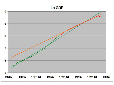
Here is quarterly GDP, (Update: seasonally adjusted at annual rates) on a log scale, since 1947 - basically, my entire lifetime, minus the first 3 1/2 weeks. I've divided it into two segments at 1980, and added trend lines for each segment. Note the slope differences.
Note also that pre-1980 the data line snakes quite a bit around the trendline, while post-1980 it mostly lies on the line, except at the extremes. There is your alleged "Great Moderation."
Graphs like this one are popular now. Mark Thoma is cautiously encouraged by the uptick since the '08 collapse. Noah Smith is underwhelmed. I think Noah is a wild-eyed optimist. His post is very good, though. Please go read it.
Bill McBride looks at it in a completely different way. Please check it out.
Thoma curbs his enthusiasm:
Again, though we are beginning to grow at trend rate again and that's better than the free fall we were in, there is a lot of ground to make up. That requires a period of growth in excess of trend, and there's nothing to indicate that will happen anytime soon. [And it will be even slower if we begin cutting the deficit too soon.]
I only thing I disagree with is: ". . . we are beginning to grow at trend rate again . . . ." No, We're not. Here is GDP during the current millennium.
I've indicated GDP during the recovery in yellow, and added a new trend line for that portion. Also visible are the pre-1980 trend line in green, and the post-1980 trend line in red. By some weird coincidence, the three almost converge in early 2000, which is helpful in observing the slope differences for the periods in question.
Even if we avoid a slip back into recession - and I am deeply pessimistic on this issue - we seem to have established a new trend line which is lower than the old trend line, which is lower than the even older trend line. So our chances of ever getting back to even the post-1980 trend line are slim, indeed. Fun stuff, eh?
Just for kicks, here is the same chart, color coded by the reigning president's political party.
Make of it what you will.
In Part 2, we'll look at rate of change.
Data source is the Bureau of Economic Analysis (BEA.)
.


![[Most Recent Quotes from www.kitco.com]](http://www.kitconet.com/charts/metals/gold/tny_au_xx_usoz_4.gif)


3 comments:
So our chances of ever getting back to even the post-1980 trend line are slim, indeed.
I've done similar charts of employment growth in the past. I have the same conclusions.
Here's my most recent on it.
Peak Employment?
Here's a post showing why I think it is mathematically impossible to get back on trend.
36 Million Missing Jobs
What can the government possibly do to get us back on trend?
Keep in mind that there are roughly 15 million unemployed. Even if the Wizards of Wall Street used powerful arcane magic to put every single one of them to work, then we'd still be 21 million jobs short. Go figure.
The 1980s and 1990s are over. There's no going back.
hop over to this website check out the post right here he has a good point Louis Vuitton replica Bags webpage helpful resources
s5l29j0s37 f7w15e9j05 s1a86b5f58 h6y49l8o38 e0o29w6k79 x5j88n0a02
Post a Comment