Art Demurs: "You don't break it up that way. The increase in debt shows one long, continuous trend. One trend."
Actually, they're both wrong.
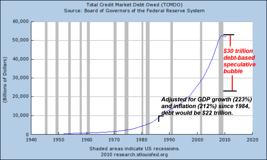
It is very hard to look at an exponential growth curve and see any of the detail. Is the rate of growth changing? If so, which way? Too much for my aging eyes to discern. The answer, of course is to display the data on a log scale. Human mind-eye coordination is adapted to deal with straight lines, and that is what a constant growth rate provides on a log scale. Here is the right way to look at this data.

Contra Art's objections, we can now clearly see that there are distinct differences over time: straight line growth through the early-mid seventies; steeper through the mid-late eighties; then a rather sharp knee followed by another straight line with almost identical slope as the first segment until the Great Recession.

This does not negate the idea that the last few decades have been a speculative bubble. But, OTOH, it gives the idea no support at all.
Update: Prompted by the discussion in comments to this post, here is a graph of total credit debt divided by GDP. I think it's pretty astounding. Until 1980, debt was flat at about 1.5*GDP. Under Reagan it rose to about 2.2 times. It was close to flat under most of Clinton's term. Then it skyrocketed to almost 4 times under Bush. Compare to Mark's linked graph in comments. Debt becomes overpowering when it exceeds ability to pay. Mark's graph and this one show big moves in the wrong direction.

.
![[Most Recent Quotes from www.kitco.com]](http://www.kitconet.com/charts/metals/gold/tny_au_xx_usoz_4.gif)


10 comments:
Divide the total debt by the wages.
Total Debt / Total Wages
That's the chart that leaves little doubt to me.
Jazz -- I agree with your evaluation of the first graph here, and I admit surprise at the size of the differences shown by the trend lines on your second graph.
I keep returning to to what Staniford said a while back: it's hard to read changes in small growth rates on a log graph.
It's hard to evaluate bigger changes, too. I won't disagree with you, except to suggest that maybe the trend-lines you show on your second graph are subtrends, I think that's what you call 'em. We're looking at an increase before and during the Reagan years, followed by a decrease (Clinton's balanced-budget magic) that returned the dataline to the exponential trend. You are showing subtrends. The main trend is exponential.
I do not deny that we've had a *series* of speculative bubbles. I do not deny that policy changes helped them develop. I point out that the general trend of total debt is exponential. And I point out that speculation and "financial tail-chasing" were the only ways left to stay on the exponential curve -- the growth curve -- after finance sucked the life out of the non-financial sector during the 30 years before Reagan.
Excel gave me an R-squared value of 0.99 for total debt and its exponential trend line here.
I look at departures from the exponential trend here.
Some time back you said to me: You inspire me. And then you profoundly disagreed with me!
Yeah: We don't see eye-to-eye on a lot of stuff, but you inspire me, too. It drives us both to do more, I think. A good thing.
Stag -- As I see it, the TwoMinds guy is looking at results when he looks at the last 30 years. The overall debt trend is exponential, so the driving force must have been existing since the beginning of the exponential trend.
The Arthurian,
Stag -- As I see it, the TwoMinds guy is looking at results when he looks at the last 30 years. The overall debt trend is exponential, so the driving force must have been existing since the beginning of the exponential trend.
The overall debt trend was exponential mostly because the overall wage trend was exponential (women entering the workforce, inflation, and so on).
In 1960 it took about 2.8 years of wages to pay off the total debt. That seems like a fairly reasonable debt load.
20 years later (1980) it took about 3.3 years of wages to pay off the total debt. That seems like a fairly reasonable debt load.
Today it takes 8.0 years. That does not at all seem reasonable. Most of the unreasonable debt behavior was therefore between 1980 and today. I firmly believe that and that's what the chart I provided shows.
Starting in 1980, we allowed total debt to grow at a pace far in excess of the growth in total wages. Very bad plan.
Here is my version of the chart showing the change in exponential growth rate of debt vs. wages starting in 1980.
We are so @#$%ed.
Art -
it's hard to read changes in small growth rates on a log graph.
Right. So the red line on my graph demonstrates a huge change. It's all exponential, just with different growth rates. BTW, the two green lines are strictly parallel.
So - whatever the significance of this graph, the period including most of the 70's and 80's is substantially different from either before or since.
after finance sucked the life out of the non-financial sector during the 30 years before Reagan.
No. Context matters. Check out Mark's brilliant graph, and the one I posted in an update to this entry.
Debt was absolutely not a problem before 1980.
so the driving force must have been existing since the beginning of the exponential trend.
Remember, an exponential trend is simply growth at a constant percentage rate. The problem is not that debt growth was exponential. that is inevitable with a growing population and economy. The problem is that debt grew much faster than income or GDP.
In the 60's we had a debt burden that was serviceable. Now we don't.
It is absolutely a post-1980 problem.
Mark -
Most of the unreasonable debt behavior was therefore between 1980 and today.
Specifically during the regimes of Reagan and Shrub. It's much different during the Clinton years.
Cheers!
JzB
Jazzbumpa,
I took that original chart and created a new version with exponential trend lines. You might want to link to it instead.
1959 to 1979: 0.6% annual growth rate in debt to wages
1980 to 2011: 2.8% annual growth rate in debt to wages
Ouch.
I see you spotted it. I'm now trying to have a conversation on both of our blogs at the same time. Behold the power of the Internet to force multitasking!
That said, other than the cost of an Internet connection, it is amazing how much @#$% we can post for free, lol.
Jazz, you write: "Remember, an exponential trend is simply growth at a constant percentage rate. The problem is not that debt growth was exponential. that is inevitable with a growing population and economy. The problem is that debt grew much faster than income or GDP.
In the 60's we had a debt burden that was serviceable. Now we don't.
It is absolutely a post-1980 problem."
The debt burden was "serviceable" before 1980 but not after, BECAUSE debt consistently grew much faster than income or GDP. I think we agree on that.
With variations only at the sub-trend level, debt grew faster than the economy for the whole post-WWII period.
While the debt was still "serviceable" it gave us a golden age. Beyond that point, debt has given us nothing but problems. The one consistent thing is the excessively rapid growth of debt.
"The problem is that debt grew much faster than income or GDP."
Yeah, that about sums it up.
With variations only at the sub-trend level, debt grew faster than the economy for the whole post-WWII period.
This is way too broad-brush, and totally misses a major point: policy matters. Note that the vast majority of debt/earnings growth took place under Reagan and Shrub.
Those were the only times the governing economic policy was Reganomic trickle-down.
This is why the Clinton administration stands out - not because it was particularly good, but because it was not particularly stupid.
Note also: this.this.
JzB
Me: "With variations only at the sub-trend level, debt grew faster than the economy for the whole post-WWII period."
You: "This is way too broad-brush, and totally misses a major point: policy matters."
Me now: It does NOT miss the point. I agree, policy matters. It has been our consistent policy since the end of WWII to encourage credit use, because it is thought to stimulate growth. And it has been our consistent policy since the end of WWII to restrict the quantity of non-credit money, because it is thought to fight inflation.
Those two policies together give us the result I show on my DPD graphs.
I have tried to talk about policy that did not change in the two "Policy Venn" posts under the "First Visit?" button on my sidebar.
Post a Comment