Look: I am eager to learn stuff I don't know--which requires actively courting and posting smart disagreement.

But as you will understand, I don't like to post things that mischaracterize and are aimed to mislead.

-- Brad Delong

Copyright Notice

Everything that appears on this blog is the copyrighted property of somebody. Often, but not always, that somebody is me. For things that are not mine, I either have obtained permission, or claim fair use. Feel free to quote me, but attribute, please. My photos and poetry are dear to my heart, and may not be used without permission. Ditto, my other intellectual property, such as charts and graphs. I'm probably willing to share. Let's talk. Violators will be damned for all eternity to the circle of hell populated by Rosanne Barr, Mrs Miller [look her up], and trombonists who are unable play in tune. You cannot possibly imagine the agony. If you have a question, email me: jazzbumpa@gmail.com. I'll answer when I feel like it. Cheers!

Tuesday, May 31, 2011

House and Home - Pt 2.

Mark takes a different look at housing.  See his post for the text.

I borrowed his graph, and eyeballed in the yellow "Danger, Will Robinson" line.  Whenever starts/cap go above it, it's a bubble that will crash as soon as it hits the top trend line.


Mark's comment on my earlier post suggests uncertainty in how to characterize the trend in the first graph there.  Is it linear?  Exponential?  Actually, I think it's a mess. It's reproduced below with some trend lines to consider.   I forced a polynomial curve through the pink points by cherry picking them from the entire data set.  It's the curved pink line line below, and looks fairly respectable, considering it's heritage.  OTOH, so does the straight pink line, through those same points.  Of course, neither looks good for the whole set.  Hence the straight blue line, which is the best fit for the entire data set


It's hard for me to rationalize why this growth curve would be exponential, even without aberrations.  Population growth is exponential, but the bank of already built homes takes care of the bulk of that potential demand.  All you really need is enough new homes to satisfy the demand caused by first time home-owners + replacement of dwellings that are no longer useful. A fairly straight line with a modest upward slope ought to be adequate.

We were above the blue trend line that I favor for a decade, and far above it for at least 5 years.  The glut of existing homes, with many foreclosures still to be executed, combined with the personal debt overhang and continuing dismal economic outlook is going to keep construction depressed for a long, long time.
.

Sunday, May 29, 2011

House and Home

Here is a look at housing over the last 50 years, or so.

Single family dwelling construction, nationwide, by year.


The average over the data set is 1.068 million.  There's a lot of what looks like boom and bust here, but the years centering on 2005 are most especially bubblicious.  Oh - and what a crash!

Here is a look at pricing, on a log scale .


That is certainly not a straight line.  But pricing is subject to a lot of inputs.  Material cost, inflation, inventory and demand levels spring readily to mind.  Also note the bubble can be seen here as well - though it tops out in 2007 instead of 2005.

To get a handle on how all these home purchases have contributed to debt overhang, here is a graph of single unit construction per year, multiplied by the median price.  (1959 - 62 price data extrapolated from the '62 - 68 trend.)


The whole point of this exercise is to see how closely this graph represents the one linked here that Art acquired from Krugman.

Interesting differences and similarities.  But I am willing to posit that a great deal of the debt overhand is specifically housing related.  And until that situation is corrected, the housing market and general U.S. economy are going to be in a sad, sad state.   Good bye, American Dream.

Data from the Census Bureau:
Construction.
Prices.

History Summarized in a Single Run-on Sentence

All of human history and experience can be described as the actions of a small, privileged elite, motivated by boundless avarice and lust for power, to use tradition, religion, political and economic theory, divide and concur strategies like nationalism, tribalism, and racism*, as well as force and violence at the slightest provocation, to suppress, repress, exploit, manipulate, and even enslave the vast majority of the human race, for their own personal gain and aggrandizement.

________________________________
* Addendum
.

Saturday, May 28, 2011

Moron More on Short Term Interest Rates

A few days ago I drew these tentative conclusions:

1) The Fed has very little power to influence interest rates.
2) An attempt to move counter to the market might have an incalculable distorting effect.

But now, due to phantom inflation fears and the influence of zombie ideas, there are serious desires to raise short term rates both here and in Europe.

This is what 10 year bonds rates are doing.  I've posted the long term trend before.  You can see an update here.  Since peaking on Feb 8, well within the long range channel, rates have dropped from 3.725% to 3.06%.   Meanwhile, TIPS spreads have fallen from 2.66% on April 11, to  2.275% today.  The clear message of the market is that inflation expectations are low, and falling.

If the Fed succeeds in raising the Federal Funds Rate, which has been stuck at 0.25% for over two years, it will flatten the yield curve.  What will this accomplish?  With nominal rates vanishingly low, and inflation low, but still positive, we're in uncharted policy waters.  I suppose it depends on how far they go.  

Would a change of 0.25% matter to anyone?  Maybe not. But if it does, it will be harmful.

A change of 1% almost certainly would.  But with real short rates negative (nominal rate minus inflation {low, but still > 0.25%}) business is still sluggish.  What would a real positive interest rate do?

Still - the Fed usually makes it's changes in increments, not whole percentage point jumps.  Even a half percent change would be huge in the current environment.

Any attempt to raise short rates at this time would be a serious market distortion, in the direction of stifling the economy.  With unemployment high, the recovery sluggish, and no real sign of inflation, this would be insanity.

That word often gets used hyperbolically, but I am deadly serious.  It is very difficult to imagine a policy decision (short of adopting the Ryan budget plan) that would be more destructive to the economy - and more obviously so - than raising interest rates at this time.

Yet that is what very serious people want to do.

We're screwed.
.

Friday, May 27, 2011

GDP Revisited - Part 2

Part 1 can be found here.

This look is at "Percent Change From Preceding Period in Real Gross Domestic Product, Seasonally adjusted at annual rates," whatever in the hell that means.  Some things you just take on faith.  Data is from BEA.

This is what it looks like.


The Quarterly number jumps around a lot.  The green line is a period average up to 1980, the red line is a period average post 1980.  The yellow line is an 8-year moving average. 

Here is my narrative, vis-a-vis the Great Moderation - which, if you recall, is the decrease in standard deviation in the data set, since roughly 1980 (give or take about 7 years.)  This is more correctly viewed as The Great Stagnation (a phrase I coined independently, months before Tyler Cowan's e-book of the same name was issued.)

In the 50's, there was a lot of economic turmoil, as the economy restabilized during the first wave of the baby boom and about 7 million soldiers reentered the work force (from 1945 to 1947) following WWII - which came hard on the heels of the Great Depression.  There were wild growth peaks in 1950, '52, and '55, along with recessions in 1953, '58, and '59-60.  Then came the First Little Moderation  - a decade without a recession, until late in 1969.   The 70's brought stagflation, the end of the Viet Nam war, and wild gyrations - though, except for one spike in 1978, and the recession of 1980, not as wild as the '50's. Reagan's profligate voodoo spending held recessions at bay after 1982, though the buzzards came home to roost in 1990, putting Poppy Bush in rather a bad light.   Clinton fought the head wind and gave us the Second Little Moderation, but his policies were too conservative to rekindle anything like a golden age (I call it the bronze age.)  The wheels were about to come off the Clinton psuedo-prosperity anyway, but the insane economic policies of the Shrub administration threw us farther over a deeper cliff than was necessary.  Shrub's spending made Reagan look prudent, and gave us an anemic and declining series of mini-peaks, culminating in the the crash of 2008.  B. Hoover Obama and an utterly idiotic Rethug dominated congress have given us a weak recovery with little hope for significant improvement - ever!

Here is a look at some trends - declining peaks in the 50's, 70's, 80's and noughts, but except for the Little Moderations, no systematic trend in milder bottoms.  During the first one (Kennedy-Johnson,) successive bottoms were about flat, and actually trended up during the second one (Clinton.)

A best fit line throught the entire data set has a downward slope.


Here is a look at the Standard Deviation of the data set.  This is based on 34 quarterly data points.  Also illustrated are 21 point (red) and 55 point (green) Std Devs, just to show that there is nothing special about choosing any particular data kernel size. 


That was no joke about The Little Moderation, as Std Dev fell sharply through the 60's.   After that, there was a steady increase until the early 80's, when there was another sharp drop.  Since then, it's been flatish, with some wiggles.   Even the '08 collapse only shows up as a blip.  So, the whole story of earlier high standard deviation can be explained as the post war readjustment of the 50's and the stagflation of the 70's.

As I've stated before, The Great Moderation is a data artifact of declining economic growth.  Now I can modify that by saying that the period before 1980 had two sub-periods of extraordinarily high Std Dev - the 50's and the 70's.   The whole Great Moderation idea is pretty much a sham, resulting from failing to take a serious analytical look at the data.  The Great Stagnation, however, is very real.

Here's one last look, with the data color coded by administration, and illustrating the moving average along with an envelope one Std Dev above and below the average.


So - what do you think?  Am I all wet?  Do you have a better narrative?  Did I miss anything?
.

GDP Revisited - Part 1

Some new data came out yesterday, and that prompted a new look, and, hence, this update.

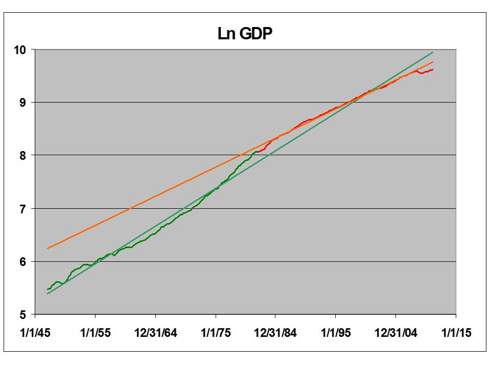
Here is quarterly GDP, (Update: seasonally adjusted at annual rates) on a log scale, since 1947 - basically, my entire lifetime, minus the first 3 1/2 weeks.  I've divided it into two segments at 1980, and added trend lines for each segment.  Note the slope differences.


Note also that pre-1980 the data line snakes quite a bit around the trendline, while post-1980 it mostly lies on the line, except at the extremes.  There is your alleged "Great Moderation."

Graphs like this one are popular now.  Mark Thoma is cautiously encouraged by the uptick since the '08 collapse.  Noah Smith is underwhelmed.  I think Noah is a wild-eyed optimist.   His post is very good, though. Please go read it.

Bill McBride looks at it in a completely different way.  Please check it out.

Thoma curbs his enthusiasm:

Again, though we are beginning to grow at trend rate again and that's better than the free fall we were in, there is a lot of ground to make up. That requires a period of growth in excess of trend, and there's nothing to indicate that will happen anytime soon. [And it will be even slower if we begin cutting the deficit too soon.]

I only thing I disagree with is:  ". . . we are beginning to grow at trend rate again . . . ."  No, We're not.  Here is GDP during the current millennium.


I've indicated GDP during the recovery in yellow, and added a new trend line for that portion.  Also visible are the pre-1980 trend line in green, and the post-1980 trend line in red.  By some weird coincidence, the three almost converge in early 2000, which is helpful in observing the slope differences for the periods in question.

Even if we avoid a slip back into recession - and I am deeply pessimistic on this issue -  we seem to have established a new trend line which is lower than the old trend line, which is lower than the even older trend line.  So our chances of ever getting back to even the post-1980 trend line are slim, indeed. Fun stuff, eh?

Just for kicks, here is the same chart, color coded by the reigning president's political party.


Make of it what you will.

In Part 2,  we'll look at rate of change.

Data source is the Bureau of Economic Analysis (BEA.)
.

Thursday, May 26, 2011

Republicans, All Wrong, All the Time, Pt 28 - Never Apologize . . .

. . . It's a sign of weakness
.


Screw the apology.  How about a suspension without pay for Representative Patrick McHenry (Rethug, NC)?  Unless it's OK to call Elizabeth Warren a liar in a committee session, where she is testifying under oath.


Maybe so since it's OK to yell, "You lie," at the President during a major address.

OTOH, here is a dissenting view.


Some days, I just don't know what to think.
.

Standing Up for Lura Ingraham . . .

. . . for all that she deserves it.

Here's the charming and delightful Laura* on quasi-harlot Nancy Pelosi.  Now THIS is class!


You think the pictures of dead bin Ladin would be gruesome?  To put it in perspective, have a look at Janet Napolitano.


Here, Laura blows the lid on Obama's loan guarantees for Brazilian off-shore drilling.


Oh, wait . . . that's a god-damned lie.

 But here, she points out that the stimulus didn't create any jobs, and didn't help the economy.


Shit. That's a lie, too.

That's only going back a few months, and only relying on a single source.  Clearly, this game could go on for hours, but I've grown weary of it all ready.

Media Matters has  a point, when they say: "However, being progressive means recognizing that Ingraham -- no matter how much we disagree with her views -- deserves to have her commentary evaluated on its merits and should not be attacked with sexist language."

Well, we've done a bit evaluating on the merits, and discovered there are none.  But why pussy-foot on the language?  We know what a media whore is.  Is there any reason to think that Laura Ingraham is anything other than a right-wing talk slut?  Maybe he should have just called her a mealy-mouthed, lying piece of shit.   There's no way to infer sexism from that.

__________________________________________
* When I was playing one of these clips, my lovely wife asked, "Who is that?  It sounds like a man."  That's when I noticed that she looks even more like a man in drag than that other right-wing talk slut.  (Seriously - tell me she has no Adam's apple.)
.

Who Determines Short Term Interest Rates?

Do you think it's the Fed?

It's not.

The market determines short term interest rates.

Really.

The Federal Funds Rate, which is set by the Fed, FOLLOWS 3 month T-Bill rates.  It does not lead the economy.  Here are some looks.  First the whole data set, going back to 1954, presented in Graph 1.

Federal Funds data from FRED.

T-Bill rates from a different Federal Reserve site

These are tabulated monthly values.  But the T-Bill rate is set in a weekly auction, and the Fed Funds rate is set by the Fed Open Market Committee, on an arbitrary schedule, at their discretion. 


Graph 1  Fed Funds and 3 Mo. T Bill Rates, 1954-2011


Not exactly lock step, but they are a couple of clinging vines.  At this scale, it's pretty hard to tell who leads and who follows.  Let's look closer at the last few decades.  First, the all-time highs of the early 80's, in Graph 2.


Graph 2  Fed Funds and 3 Mo. T Bill Rates, 1978-84

Here, the Fed Funds are in green and the T-Bill rate in orange, with the moves off of tops and bottoms highlighted in other colors.  Fed Funds tend to run a bit above T-Bills.  From this data, T-Bill rates generally change direction in the same month or the month prior to a Fed Funds change.


Graph 3  Fed Funds and 3 Mo. T Bill Rates, 1978-84

Same story in Graph 3: either concurrent motion or T-Bills are slightly ahead.  For the two downward moves at the beginnings of 1990 and 1995, they are three to four months ahead.

The story is similar for the most recent decade, shown in Graph 4.


Graph 4  Fed Funds and 3 Mo. T Bill Rates, 2000-2008

Looks like the Fed is a close follower of T-Bill rates, usually within a month or so.  Coming off a diffuse top, the lag can be a little longer.

Graph 5 shows a close up of 2001-5, without the odd colors.  T-Bill leadership is easily seen.

Graph 5  Fed Funds and 3 Mo. T Bill Rates, 2001-05

Two questions present themselves:

1) Does the Fed have any power to influence interest rates?
2) What would happen if they attempted to move counter to the market?

In my mind, this casts serious doubt on the usefulness of interest rate manipulations as a monetary policy lever.   What do you think?

Cross-posted at Angry Bear.
.

Wednesday, May 25, 2011

Republicans, All Wrong, All the Time, Pt . 27.1 - Words From the Tongue of a Lizard-Person

I still can't come up with a video of Virginia Rethug Eric Cantor, but I did find his words at The Washington Post.

"If there is support for a supplemental, it would be accompanied by support for having pay-fors to that supplemental," Mr. Cantor, Virginia Republican, told reporters at the Capitol. The term "pay-fors" is used by lawmakers to signal cuts or tax increases used to pay for new spending.

The article goes on to point out that even previous Lizard-Person (and convicted criminal) Tom Delay wouldn't go that far in the wake of Hurricane Katrina.  In other words, Cantor is to the right (in a metaphorical sense) and to the wrong (in a literally moral sense) of one of the worst Rethugs ever to foul the soil of this tortured planet.

Think about that, folks, before you ever vote or a Repugnicant again.  Should you ever need disaster relief for an event that occurs through no fault of your own, Federal assistance can only come at the expense of actually depriving somebody else.  And that somebody else will not be a millionaire or transnational mega-corporation.

Rethugs have no concern at all for 95%  of the American people.  They have sold their souls and their tiny reptilian brains to entities that have no loyalty to anything or anybody.

Think about it.
.

Republicans, All Wrong, All the Time, Pt. 27 - Cantor to Missouri: Drop Dead

I have a big date with a granddaughter this morning, so I'm short on time.  Wanted to find a vid of Eric Cantor speaking his words of damnation to the po'  fo'k  o'  Joplin, but can't come up with one.  The essence of it is that, speaking for the Repugnicants, Cantor said that there can be no Federal funds to assist the citizens of Joplin, MO (average income about $33K, average household income about $39K, who have just lost everything in a tornado) unless the cost is offset by other spending cuts.

Hal Sparks on Steph's show this morning suggested elimination of spending on Oil Subsidies.  Bam! Spending covered, case closed.  But we all know the Rethug position on that.


.

Sunday, May 22, 2011

Quote of the Day

Here's Krugman, on the subject of Charlatans and Cranks.

Maybe. But my take is that the hermetic nature of movement conservatism — its loyalty tests, its closed intellectual world where you get all your alleged facts from Fox News and the Heritage Foundation, the “wingnut welfare” that ensures that defeated politicians always have a cushy job waiting at a think tank somewhere, always made it vulnerable to this kind of spin into policy craziness. The Bush debacle undermined the control once exercised by the establishment, which tried to keep up the appearance of reasonableness; and now people like Pawlenty and Romney need to sound crazy even if they (possibly) aren’t.


The 2010 election may, in retrospect, turn out to have been a disaster for the GOP: it empowered the extremists, leading them to believe that they could go the whole way and keep winning elections. I guess we’ll see.


More importantly, though, even the most casual glance at the entire Rethug establishment provides instant verification of what Bill Maher said about politics over recent decades: "The Democrats have moved to the right, and the Republicans have moved to the insane asylum."    For all that this is a smart-ass jab, Maher absolutely nails it.  The litmus tests for Rethugs are now such that a sane person must totally abandon all reason and integrity to succeed as a Rethug.

Here, Lawrence O'Donnell, draws the truth out of Grover Norquist, the Repugnicant behind the curtain.


This is the real tragedy of modern American politics.
.