Look: I am eager to learn stuff I don't know--which requires actively courting and posting smart disagreement.

But as you will understand, I don't like to post things that mischaracterize and are aimed to mislead.

-- Brad Delong

Copyright Notice

Everything that appears on this blog is the copyrighted property of somebody. Often, but not always, that somebody is me. For things that are not mine, I either have obtained permission, or claim fair use. Feel free to quote me, but attribute, please. My photos and poetry are dear to my heart, and may not be used without permission. Ditto, my other intellectual property, such as charts and graphs. I'm probably willing to share. Let's talk. Violators will be damned for all eternity to the circle of hell populated by Rosanne Barr, Mrs Miller [look her up], and trombonists who are unable play in tune. You cannot possibly imagine the agony. If you have a question, email me: jazzbumpa@gmail.com. I'll answer when I feel like it. Cheers!

Tuesday, May 6, 2014

What is a Good Batting Average?

I think we'd all agree that .300 is a good batting average, and that .200 isn't.   Also, that 280 is pretty good and .220 is pretty poor.  But where do you draw the line?  Let's say that a good batting average is anything above the mean for the league in that year, and the degree of goodness is defined by the difference from the mean.  Similarly, poor batting is hitting below the league mean.

Fortunately, mean batting average data is available at Baseball Almanac, going back to 1901, so the comparisons are easy to make.  "These totals include every player, every at-bat and every hit during the season listed."

Graph 1 shows the mean batting average for each league from 1901 through 2013.

Graph 1

There have been some pretty big changes over time as the tide shifts in the battle between hitters and pitchers.  Within the broad sweeps, there are also year to year variances that tend to run more or less parallel in the two leagues.  So, in general, whatever is happening, happens in both leagues.

To get a clearer picture of the broad sweeps, I took 13 year moving averages for both leagues [Yes - averages of averages of averages.]  This can be seen in Graph 2.


Graph 2

This clarifies two things - times when either pitchers or hitters were gaining on the other, and times when one of the leagues had either better hitting or better pitching.   Batters became increasingly more dominant from the mid 19-teens through the early thirties.  Then pitchers took over until the early to mid seventies.  Afterward, batters gained ground until 2007.  That trend may now be reversing. 

Back in the early days, the performances in the two leagues was, in gross terms, nearly identical.  There were big differences between the leagues in individual years, but a lot of year-to-year flipping eliminated dominance by one league over the other.  Since about 1950, there have been some robust separations. Graph 3 shows this in detail.

Graph 3

From 1901 until 1938, a  difference of .013 or more between the leagues was fairly common, occurring 8 times in those 37 years, 4 with the AL on top, and 4 with the NL on top.  Over that span the AL grand average was .002 above the NL average.  Since 1938 there have only been 3 occurnces of a .013+ difference.

From 1943 to 1972 the NL batters did better, by an average of .004 per year.  The greatest difference was .016 in 1966.  Since 1973 the AL has done better, out hitting the NL by an average of .007 per year, with peaks of .014 in 1989 and .015 in 1996.  These average differences in the three eras are indicated with heavy blue horizontal lines. The yellow line is the average difference for the entire data set.  Since 2007, as batting averages in both leagues have dropped by large margins, the gap between the leagues has gotten smaller.

It occurred to me that a good batter should be above the mean by some margin, and standard deviation ought to be a useful number.  I got the data here for the 2013 season, and arbitrarily eliminated players with fewer than 200 at bats.  The mean batting average of the 170 qualifying players was 0.2568, as compared to 0.2558 for the every player, every at bat method cited above.  The standard deviation was .030.

So, if you're lenient, a good batting average in the American League was anything over .257.  If you want to be more strict, use .287.  For 2 Std Devs above the mean, it's .317.

Miguel Cabrera's league leading batting average of .348 for 2013 was a full 3 standard deviations above the mean.  Here is a list of all the qualifying AL players with batting averages over .300 in 2013.


Five full season Tigers were on that list of 15 names.  They picked up Iglesias at the End of June, 2013 then lost Peralta and Infante over the winter.  Iglesias is now out with stress fractures in both legs, and will miss the entire 2014 season.  He is expected to make a full recovery.

Afterthought: 2007 was the year MLB got serious about enforcing bans on PEDs.  Since then mean batting averages have dropped by about 20 points.  Coincidence?  I don't think so.


Saturday, May 3, 2014

This is for Mike Shupp

I'm not any kind of Red Sox fan, but I think Dustin Pedroia is pretty cool.

He hit his 100th HR tonight, a grand slam that bounced off the top of the monster.

The whole event just seems perfect.

Phooey.  The vid won't embed.

Here's the link.


Thursday, May 1, 2014

Tigers April Wrap-Up

Tigers have yet another travel day today, off to KC for a week end series with the Royals.  After 23 games, they're atop the Central Division at a rather impressive14-9, or .609.  This would project to a hefty 98 to 99 wins over the season.  Last year at this time, they were 15-10, for an even .600.

Because of several travel days and 3 games postponed due the weather, they have played from 1 to 6 (!)  fewer games than their division mates.  Chicago, with the most games completed, also has 14 wins, but 6 more losses than the Tigers.  The second place Royals also have 14 wins, against 12 losses.  These games in hand give the Tigers a chance to build some separation, if they can take advantage.  After the 3-game Royals series, they have 4 at home against the hapless Astros, so the near future looks pretty bright.

Last year at this time, with 25 games completed, the Tigers had scored 125 runs, averaging an even 5.00  per game.  Scoring is a bit off so far this year, with 104 runs in, or 4.52 per game.  Defense is a bit off as well, with 4.13 runs allowed per game, vs 3.92 after last April.

An average run differential of 0.39 is not a robust recipe for success.  Both offense and defense need to improve.

Wednesday, April 30, 2014

Deep Stupid #24 - Georgia on my Mind

The Georgia take-a-gun-anywhere law, signed by Governor Nathan Deal last Wednesday, takes affect in July.

The Atlanta Braves have a home stand against the Phillies, Marlins and Padres from the 18th through the 28th of July.

Suppose during one of those games the Braves have a man on third, and a crazed gun man in the stands shoots the opposing pitcher while he is on the rubber and makes a motion associated with his pitch, but is not able to complete the delivery because he's been shot.

Here is my question: is the pitcher charged with a balk that allows the run to score?

.

Thursday, April 24, 2014

A Song of Jaime and Cersei

There's been a great deal of commentary on this week's GoT episode, Breaker of Chains, and a disproportionate amount of it, along with associated reader commments,  has been focused on a certain 51 second long incident involving everyone's favorite set of incestuous twins.

Here is a particularly forceful condemnation.

There was no ambiguity to the scene. Cersei repeatedly said no. She said, “Stop.” She said, “Not here.” She said, “This is not right.” She resisted Jaime’s efforts, to no avail. The scene was unequivocally a rape scene and it was not merely shocking. It was thoroughly senseless.

But Roxane Ray is wrong.  Cersei never says, "No."  She says the other things that are actual quotes, but she never says, "No."  Further the scene is not glamorized as her article's  title claims.  Nor is it sensationalized, as she claims in the text.  Neither of these assertions makes any sense, as far as I can see.

Ms. Ray's final paragraph is revealing.
Rape is used to create drama and ratchet up ratings. And it’s rare to see the brutality and complexity of a rape accurately conveyed on-screen. Instead, we are treated to an endless parade of women being forced into submission as the delicate and wilting flowers television writers and producers seem to want them to be.

She has a beef that reaches far beyond the world of Westeros and Essos.  This distorts her view of what is happening in GoT.  And if she thinks the women in GoT are delicate and wilting, someone should introduce her to Olenna, Margaery, Catelyn Stark, Arya, Osha, Ygritte,  Danaerys, or - wait for it - Cesei.  In fact, the only prominent female in GoT who comes close to resembling this false description is Sansa, who is traveling her own trope-defying character arc.  But, alas, Ms. Ray isn't alone in her beliefs.  Here is a particularly stupid example.

Monday, April 21, 2014

The Heritage Heritage

Here is a compendium of my posts on the lying liars at the Heritage Foundation.  [Titles are hot links]

Republicans: All Wrong, All the Time, Pt. 12 - Taxes and Revenues    2/25/10 [Reposted 4/21/14]

Riddikulus! Pt 2 -- Ludicrous                                                                  4/11/2011 

Another Lie From The Lying Liars at The Heritage Foundation         6/12/2011

More on the Lying Liars at the Heritage Foundation                              6/5/2013              


They never fooled me even once.  Don't let them fool you.

As I said, responding to a comment here, "When I disagree with someone who deserves my respect, I do it respectfully. But tools, fools, and liars get the contempt they so richly deserve."


Republicans: All Wrong, All the Time, Pt. 12 - Taxes and Revenues

While mucking around in the archives, I somehow made this old post from 2/25/10 inaccessible.

So, I'm reposting it now, because it has important information.

________________________________________


 The liars at the Heritage Foundation will tell you that lowering taxes increases federal Revenues.

A New York Times article, Deficit Spending Can Help Republicans, by Daniel Altman, shows that old, wrong assumptions die hard. The article reports that:
"From the beginning of 2001 through the third quarter of 2002, the federal government leapt from a surplus (including Social Security) amounting to 2.3 percent of gross domestic product to a deficit of the same size. By itself, the current deficit is not terribly threatening. Indeed, running a modest deficit during an economic downturn can be useful, as long as the policies behind the deficit — lower taxes and higher spending — benefit consumers and businesses."
The article then claims that the 1980s Reagan tax cuts failed to increase tax revenues;
"The White House says lower tax rates will lead consumers to work more and businesses to expand, resulting in higher tax revenues and eventually closing the budget gap. That notion, chided as "voodoo economics" by critics, turned out to be false when it was last in vogue, during the 1980's."
However, the numbers, crunched by Heritage's Brian Riedl, show otherwise (see chart below). In 1980, the last year before the tax cuts, tax revenues were $956 billion (in constant 1996 dollars).
Revenues exceeded that 1980 level in eight of the next 10 years. Annual revenues over the next decade averaged $102 billion above their 1980 level (in constant 1996 dollars).


They even offer this chart as proof!  (Click the link, expressed in constant 1996 dollars.)  But the real Voodoo is in achieving an actual reduction in revenues, as they did according to the Heritage Foundation figures in 1982 and (quire dramatically) 1983, in the context of an economy that has achieved 3.7% annual growth for 200 years!

And that is key.  Every year the population grows.  Almost every year the economy grows.  There is inflation in the background, most of the time.  In fact, the compounded annual growth rate of federal tax revenues from 1970 through 2008 was just slightly over 7%.   (Current dollars, not inflation adjusted.)

Here is reality, presented in non-inflation adjusted dollars   Data from the Congressional Budget Office.


Actual revenues are shown on the broken red and blue line, with segments color-coded to indicate the party of the White House occupant.  The purple curved line is the 7% growth line, starting in 1970.   The pink line is the best-fitting straight line.  Each President's term has also been overlayed with a best fitting straight line. In retrospect, these straight lines don't tell us much of anything. 

One interesting facet of this display is that most of it lies well above the 7% growth curve.  This is entirely due to increases during the Carter and Clinton administrations, as a visual inspection reveals, and we will also prove mathematically.

Here is the compounded  annual growth rate of tax revenues, by President, over the 1970 to 2008 period.


Well, Nixon and Ford managed to top the long period average by a slight margin, but they were not under the thrall of Voodoo Economists.  Neither was Clinton.  Bush I wasn't either, but he inherited Reagan's vultures.  Look at Reagan's revenue growth rate: 5.35%.  Consider that average inflation over Reagan's years was 4.56%, and GDP growth averaged 3.4%.  Under those circumstances, revenue growth should have been at least 7.96%, not a paltry 5.35%.  The average compounded growth in constant 1996 dollars, using the Heritage Foundation table is 2.38%.  This is more than a full percentage point below real GDP growth. 

Bush II's revenue growth rate was 3.01%.  But inflation averaged 2.84% and GDP growth averaged an anemic 2.16.  Together they total 5.0%.  So, Republican tax revenue growth cannot even match the inflation adjusted level of growth in the economy.


Many years ago, my dad told me that figures don't lie, but liars sure know how to figure.  The bullshit you get from the Heritage Foundation is exactly what he was talking about.  It's another example of the conservative ploy of willfully denying reality.

Which is just one more reason why WE ARE SO SCREWED.
.


Friday, April 18, 2014

Early Thoughts on the Tigers

The Tigers have now completed 12 games, and stand more or less on top of the A.L. Central at 7-5 (.583).  Other A.L. teams have played from 14 to 16 games; but the Tigers had 2 travel days to the west coast and back, and 2 weather delays at home - the 1st due to rain, and the 2nd due to snow and cold.

Over that span, they've scored 4.08 runs per game, while giving up 3.92.  This kind of performance is not a recipe for success, unless you're the 2012 Baltimore Orioles. [93 W, 39L, while scoring 712 runs and giving up 705.]  In my first post last year, I said the Tigers' play was erratic.  That is centrally true so far again this year.

Here is scoring per inning per game.  Last year I had it per inning per month, but with different numbers of games per month, normalizing per game is more sensible.  Inning 10 represents all extra innings.


Looks like the second time through the order is when the Tigers are most productive.  Tigers are still not particularly potent after inning 6, scoring only 13 of their 49 runs, or 26.5%.   Ninth inning only has produced 4 runs, or 8.2% of the total.

Here is opponent's scoring by inning.


Tiger starters are not having good first innings, and closers have been awful.  Middle relief had done mostly OK.  Of 47 runs given up, 20, or 42.6% have been after the 6th inning. Opponents have scored 12 runs, 25.5% of their total in the 9th inning alone.

It's a bit early to be looking at individual stats, but I want to establish a base line, and see how things develop over the season.  I wish I would have done this last year, to track how Victor Martinez brought his b.a. up as the season progressed.  This year, we might want to watch Miggy.  He receives about $45,000 per plate appearance.  [by this reckoning, his play in the field is free.]   Last season, he fell off at the end due to injuries.  This season, he's off to a slow start.  I'm hoping he can pull a Victor and improve right though September and into the post season.

Batting Stats. [Alphabetical]


Pitching Stats.  [By innings pitched]


The Tigers took advantage of the holes in their schedule to use only the top four pitchers in their rotation, and use Smyly in long relief.  He's been strong in his 2 appearances totaling 6 innings.  The Halos are in town to start a three game series tonight, and Smyly is on the mound.  Hope he does well, and gets some run support.

Individual Data Source

Quote of the Day

The quickest way to build a wrong story is to adopt the wrong ideas of others. And that, I think, is how economics got into trouble: by building on Milton Friedman's ideas instead of doubting them.

----  The Arthurian

Tuesday, April 1, 2014

Tigers' Opener

I'll be blogging about the Tigers again this year.  There will be end-of-month wrap-ups and other posts whenever something interesting happens or I just get the urge.  Yesterday's game qualifies on both counts.

Starters: Verlander, Shields
W: Nathan, L: Davis

The Tigers did not play a great game, but there was great drama.  Victor Martinez opened the scoring with a solo HR in the second.   Torii Hunter made an inexplicable error in the top of the 2nd, dropping a routine fly ball, but no harm came of it.  New SS Alex Gonzales was the goat for a while in the 4th inning when Lorenzo Cain's ground ball slipped by him, then two batters later with two outs, he fumbled Nori Aoki's grounder to load the bases.  Verlander then walked in a run to make it 3-1 K.C.   This was a big scary moment with the bases still loaded and Eric Hosmer, who hit a first inning double, coming to the plate.  Fortunately, JV got him to pop up a 98 MPH fast ball and end the inning.

But the real drama came later.  It was still 3-1 after 6.  Evan Reed replaced Verlander on the mound and had a 1-2-3 inning.  In the Tigers' 7th Austin Jackson hit a 1 out triple.  After Avila walked, starter James Shields was lifted for Aaron Crow.  AJ scored on a wild pitch, while Avila took 2nd.  Gonzales then began to redeem himself by smacking an RBI double and aggressively extending it into a triple.  Rajai Davis grounded out to end the inning.  Tie ball game.

The eighth inning was uneventful, with new pitchers Albuquerque and Davis each getting through on four batters.

Joe Nathan came on for the Tigers in the 9th, and had a 1-2-3 inning.  In the bottom of the 9th, with Davis still on the mound, Jackson grounded out, then Avila walked.  Tyler Collins came on to pinch run.  Nick Castellanos, who had been thrown out at 2nd trying to extend a single in the 5th, singled, with Collins taking third.  K.C. then brought in their all star closer Greg Holland.  Last year, RH batters were only 18 for 107 (.168 ba) against him with 48 K's.  Gonzales finished the day with a single to left, scoring Collins for the win.

This game was marred by two errors, a bad route by AJ on a hit that could have been caught, Castellanos failing to get to a foul fly near the stands, and also getting thrown out trying to extend a single.  With a walked in run, that makes 6 pretty glaring mistakes.  JV got a quality start in a solid, but less than stellar outing.  It was nice to see major contributions from the new comers.  Collins must have been thrilled crossing the plate to seal the victory.

This game was remarkable for being so unlike Tigers games last year.

- The bull pen closed down the other team.
- The Tigers came from behind to win AFTER the 6th inning.
- The Tigers showed some aggressive and productive base running.
- The Tigers overcame some pretty bad play to get the win.

I'm not going to be offering detailed game description like this very often, but this game was worth it.

One down, 161 to go.

Update:  According to this analysis, teams have averaged about 7 walk off wins per year between 1995 and 2012.  That's 8.6% of the time.  So you have about a 1 in 12 chance of seeing a walk off when you go to a random game.  By my count [I can't find anyone else's] the Tigers had 7 in 2013, 5 in regulation and 2 in extra innings.

Box Score

Recap

Play by Play

Impressions

Tuesday, March 11, 2014

Equity Extraction and Personal Consumption Expenditures

In comments to my previous post I made this statement of historical fact: "home price bubble equity was an ATM that grew consistently as a fraction of PCE after 1996, and accounted for over 2% in 2005 – and I got this from Greenspan and Kennedy, Table 2." In my estimation, this implies that the collapse of the housing bubble eliminated the possibility of equity extractions, and was therefore a major contributor to the decline in personal consumption expenditures [PCE] that led into the Great Recession.

Here is the explanation.

Bill McBride at Calculated Risk has been following the equity extraction data. Here is the March, 2014 update. Dr. James Kennedy, mentioned above, wrote that for technical reasons, the data set that he and Greenspan were using was no longer valid after 2008, and presented an alternate calculation method [link at the linked CR post.] McBride uses this alternate measure, calculated from the Fed's Flow of Funds data and the BEA supplement data on single family structure investment. Also linked at the CR article is a spread sheet with the two data sets. Graph 1, from CR, shows how the two data set compare.

Graph 1 - Equity Extractions - G-K Data vs CR Calculation.

I'm looking at the correlation between equity extractions and personal consumption expenditures during the housing bubble and collapse to support my claim. The method is to compare McBride's calculated data, which extends past the end of '08, and FRED Series PCE. Graph 2 shows Equity Extractions [blue, left scale] and the YoY dollar change in PCE [green, right scale] from 1991 through Q1, 2010, both in billions, quarterly data.

Graph 2 - Equity Extractions and PCE Change

The traces start rising together after the 1991 recession. There's a disconnect during the 2001 recession, when PCE takes a dive, but extractions continue to increase. From 2003 until the crash, they are close to being in lock-step; but from the peak, extractions fall farther and faster leading into the recession. One objection to my claim is that extractions decline a year earlier than PCE. We'll get to that.

Graph 3 shows a scatter plot of Year-over-year PCE dollar change vs equity extractions from Q1 2001 through Q3 2008

Graph 3 - PCE Dollar Change vs Equity Extractions - '01 to '08

The period from Q1, '01 through Q2, '03 is highlighted in red. During this time, PCE falls and levels off without a correlation to extractions. After mid '03, extractions and PCE rise together into the peak values highlighted in yellow, then fall together into the crash. R^2 for Q3 '03 through Q3 '08 is .75. This includes the blue and yellow points.

Graph 4 is a scatter plot of the Q1 '91 through Q1 '10 period. I've color coded data subsets representing different coherent realms.

Graph 4 - PCE Dollar Change vs Equity Extractions - '91 to '10

Starting from the 1991 recession in red, PCE increased into the cluster of purple dots representing Q1 '92 to Q1 '98. From Q2 '98 until Q1 '01 is another [less tight] cluster representing a greater change in PCE but only slightly higher equity extractions. This is the peak of the dot com bubble. Q2 '01 to Q2 '03 is again in red, the slide into and climb out of that recession. The blue dots, as in Graph 3, represent the period from Q3 '03 to Q3 '08 - the housing bubble peak and decline into the crash. The green dots are from Q3 '08 through Q1 '10, when everything collapsed and the correlation fell apart. The R^2 for all the data points except the green is .49. Eliminate the red dots as well, and it rises to .70. Take out the top 4 yellow dots, Q4 '99 to Q3 '00, and it rises further to .81.

This suggests that outside of recessions and the peak of the dot com bubble, which can be considered as distortions to a underlying trend, from 1992 on, changes in consumption expenditures were strongly correlated to mortgage equity extractions.

I used an ATM analogy for equity extraction, but there's a big difference. You can go to the ATM as often as you like, but extracting equity is an event that is unlikely to be repeated very often. So it's not out of the question to expect that the flow of equity dollars into consumption expenditures would be spread over several months - possibly a year or more.

I also looked at the correlation between extractions and the PCE dollar change 4 quarters later. This is shown in Graph 5.

Graph 5 - PCE Dollar Change vs Equity Extractions - '91 to '10

Color coordination, based on the PCE values, is the same as in Graph 4. The blue dots now make a more spiky array, but there is almost no loss in the coherence of the data sub sets. Only the green dots, now extended though Q1 '11, look substantially different.  R^2 for the blue dots slips from .75 to .56, but for the entire data set [except the green dots] it increases slightly from .49 to .55.

Extraction data is seasonal, with local peaks in Q's 2 or 3, and valleys in Q's 4 or 1.  This accounts for some of the data scatter.  PCE dollar change data is smoother, with no consistent seasonal pattern.  Graph 6 shows a scatter of 4Q averages of each variable, same color coding as graphs 4 and 5.  Not including the recession-related red and green dots, R^2 is .75.  Include the red dots and R^2 drops to .588.

Graph 6 - PCE Dollar Change vs Equity Extractions - '91 to '10 - 4 Q Avgs

It's now very easy to see the two variables rise and fall together from the time after the 2001 recession into the Great Recession.

I know correlation is not causation, but I have a coherent narrative that is completely consistent with the data. The behavior of the [blue dot] data from 2003 until deep into the collapse is striking, either with or without a 4 Q lag. Non-conforming data [other color dots] are explainable variances. I think the counter assertion that equity extractions had not a darned thing to do with the collapse into the great recession is not supported by real world data.


Sunday, March 2, 2014

Did the Fed Cause the Great Recession?

With the release of the Fed's Open Market Committee Meeting minutes from 2008, it has been confirmed that the Fed was too concerned about inflation, and, to quote Marcus Nunes, "worse, the headline kind" leading into the 2008 crash.  The Market Monatarists cite this as evidence that the Fed was responsible for turning a potentially pedestrian downturn into the Great Recession.  See David Beckworth here

I'm not here to defend the Fed, but there are two issues. The first issue is their behavior - and if they mistook 2008 for 1978, that is inexcusable.

 And, as Marcus points out, it looks like they did. [Emphasis his]

Two speeches by voting Regional Fed presidents certainly helped perceptions along:

Plosner (July 22): Keeping policy too accommodative for too long worsens our inflation problem. Inflation is already too high and inconsistent with our goal of — and responsibility to ensure — price stability. We will need to reverse course — the exact timing depends on how the economy evolves, but I anticipate the reversal will need to be started sooner rather than later. And I believe it will likely need to begin before either the labor market or the financial markets have completely turned around.
Hoenig (July 16): “While the comparison to the ´70s can be useful(!), the present economic situation is also different…
However, like the 1970s, monetary policy is currently accommodative(!)…In this environment there is a significant risk that inflation and inflation expectations could move higher in coming months.
Thus, it will be important for the Federal Reserve to monitor inflation developments and inflation expectations closely, and to move to a less accommodative stance in a timely fashion”.

By their words shall you know them.  But only if you're paying attention.

Let's look more closely at that first issue - Fed behavior.  What was happening with inflation, and how did the Fed react?  Graph 1 shows headline inflation in blue and core inflation in red.


In mid 2008, core inflation was running at 2.3 to 2.5%, not far off its decade-long average of 2.2%, and had been pretty stable year to date.  Headline inflation, however, had taken a big jump.  As Graph 2 shows, headline inflation, now in red, was following the producer price index, in blue, which had taken an even bigger jump.


As these graphs show, core inflation - which is what, if anything, policy makers ought to be reacting to - is much less volatile, and did not look at all like cause for concern.  But, as Steve Roth pointed out a while back, fighting inflation is the only part of its alleged dual mandate that the Fed takes seriously.  The scorpion has to follow its nature.

 Meanwhile, what was the economy doing back in 2008?

As Graph 3 shows, the growth in personal consumption expenditures had been in steady decline from the local high of just over 7% in 2005, was more or less stable through the first half of 2008 at about 4%, but then fell off to 1% in October.   It was deeply negative by the end of the year.


Not surprisingly, NGDP growth followed a similar path.  See Graph 4


Meanwhile, Real Median Household Income, which had risen modestly from 2005-7, was slumping, probably due to income lost in the housing construction bust.  See Graph 5.


So, I think it's right and proper to criticize the Fed for their focus on inflation.  With 20/20 hindsight, it looks spectacularly wrong-headed.

The second issue is cause and effect between Fed action and the condition of the economy. Did the Fed really spawn the Great Recession in 2008?  David Beckworth says yes, and I believe the Market Monitarist community is unanimous on this point.  But let's look at what the Fed actually did.  Graph 6 shows the Effective Federal Funds Rate in blue.  Also included for reference is the Prime Lending Rate, in red, which follows in lock-step.


The Fed Funds rate was shaved a bit from about 5.25% in the 3rd quarter of 2007, then cut dramatically to 2% by the end of the first quarter of '08.  In statements from the Open Market Meetings of August 5 and September 16, the FF target rate was kept at 2%.  Clearly, that decision did not hold, as the rate was hovering near 0% by the end of the year.

I hope I'm not misstating the Market Monetarists' stance when I say that they believe the Fed has essentially unlimited power to achieve whatever targets it chooses, and that in managing expectations, Fed words speak louder than actions. In a comment at Beckworth's post, linked above, I asked the following:

Regardless of what the Fed did or didn't say; during the first quarter of 2008, The Fed funds rate was cut in half from 4% to 2%, and between August and December dropped to almost zero.

Why do words [or the absence of words] trump what is actually happening in the real world? What percentage of the population has even the slightest awareness of the FOMC? Why would their announcements influence behaviors in the general population?

On October 8, they announced a 50 basis point cut to 1.5%, then to 1.25% on 10/29, on 12/16 the target was reduced to 0 to 1/4%.

When you consider that until the Fall of '07, the Fed Funds rate was over 5%, they did rather a lot taking it to essentially 0 in about 14 months.

What am I missing?

Part of his answer [read it all here, reposted as a follow-up here] was -

As I noted in the post, the key is to change the expected path of monetary policy. That means more than changing the federal funds rate. It means committing to keeping it low for considerable time like the Fed did in 2003 and signalling it clearly and loudly. With this policy, the Fed would have provided a check against the market pessimism that developed during this time. Instead, the Fed did the opposite: it signaled it was worried about inflation and that the expected policy path could tighten. So, yes, the correct response is far more than just cutting the federal funds rate, it is about setting expectations about the future path of policy and the future economic outlook.

I have a hard time accepting this ignore what I do, pay attention to what I say [or don't say] argument.  It has to assume that people are deciding their actions by thinking months or years into the future based on what they think the Fed might do then, instead of reacting to what is happening today.  Maybe I'm just disoriented by the time travel, but in a world where the major focus is on the current quarter's returns, I don't think very many actual people behave that way.  Nor do I believe that the hoi polloi have even the vaguest awareness of Fed activities, let alone their words.

The Market Monetarist response, from Marcus is, "Interest rates are a terrible (even misleading) indicator of the stance of monetary policy."  At his article linked in the first paragraph of this post, Marcus indicates that the true stance of monetary policy is the resulting growth in NGDP - which I believe, as post-hoc as it may be, is the axiom on which Market Monitarism rests. 

But there are other reasons to disagree.  Krugman provides two.  First, "We were in the midst of an epic housing bust, which was in turn causing a collapse in the value of mortgage-backed securities, which in turn was causing a collapse of confidence in financial firms."  This strikes me as being a market failure, aided and abetted [if not actually caused] by weak lending standards and lax regulation, and thus totally outside the realm of anything that can be effected by either setting or talking about interest rates, especially after the fact.

Second, "what we actually know is that the panic was in fact fairly short-lived, ending in the spring of 2009.  .  .  .  Yet the economy didn’t come roaring back, and in fact still hasn’t. Why? Because the housing bust and the overhang of household debt are huge drags on demand, even if there isn’t a panic in the financial market."  Again, it doesn't seem likely that Fed action or words would have any effect on this outcome.

Further, as Stephen Williamson puts it, "So, it's like there was a fire at City Hall, and five years later a reporter for the local rag is complaining that the floor wasn't swept 
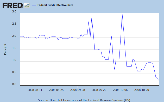
while the fire was in progress."  A bit on the snarky side, but he also points out that the Fed had lost control of the Fed Funds rate at this time, anyway, due in part to risk perceptions.  This is shown in Graph 7.   What does this tell us about expectations at a time of panic?


He also indicated that the Fed loaned substantial amounts to financial institutions, starting early in '08, and increasing dramatically in September and October.  This is shown in Graph 8.


There was a lot of overt Fed action in 2008.  Maybe it was a bit sluggish, but if so, it was only lagging real world events by a few weeks.  They might have acted a bit quicker, but I don't see any more they could have done, other than talking differently.

Can those words really have been the cause of the greatest financial disaster in 80 years?

Afterthought:  It's entirely possible that the Fed, and most particularly bubble denier Alan Greenspan, were complicit in the many-years-long prelude that set the stage for the crash.  But that was much earlier and really is a separate set of issues.