It looks like this - Graph 1.

Graph 1. Fed Expenditures/GDP
Sure enough, by the end of Clinton's term the ratio had fallen from Reagan's high of 24% to a modern low of 19%. But note that the 19% value wasn't typical. It was the end point of a decade-long decline. And, yep, there's Obama with an all-time-high approaching 26%.
What otherwise intelligent, and sometimes even famous people seem to ignore though, is that every ratio has not only a numerator but also that ol' devil denominator. Let's have a look at both of them. Graph 2 shows GDP and Expenditures since 1980, expressed in $ Billions. I've also added a line representing 5* Expenditures, since 20% of GDP is a reasonable rough estimate for the post WW II era.

Graph 2. Expenditures and GDP Compared
Actually, the 5x Expenditures line runs pretty consistently above the GDP line, telling us two things that we should have already known from looking at Graph 1. First, Expenditures greater than 20% of GDP have been the norm since before 1980, and 2) Clinton's final number is not representative of anything other than a single year. Using it as a comparator is cherry-picking and fundamentally dishonest.
The 5x line also emphasizes that the majority of the spending increase under Obama unavoidably occurred during the officially designated recession. The GDP line shows that, post recession, GDP growth has not recovered to the pre-recession trend line. In fact, growth has established a new trend line with a lower slope. This is unprecedented in the scope of FRED historical data. My guess is that insufficient Federal spending has been a big drag on this recovery. But it's also true that GDP growth has been in secular decline since the Reagan administration. Note that skewing the denominator down will automatically skew the ratio up. This is what Bill Clinton calls "arithmetic."
Slicing across this a different way, Graph 3 gives us year-over-year percentage growth in Expenditures and GDP, dating back to the Eisenhower administration.
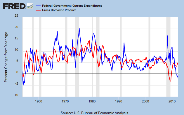
Graph 3. YoY % Change in Expenditures and GDP
A few simple observations:
- The spending increase during the recent recession was modest by any standard, and dwarfed by earlier surges.
- That increase, coupled with the most severe GDP decline since the other Great Depression gave our beloved ratio a terrible, horrible, no good, very bad double whammy.
- GDP growth during this recovery is only marginally better than it was during the 2001-2 low, and far below Clinton era levels.
- Clinton was the most consistently frugal president of the post WW II era - until now.
- Since the recession was declared over, B. Hoover Obama has been miserly.
One can legitimately argue that Obama's approach to the economy has been excessively conservative. Krugman has made this point repeatedly. I often say that Clinton governed to the right of Eisenhower - who was a genuine deficit hawk - and that Obama is to the right of Clinton. That is intended to be slightly hyperbolic, but using this data as the benchmark, it's dead on.
Any questions?
Cross posted at Angry Bear
![[Most Recent Quotes from www.kitco.com]](http://www.kitconet.com/charts/metals/gold/tny_au_xx_usoz_4.gif)


7 comments:
Look at you, numbering those graphs!
Good post.
I suppose the "devil denominator" thing has to be said over and over, as ratios are often misused to prove things that are not true.
Art -
Thanks.
Yeah, somebody suggested I should do that numbering thang.
I occasionally feel the need to beat the denominator drum. Maybe I should be more on the lookout for opportunities.
Cheers!
JzB
Here's my opinion for what it is worth.
There's nothing inherently wrong with using ratios to make a point.
ALL statistics can be abused. Ratios are no exception.
The current spending to GDP ratio is horrible and most likely cannot be permanently maintained. I don't blame one particular political party over the other for it though. I'm much more likely to blame this.
Mark -
Art has a consistent theme - the private debt overhand that is a drag on our economy.
You have a consistent them - the failure of exponential trends.
I'm more ad hoc, I guess, but one of my interests is to skewer nonsense that comes from the right wing - and I never run out of material.
Re: abuse - my father told me about 50 years ago the figures don't lie, but liars sure know how to figure.
There is nothing inherently wrong with using a ratio to illustrate a valid point. There is everything wrong with trying to make a point about a ratio as if it were a point about the numerator alone.
Sadly, I see this a lot. It's done either out of ignorance, which can be corrected with some education; or dishonesty, which needs to be exposed and vilified.
You raise a number of valid issues in your post, but it's not clear to me how they relate to my topic.
Cheers!
JzB
Jazzbumpa,
Art's theme and my theme often interact. Sigh.
The failure of exponential trends is clearly very interesting to me.
1. It's pure. Few can debate that an exponential trend hasn't failed when it clearly has.
2. The failure of exponential trends go hand in hand with the "it is different this time" theme. We are continually told that "it is different this time" is a dangerous mindset to have when is investing. In sharp contrast, I am embracing it. I really do think it is different this time. There have been a staggering number of long-term exponential trend failures in recent years. It is very unlikely (if not impossible) that we will ever return to the previous trends.
I have certainly seen my charts used in ways that make no sense to me. The most recent one was this exponential trend failure that began in 2000. I've seen it used to show how bad Obama is doing.
Correct me if I am wrong, but I am fairly confident that Obama wasn't elected in 2000. If we were to use political arguments to place blame here (and I'm not suggesting we should), then it would be 66.7% republican and 33.3% democrat.
I'm also fairly confident that Obama can't create 40.6 million jobs when there are only 12.5 million unemployed. He's not a miracle worker.
It's done either out of ignorance, which can be corrected with some education; or dishonesty, which needs to be exposed and vilified.
I think your "or" deserves to be an "and/or". Sigh.
ce site sacs de répliques plus d'informations ici répliques de sacs de créateurs bon marché En savoir plus ici Dolabuy Chrome-Hearts
jordan retro
off white jordan
off white shoes
golden goose shoes
jordan 1
birkin bag
yeezy boost 350
goyard
moncler
golden goose
Post a Comment