Part III - How to think about time series data.
For reference:
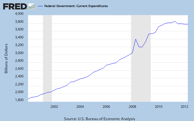
Part II
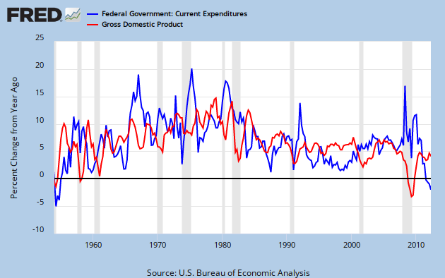
Federal Spending as a Fraction of GDP
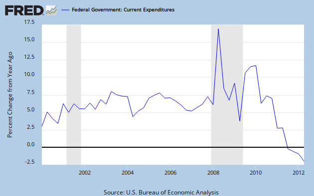
Part I
Federal Spending Growth
Some commentors to the previous posts have rightly concluded that I consider spending under Obama in the context of historical trends. In fact, if you don't consider historical trends, you are ignoring the most important element of context that is available. I only mentioned trends briefly in Part II, but the directional changes in the graphs of Parts I and II implicitly suggest them.
Time series data that relate to the size of the population, the government, or the economy generally follow a quasi-exponential growth pattern. I say
quasi- because a perfect exponential growth pattern results from a continuous constant rate of growth, while real world growth rates vary from year. Graph 3 of Part II shows how these variations have occurred over several decades. Usually this does not result in a large or permanent deformation in the shape of a quasi-exponential curve, since the growth rate typically oscillates irregularly around a mean value that only changes slowly over time.
Graph 2 in Part II shows that the spending and GDP growth curves stay close to exponential tracks over long time spans. It also illustrates that the recent recession was one of those rare times when growth rates deviated substantially.
Human eye-brain coordination doesn't deal well with exponential curve shapes. Straight lines are much easier to comprehend and extrapolate. Graphing quasi-exponential data on a log scale reduces the curve to a quasi-straight line that is much easier to use and understand.
Graph 1 shows Federal Spending and GDP, since 1995, plotted on a log scale. Constant growth results in a straight line segment, and a higher growth rate causes a steeper slope. Zero growth shows up as a horizontal line. I've again included a line for 5 times spending, to get a close overlay with the GDP line.
Graph 1. Spending and GDP since 1995 (log scale)
There is an upward bend in the spending line in 2000. This is most easily seen in the blue line. During the 90's, we can see that GDP grew faster than spending. In 2001-2, GDP growth flat-lined, as expected during a recession. Then, from 20002 to 2008, the growth rates for GDP and spending were close to identical. Both lines twist during the most recent recession. Curiously, spending growth was flat for a large portion of 2008.
Since the recession, the spending lines are very close to flat, and GDP growth has been anemic. Here is a close up.
Graph 2. Spending and GDP since 2007 (log scale)
Graph 3 provides context, all the way back to 1947. Ponder the inflection points and slope changes at your leisure.
Graph 2. Spending and GDP since 1947 (log scale)
Note that there are only two flat-ish spots in the spending lines: now, and during the Eisenhower administration. The current administration has, at least temporarily, broken the decades-long trend in continuous spending increases.
To emphasize the obvious, spending growth is now very close to zero. In context, this is remarkable. Saying Obama is a profligate spender is a lie.
In this post, I am not suggesting that the rate of spending growth under any president is good, bad, appropriate or inappropriate. I am only pointing out what was and is.
So, this is how you think about time series data.
0) Forget your preconceived notions. (Frex:I had no idea that spending growth has essentially stopped until I looked at the data.)
1) Identify trends. The history of time series data provides meaningful context.
2) Identify break points and trend changes. These are key data points.
3) Note the directions of these changes.
4) Think hard about what these observations are actually telling you, not what you want them to say.
5) Double down on 4) if you are looking at a ratio. Ponder that denominator.
6) Don't cherry pick. It's dishonest.
There are a lot of ways to look at a data set: linear and log scales, rate of change, etc. Chose the one that gives the clearest picture of the data you want to analyze, or simplifies the analysis, or makes it easier to understand. Studying different views can be informative, as can a comparison of different data sets.
Here is the working page at FRED for the graphs in this post. I encourage the interested reader to spend some time working with the capabilities of this very powerful tool.
Editorial Comment:
In case it's not obvious, I'll tell you that I write these posts because they interest me and I think they generate some knowledge, or at least information, that is worth sharing. I have virtually no interest in the fool's errand of convincing anybody that I am right - either the data analysis convinces you or it doesn't. So unless you have better data, or can point out some specific flaw in my reasoning [and then tell me specifically and in detail how to get it right] don't bother arguing with me.
I appreciate rational discourse, and am always willing to engage thoughtful readers. I'm also willing to be proven wrong by a cogent argument. That said, though, I don't really care if anyone comments. At this point, I'd
almost rather nobody did. But if you chose to, please do me the courtesy of having your comment be somewhere in the general vicinity of on-topic. And - fair warning: naked assertions and unsubstantiated ideologically approved talking points will be scoffed at, so please check that nonsense at the door.


![[Most Recent Quotes from www.kitco.com]](http://www.kitconet.com/charts/metals/gold/tny_au_xx_usoz_4.gif)


