and made this comment.
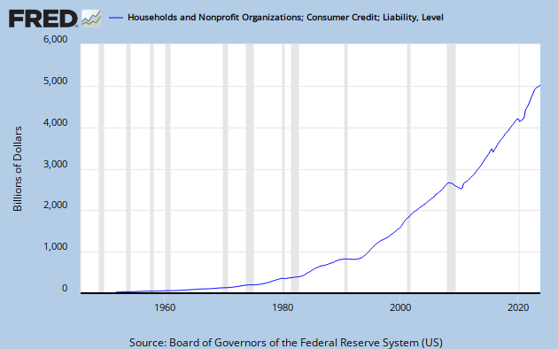
Second, a dramatic rise in household debt, which many of us now believe lies at the heart of our continuing depression.
There are those who seem to believe that if Krugman says it, it must be wrong. Here is Scott Sumner's reaction.
What do you see? I suppose it’s in the eye of the beholder, but I see three big debt surges: 1952-64, 1984-91, and 2000-08. The first debt surge was followed by a golden age in American history; the boom of 1965-73. The second debt surge was followed by another golden age, the boom of 1991-2007. And the third was followed by a severe recession. What was different with the third case? The Fed adopted a tight money policy that caused NGDP growth to crash, which in turn sharply raised the W/NGDP ratio. Krugman has another recent post that shows further evidence of the importance of sticky wages. Forget about debt and focus on NGDP. It’s NGDP instability that creates problems, not debt surges.
Bold emphasis is provided by Marcus Nunes, who goes on to say:
Why does the share of debt rise? I believe it reflects peoples “optimism” about future prospects. In the chart below I break down Krugman´s chart and separate mortgage and non-mortgage household debt as a share of NGDP. I also add the behavior of the stock market (here represented by the Dow-Jones Index).
[See the linked Nunes post for his chart.]
Eye of the beholder, indeed. Nunes makes an expectations-based argument, and adds:
Non-mortgage debt remains relatively stable after 1965, fluctuating in the range of 17% to 22% of NGDP. No problem there.
But the reality is that non-mortgage debt has grown quasi-exponentially in the post WW II period.
Sumner, as always, beats the NGDP drum.
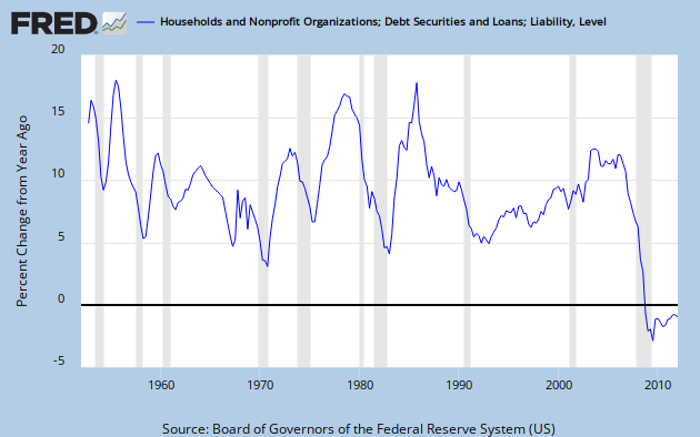
My friend Art takes a jaundiced view of the Sumner-Nunes interpretation. He gets it exactly right. To see why, let's go back and have a look at the data. Here is straight CMDEBT (Household Credit Market Debt Outstanding,) presented as YoY percent change - not distorted by a GDP divisor.
Sumner sees a debt surge from 1952 to 1964. I see a secular decrease in the YoY rate of debt growth from over 15% to under 5% by about 1966.
Sumner sees a debt surge from 1984 to 1991. I see a decrease in the YoY rate of debt growth from over 15% to about 5% over that same span.
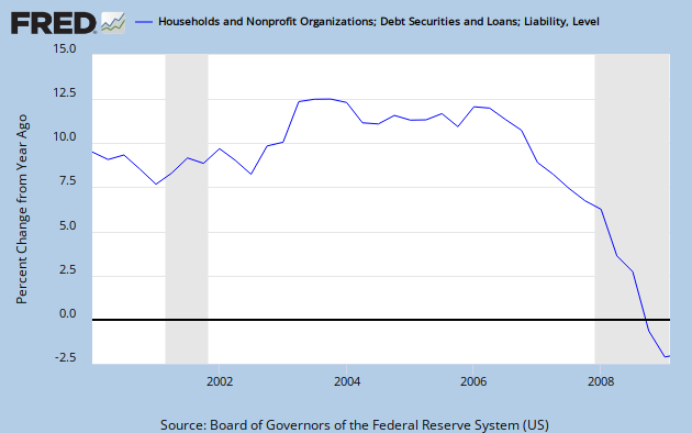
Sumner sees a debt surge from 2000 to 2008. I see a modest rise into a broad peak between 2003 and 2006, with a net decrease in the rate of debt growth over the 2000 to 2007 period. In CY 2008 debt growth goes negative. Here's a close-up view.
So much for optimism-fueled debt growth.
Between the non-existent debt surges Sumner sees a golden age from 1965 to 1973. I'm a bit puzzled by a golden age boom that straddles one recession and leads directly into another; though I will admit that average GDP growth then looks impressive compared to the GDP growth of the last decade. But the thing that Sumner misses within his "golden age" is the big debt surge from 1971 to 1974.
By my reckoning, Sumner is incapable of identifying either a debt surge or an economic boom.
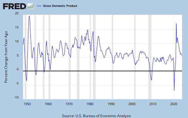
So what is going on here? Sumner and Nunes either fail to realize or deliberately ignore that the quantity CMDEBT/GDP has a denominator. Let's look at GDP. Here is YoY GDP growth over the post WW II period. And, of course, this is NGDP - not inflation adjusted - the very quantity to which Sumner ascribes so much gravitas.
The average GDP growth over the period 1948 to 2007 is 7.04%
The average over the "debt surge" period 1952 to 1964 is 5.35%
The average over the "debt surge" period 1984 to 1991 is 6.85%
The average over the "debt surge" period 2000 to 2007 is 5.24%
What we have are three periods of below average GDP growth, two of them substantially so. The middle one is only slightly below average, but that is misleading since there is a steep decline in GDP growth over the period.
Consider C = A/B. If B is small or decreasing, it will tend to make C large or increasing. To ascribe all of the changes in C to changes in A is to ignore that Ol' Devil Denominator.
Sumner does bring up NGDP growth late in the passage quoted above, but I don't get his point. If I'm reading him correctly, he claims that NGDP growth crashed between 2000 and 2008, and that caused the Debt/GDP ratio to rise. But NGDP growth was sharply up from 2001 to 2003, relatively steady through 2006, and never crashed until 2008. If there is any sense in his argument, somebody will have to explain it to me.
What actually happened was a real debt surge - but it was between 1997 and 2004. Meanwhile, GDP growth both before and after the 2000-2003 dip was around 6 to 7%. Then, in 2006, household debt growth and GDP growth both started to slump, and in 2008 took a nose dive together.
Sumner and Nunes have made a very fundamental error - not so much in the math itself as in the application of logic. This is sloppy thinking, and any conclusions drawn from it must be highly suspect.
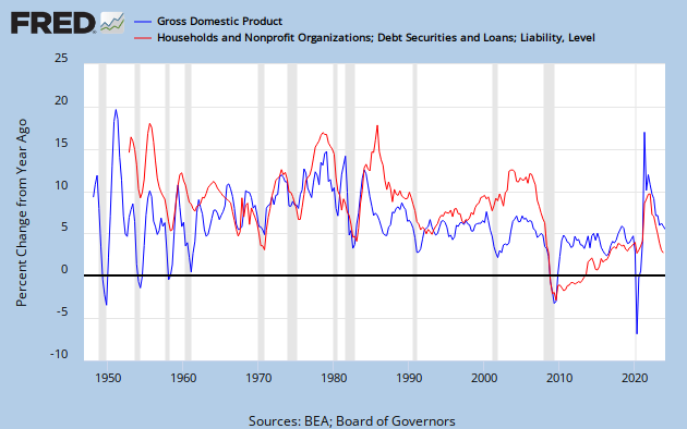
To get a handle on what is really going on, let's look at debt growth and GDP growth together.
They don't move in lock-step, but the similarity is striking. Specifically, every recession except 2001 corresponds exactly to a minimum in debt growth. So Sumner's advice to "forget about debt" looks like it's missing something very important - specifically that the household component of spending [aka GDP growth] has been debt financed. To put it in context, have a look at Krugman's first graph in the article linked above. It shows what we all know, but some chose to ignore - that median wages have stagnated for 40 years.
In my narrative, the reason household debt grew to almost 100% of GDP is that stagnating incomes have not been able to support the cost of the American life style - due to decades of inflation, but probably largely driven by the costs of health care and education. Remember - contra the prevailing view of economists today - spending, and therefore GDP growth, is directly dependent on income, not on wealth.
Debt is a useful tool that develops into a problem when it becomes too burdensome to service. Looking at debt as a percentage of GDP provides a clue as to how serviceable the debt is. When you also consider that all of the GDP growth over several decades has gone to the top income earners, you can see that the debt servicing problem is made that much worse for the average person.
Nunes thinks debt rises when people are optimistic about the future, and he weaves a narrative based on that idea. He then blames the 2008 collapse on bad policy, including a contractionary Fed. He appears to want spending growth, but refuses to recognize the exhausted ability of ordinary people to spend.
In my view - and I think the data supports it - Krugman and Art have this exactly right. And, as is nearly always the case, those who disagree with PK on what is happening in the real word have to invent a fantasy-world explanation - or, if I can borrow an especially tortured metaphor from Nunes, pull a red herring out of a hat.
Cross-posted at Angry Bear.

![[Most Recent Quotes from www.kitco.com]](http://www.kitconet.com/charts/metals/gold/tny_au_xx_usoz_4.gif)


5 comments:
Hey, somebody at Business Insider likes you! (But not enough to identify you by name, I guess.)
Your YoY Percent Change graph really tells the tale. I remember a while back you recommended using such graphs. Now I see why.
Art -
I think B I picks up all the AB posts.
Too bad that they can't grab the graphs.
YoY % is just one way to look at data.
I like to do what I think makes sense in context.
Cheers!
JzB
yeezy boost 350
canada goose
retro jordans
nike air huarache
jordan shoes
yeezys
yeezy shoes
hermes handbags bag
jordans
nike 97
lebron james shoes
kyrie spongebob
curry 6 shoes
golden goose
moncler
supreme clothing
nike air max 97
jordan shoes
kobe shoes
air yeezy
mjy784g32f
golden goose outlet
golden goose outlet
golden goose outlet
golden goose outlet
golden goose outlet
golden goose outlet
golden goose outlet
golden goose outlet
golden goose outlet
golden goose outlet
Post a Comment