Look: I am eager to learn stuff I don't know--which requires actively courting and posting smart disagreement.

But as you will understand, I don't like to post things that mischaracterize and are aimed to mislead.

-- Brad Delong

Copyright Notice

Everything that appears on this blog is the copyrighted property of somebody. Often, but not always, that somebody is me. For things that are not mine, I either have obtained permission, or claim fair use. Feel free to quote me, but attribute, please. My photos and poetry are dear to my heart, and may not be used without permission. Ditto, my other intellectual property, such as charts and graphs. I'm probably willing to share. Let's talk. Violators will be damned for all eternity to the circle of hell populated by Rosanne Barr, Mrs Miller [look her up], and trombonists who are unable play in tune. You cannot possibly imagine the agony. If you have a question, email me: jazzbumpa@gmail.com. I'll answer when I feel like it. Cheers!

Wednesday, October 31, 2012

Halloween Fear


The scariest thought I've had this Halloween evening - and I can't get rid of it - is imagining some poor guy in a major natural disaster in the Romney universe of privatized FEMA responsibility, who has just lost his house and all his possessions having to pay Halliburton $100 for a pint of water so his child doesn't die of thirst.

Fowl and Fishy Inflation

It has been suggested that the rapid increase in the prices of fish, fowl, meat and eggs for about two years following October, 2009 was the result of QE causing inflation in these items.  From this Calculated Risk graph, we can get the QE date line.  QE was announced on Nov 25, 2008, and expanded in April 2009.  It ended in May, 2010.  QE II was hinted at in Sept, 2010, announced in Nov 2010, and ended in August 2011.

The timing correspondence is less than stellar, since the YoY increase in prices for those food items dropped like a rock from October, '08 though Oct. '09.  It then shot up to a 7 1/2 year high in May of 2011.

This can be seen in the red line of Graph 1, which also shows the CPI for all items except food and energy (CPILFESL) in blue.


 Graph 1 YoY Price increases for Selected Food Stuffs and All Items Less Food and Energy

To assume a cause and effect relationship, you have to account for a time lag of a year from the announcement and 6 months from the expansion of QE to the turn around in those price increases from the Oct '09 bottom.  Remember, through the first 11 months of QE, the YoY change in those prices dropped dramatically.  Between May and November, 2010, while no QE program was in effect, these prices had the steepest part of their rise.  After QE II ended in August, 2011, the YoY price increase remained high for those items until the end of the year, and then fell rapidly.

A longer view reveals that the increase in those food prices oscillates continuously around the All Items Less Food and Energy line.  The trough to trough period is irregular, averaging 3.52 years with a standard deviation of 0.45 year (5 measurements).   The trough to trough time from May, '06 to Oct., '09 was a very typical 3.4 years.  It is very hard to look at that graph and see anything unusual about the 2008-2012 region, other than the depth of the trough shortly after the Great Recession.

It appeared to me that the blue line of Graph 1 might be a crude approximation of a long average of the red line.  This turns out not quite to be the case, since the two lines are measuring different baskets of goods.  What we have is the YoY increase for these food items oscillating around its own mean. That sounds like a tautology, but let's look a little deeper.

Graph 2 shows the same data, along with some long averages of the food stuffs YoY price increase line.   These are the 5 Yr (light blue), 8 Yr (yellow), and 13 Yr (purple) moving averages, and the average for the whole data set, 2.9 (bright green).  I've also included an envelope one standard deviation (3.06) above (5.96) and below (-0.17) the mean in dark green.

Graph 2 YoY Price increases for Selected Food Stuffs with Avgs and All Items Less Food and Energy

This (sort of) resembles a control chart.  The +/- Std. Dev. envelope isn't a hard barrier, but does tend to turn the data path back toward the mean, unless something strange happens.  Frex, the big rise from late '02 to early '04 followed the Iraq invasion and resulting disruption in petroleum pricing.  The '09 trough was the result of the Great Recession.  These are explainable variations.

Note also that the moving average lines tended to run below the CPILFESL line prior to late 2002, and have tended to run above it since.  This is to be expected since these items are basically the top of the food chain and have several layers of fuel dependent contributors in their cost structure.  Recall that until 2002, fuel prices were low, and since then (except for the Great Recession) have increased steadily.

I'm quite sympathetic to the idea that QE has done very little to help ease the economic doldrums following the GR.  But I see no reason at all to believe that it has contributed to the pain and suffering of ordinary citizens at either the grocery store or the gas pump.


Monday, October 15, 2012

GDP Growth Caused By Tax Cuts Has Never Happened

Mike's post here got me thinking.  I'll telegraph my conclusion.  He dramatically understated his case.

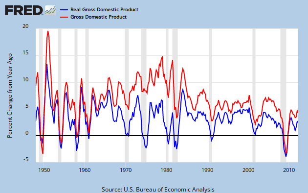
You can see the long range view of nominal and inflation adjusted GPD growth in Graph 1 of FRED quarterly YoY percent change data.


Graph 1 YoY growth Nominal and Inflation Adjusted GDP

Nominal GDP Growth was in a secular up-trend from 1960 through 1980.  However, inflation adjusted GDP growth quickly peaked after the Kennedy-Johnson tax cut, reaching a maximum value of 8.5% in Q4 of '65 and Q1 of  '66.  It then dropped dramatically for the next four years.  This peak value has been matched only once since: in 1984, during a sharp rebound from the double dip recession of 1980-82.

Since then, in the wake of numerous tax cuts, the rate of GDP growth has been anemic. To get a look at the rate of growth, I took an 8 year average of the annual percent change data presented above, and then plotted a 5 year rate of change for that data.  This is essentially the 2nd derivative of GDP, or GDP acceleration, as shown in Graph 2.


 Graph 2  GDP Acceleration

 Inflation Adjusted GDP acceleration peaked in Q3, 1966.   Fueled by the inflation of the 70's, NGDP acceleration stayed high until Q1, 1980, then plummeted for 9 years.  It has been relentlessly negative since.

Inflation adjusted GDP acceleration has not done quite as badly in this disinflationary era, but has been below zero more than half the time since 1970.  This is a little bit worse than coasting.

This all might seem a bit abstract, but the message is clear.  If tax cuts were good for the economy, then GDP growth would be increasing.  In other words, acceleration would be positive and most especially so after a tax cut.  The data is not consistent with this notion.

Clinton's famous tax increase preceded increased GDP growth by either measure, and an upturn in acceleration.  The Bush tax cuts preceded decreasing GDP growth.

I'm not going to get into a correlation vs causation discussion.  I'll simply say that tax cuts over 5+ decades have been an utter failure at stimulating real economic growth in any inflationary environment.  Since the real world data correlation is counter to the received conservative wisdom, it might be worth trying an anti-conservative approach.

It might also give the NGDP targeting enthusiasts something to ponder.

Cross posted at Angry Bear.

Thursday, October 11, 2012

Debt and Growth

Art at The New Arthurian Economics and I are looking at the relationship between debt and economic growth.  Art started with an observation of two FRED series, total credit market debt owed (TCMDO) and Gross Domestic Product (GDP,  nominal or GDPC1, inflation adjusted - take your pick.)

Graph 1, from FRED, shows these data series.  I've chosen nominal GDP and, for reference, also included the total Federal Debt.


 Graph 1 TCMDO, GDP and Total Federal Debt

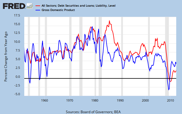
In 1950, TCMDO was about 1.3 times GDP, but growing a bit more quickly.  By 1980, the ratio was 1.6, and by 1987 it was greater than 2.  Now that ratio is approaching 4.  Note that TCMDO is also close to 4 times greater than total public debt.  This is why Art and I agree that private, not public debt is the problem that needs to be addressed, but is largely ignored.

Linked here are Art's posts with graphs of YoY growth in both factors, pre 1980 and post-1980.  Pre 1980, their moves are similar in magnitude, and pretty well coordinated. Post 1980 there is still some occasional similarity of motion, but the coordination breaks down and debt growth is generally quite a bit higher than GDP growth.  The 80's in particular stand out as being starkly different from the previous period.

Graph 2 shows the entire data set, since 1952.


Graph 2 YoY % Growth in TCMDO and GDP

These observations led Art to the reasonable hypothesis that, "Output growth slowed when debt became excessive."  This, in fact, might explain the great stagnation.

I suggested, and Art accepted two corollaries to his hypothesis.

1) There is a non-excessive amount of debt. Let's call it "just right."
2) Below the "just right" amount, there might also be "not enough."

Actually, there is a lower level hypothesis, to which Art's is corollary: That there is a functional relationship between debt and growth, in which growth is the dependent variable.

This is what I will explore in this post.

Graph 3 is a scatter plot of GDP vs TCMDO YoY % change for each, FRED quarterly data from Q4, 1952 through Q2, 2012, with a best fit straight line included.


Graph 3 GDP vs TCMDO, YoY % Change

The relationship is quite clearly positive.  The R^2 value at .39 is rather low, but not terrible.  There is quite a bit of scatter in the data.  Note the circle of data points around the left end of the line.  More on that later.

Next, I divided the data by decades, frex, 1961-1970.  This admittedly simplistic data parsing reveals that the slope and R^2 values are strongly variable over time.  Graph 4 shows the scatter plot along with the slope and R^2 values for each decade.  These data values are arranged in the chart in chronological order and color matched with the corresponding data points.


 Graph 4 GDP vs TCMDO, YoY % Change by Decade

I've added a brown line connecting the dots for the first decade of this century.  The chronology proceeds from a cluster near the center of the graph into a clockwise circular spiral.

Graph 5 shows how the slope and R^2 vary over time.

 Graph 5 Slope and R^2 Over Time for GDP vs TCMDO

After the 60's, the slope plummets, and by the 80's R^2 is a laughable 0.035.  Though the slope has remained low, R^2 has since recovered to 0.38, which is near the whole data set value of 0.39, and only slightly less than the 0.40 to 0.44 of the first three decades.

The slope changes can be interpreted as generally less GDP bang for the TCMDO buck, as the TCMDO/GDP ratio increases.  This is totally consistent with Art's hypothesis.

I have more to say about the GDP -TCMDO relationship, but this post is getting long, so I'll save it for a follow-up.

For now, I'll close with a few questions.

1) Do you think we're on to something?
2) What do you think of the methodology?
3) "Excessive debt" is suggestive, but non-specific.  How should this concept be quantized?
4) How should I go at exploring corollaries 1 and 2 mentioned after Graph 2?
5) Any thoughts on what was there about the 80's that blew up the prior debt - GDP relationship?
6) Is there such a thing as productive vs non-productive debt, and how would they be characterized?

I look forward to your constructive comments.

Cross-posted at Angry Bear.

Tuesday, October 9, 2012

Strategic Lying as Political Art

If you listen to Randi Rhodes, you know she is still livid over Romney being declared the "winner" in last week's - we'll call it a "debate" for the nonce.

Alas, though, the reason he won is that poll numbers have moved in his favor.  Whether that bounce is robust remains to be seen.  But it did gain Romney some sort of advantage, at least in the near term.

Randi's objection is that Romney lied, repeatedly, and about almost everything.  In the process, he flatly repudiated some of the major planks in his platform - the destruction of Medicare as we know it, the $5 Trillion dollar tax cut, the reduction of tax share paid by high income people, and an insurance plan not covering pre-existing conditions stand out in that regard.   And these are but a few of the 27  debate lies that can easily be recognized and refuted.

Indeed, the one rare moment of lucid candor came when he eagerly, gleefully announced that he would send Big Bird to the unemployment line in order to avoid borrowing money from China.  Big NPR whoop!  To put this in perspective, for CY 2012, the Federal Government, via the Corp. for Public Broadcasting, is contributing $26.65 million in support of PBS, or 0.0007% of total Federal expenditures ($3.77 Trillion) for 2012.    In fact, the entire Federal contribution to CPB is $445.2 million, or 0.0118% of total expenditures. That's sure going to help balance $5 Trillion in tax cuts over ten years. (CPB data from Wikipedia, current expenditure data from the St. Louis Fed.)   Romney isn't lying about our creditor position with China, but he was certainly misleading.  According to Fox News (!) "China, it turns out, holds less than 8 percent of the money our government has borrowed over the years."

OK, I get where Randi is coming from - to have a totally unprincipled opportunist in charge of running the world's greatest super power is not a recipe for any kind of enduring success, either for the U.S.A. specifically, or for the world at large.  There are many historical examples one could cite, but we really needn't go back any further than the "compassionate conservatism" of unprosecuted war criminal and would-be social security privatizer George W. Bush to make the point.

But what Randi refuses to acknowledge is that what we witnessed last week was not a debate, by any recognizable definition of the term.  Lying will get you disqualified in a real debate - right?  This was political theater - and what is theater but staged fiction? 

And there is nothing unusual here.  I've been saying for years that all Republicans do is lie, and then lie about their lies. (I might have gotten that phrase from Randi - the memory is foggy.)  Here is a four-year-old exposé of some of Romney's shape shifting.  (H/T to Dave Brockington at LGM.)


A more insidious kind of lie is simply denying reality, as characterized by birtherism, New Deal and global warming denialism, and Friday's epidemic of conspiracy theories surrounding the latest favorable jobs report.   But I digress.

Here is my point.  Brad Delong points us to a 1984 Fay Joyce article in the N. Y. Times uncovered by Michael Moore.  It turns out that lying during a debate is a time honored Republican strategy.  Even 28 years ago, when there was some chance of the main stream media doing actual journalism, they were confident in their lying strategy.

The Republicans are unabashed in their discussion of their ability to use the television medium. "You can say anything you want during a debate and 80 million people hear it,'' observed Peter Teeley, press secretary to Vice President Bush. If reporters then document that a candidate spoke untruthfully, ''so what?''

''Maybe 200 people read it or 2,000 or 20,000,'' he said.

Now, they have honed it into an art form.  And it's worth remembering the one reason that always accounts for every person's lie: their agenda is not compatible with the truth.

Saturday, October 6, 2012

James Bullard Is A Liar

It took a little bit of effort to keep the words "god damned" out of the title.

Tim Duy explains.

My comment:


Two thoughts -
1) The FED totally abrogates its dual mandate with its intense focus on inflation. Their actions over recent years - actually, decades - makes it clear they have absolutely no concern for unemployment.
2) It's time to drop "disingenuous" from the lexicon. If the man is a liar, he's a liar, and deserves to be revealed as such.

Thursday, September 27, 2012

NFL Republicanism

I've long felt that the NFL is the most Republican organization on the face of the earth.  It's an old rich white guy's play ground, and as close to medievalism as we have - until the next Republican Presidency.

The NFL lockout of the officials simply confirmed what we should already have known.  The owners don't give a hirsute rodent's hindquarters about player safety, the integrity of the game, or getting anything right.  They wanted to engage in union busting, simply because they can.

Or so they thought.  In my jaundiced opinion, the regular NFL refs are TEH SUXXOR.  But that doesn't mean things couldn't get a whole lot worse.  And they did when they brought in cast-offs from the lingerie league.

But there are limits -- if you're a big enough ass hole to go look for them.

My Lovely Wife pegged this on Monday night when the Packers got shafted by a cluster-phung of bad calls culminating in the now infamous toucherception.


Picture found on Facebook

This was beyond even what Wisconsin Rethugs like Scott Walker could stomach.

I find that irony to be quite tasty.

It all comes down to who's ox is being gored.  Everyone in WI (and even some in MI) loves them some Packers - even those inclined to break unions and roll us back to the dark ages.

That's what the LW figured out, right on the spot.

It was all over when Green Bay got the shaft.

You do NOT mess with the Packers!

Wednesday, September 26, 2012

The Effect of Capital Gains Tax on Investment - Appendix

In comments to my previous post, Robert requested the unsmoothed data from Graph 3.  Here it is.   GPDI is plotted against the Capital Gains Tax Rate.


Since the Capital Gains Tax Rate (X-axis) is quantized, the result is columns of data.  Compared to the smoothed version, there is little change in either the slope or intercept of the best fit straight line.  R^2 is, of course, much lower.


Tuesday, September 25, 2012

The Effect of Capital Gains Tax on Investment

Matt Yglesias, servitor to our corporate overlords, suggests that the reduced capital gains tax rate paid by rentiers like Willard Romney is really a very, very good thing.  To wit:

The main reason Romney's effective rate is so low is that the American tax code contains a lot of preferences for investment income over labor income.
. . .
But this is definitely an issue where the conservative position is in line with what most experts think is the right course, and Democrats are outside the mainstream.
.  .  .
That's the theory, at any rate. It's a pretty solid theory, it's in most of the textbooks I've seen, and it shapes public policy in basically every country I'm familiar with. Even researchers like Thomas Piketty and Emmanuel Saez (see "A Theory of Optimal Capital Taxation") who dissent from the standard no taxation of investment income position think capital income should be taxed more lightly than labor income. Empirically, it's a bit difficult to verify that variations in capital gains tax rates and the like really are making a material difference to investment levels. But then again the data is noisy.

Scott Lemieux at LGM demurs.

Sure, if you 1)accept the premise that reducing or eliminating capital gains taxes will result in productive infrastructure investments rather than worthless accounting tricks, 2)ignore the economic benefits created by consumption, 3)assume that significant numbers of people will forgo money for doing nothing just because the profits will be taxed , and 4)ignore the fact that in most jurisdictions consumption is also “double taxed,” then reducing capital gains taxes looks good.   But since all of these assumptions are (to put it mildly) highly contestable, it’s just question-begging.

My response to Matt is that in my jaundiced opinion, you might as well consult The Necronomicon of Abdul Alhazred as an economics textbook for an issue like this; and that in a world that has on the one hand Krugman, Thoma and Delong, and on the other Fama, Cochran and Cowan, a consensus among experts is about as likely as lions lying down with lambs for some purpose other than a quick snack.

To Scott I say, why assume or ignore anything when that oh-so-noisy data is readily available?

Saturday, September 22, 2012

Ye Olde Political Survey

Following Beale's lead I took the survey.

My prefered candidate, as it turns out, is Jill Stein of the Green Party.  Oh, well, I'm still going to vote for the foreign-born Commie Muslim Nazi Neegra.  He's not that far off.

Here is how I align with the various candidates.

Jill Stein, Green                 90%
B. Obama, Dem                 87%
Rocky Anderson, Justice     64%
Mitt Romney, Rethug           8%
Michigan Voters                63%
American Voters                64%

Like Beale, I have to  wonder how Romney's positions have been defined, since he is a schizophrenic chameleon drawn on an Etch-a-sketch by a three-year-old desperately in need of a nap.

If their assessment of American voters is anywhere near correct, then Romney can keep his position among the unemployed.

Party Affiliation
Democrat                           95%
Green                                92%
Libertarian                         18%
Repugnicant                        5%

I'm 18% Libertarian.  Actually, that seems about right.


Friday, September 21, 2012

What the Hell?!? Friday - Voter Fraud Edition

Sarah Silverman explaines it all.

Saraf F-ing Silverman - so do I need to explain it's NSFW and NSF if there are children, teabaggers, small animals or your ass-hole conservatard brother-in-law within earshot?


H/T to the L/W

My Angry Bear Posts in CY 2012

Here is a running list of my 2012 posts at Angry Bear, newest at the top.

 An Editorial on Robert Bork and his Legacy   12/26/2012

One Nation, Divisible     11/13/2012  

Fowl and Fishy Inflation     11/01/2012

GDP Growth Caused By Tax Cuts Has Never Happened     10/16/2012

Debt and Growth    10/11/2012

Strategic Lying as Political Art    10/09/12

The Effect of Capital Gains Tax on Investment      9/25/2012

What is the Economic Middle Class?   9/19/2012

Who are the 47%? Follow-up       9/18/2012

Public and Private Investment      9/13/2012

Yes, The Right Wing Lies When They Say Obama is a Profligate Spender   9/10/2012

Why Spending/GDP is a Terrible, Horrible, No Good, Very Bad Metric For Judging Obama's Performance                                     9/07/2012

A Quick Look at Federal Spending     9/06/2012

Debt, Recession, and That Ol' Devil Denominator    8/23/2012

Who Determines Short Term Interest Rates?   5/01/2012

A Different Look at GDP and Inflation           4/30/2012

Another Look at Wealth and Consumption - Pt 2  4/12/2012

The Brute Economics of Slavery   4/05/2012

Another Look at Wealth and Consumption - Pt 1   3/30/2012

World Trade    3/24/2012

Has America Lost It's Drive? - Pt. 4  3/07/2012

Insurance and Birth Control         3/04/2012

More on Michigan Voting   3/01/2012

Michigan Primary Results  2/29/2012

Is America Losing Its Drive? - Pt. 3 Vehicles per 1000 Persons      2/24/2012

Has America Lost It's Drive? - Pt.2      2/21/2012

Has America Lost It's Drive?    2/17/2012

More on Markets and Neoliberalism rom Crooked Timber   2/12/2012

Where Has All The Money Gone, Pt IV - Dividends    2/07/2012

Income and Consumption   2/03/2012

Where Has All The Money Gone, Pt III - Not to You and Me  1/31/2012

Wealth and Income Appendix  1/27/2012 

Wealth vs Income   1/27/2012

Where Has All The Money Gone, Pt II - Finance Sector  1/24/2012

Where Has All The Money Gone, Pt I - Corporate Profits 1/17/2012

GDP Revisions  1/16/2012

Ron Paul Challenges Liberals - Or Maybe Not   1/09/2012

A Deeper Dive Into Oil Pricing   1/05/2012

Speculation About Oil    1/04/12

'Jazzbumpa' To Write For Angry Bear   1/03/2012