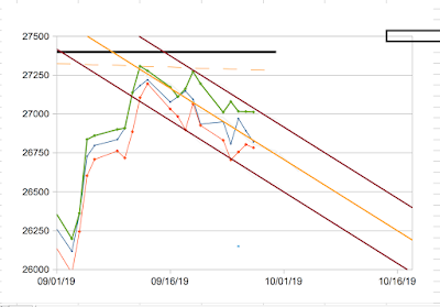
My recent
bold prediction did not come to pass. The recent channel I thought looked pretty good got blown away rather quickly. So, it's time to step back and have another look. Here in Graph 1 is a view of the Dow industrials index over this century.
Graph 1 - Dow Industrials since 2000
I have highlighted some trend channels. The light green lines contain the first big rise of the century. They are projected into the present, which might or might not mean anything. The heavy purple lines indicate the present trend channel from the recovery after the 2008 recession. The yellow line was the top channel border until the index burst through in 2017. This effectively doubled the width of the channel - this happens sometimes - and it is now the center line of the channel.
The red line connects two major bottoms. Whether that has any significance is yet to be demonstrated. This is the big picture, covering close to two decades of index movement.
This recovery is now over a decade old, which is quite rare. Further, I find it hard to believe that American industry is worth about 1.75x as much as it did 3 1/2 years ago. The bold move that occurred through 2017 looks a lot like irrational exuberance. What reasonable explanation is there for most of that 75% rise happening in the first year of the Trump administration? Since then, with a lot of gyrations, the index has gone essentially nowhere.
Graph 2 is a closer focus on the index during the recovery since 2008. This is just for perspective. Can it make any kind of sense that the nominal value of the Dow 30 industrials has increased by more than a factor of 4 in the last decade?
Graph 2 - Dow industrials since 2008
Graph 3 is a look at the Dow Industrial Index during this calendar year. The heavy green line connects the 3 tops since early 2018. The light green lines are the extended trend borders from the pre-2008 upward trend. The yellow and red lines are as described above. The orange lines might be the current short term decline trend channel- but it's not pretty, and I've been fooled before.
Graph 3 - Dow industrials, Jan 1 to Sept 24, 2019
My current sense is that we are now post peak. If the index were to rise above the heavy green line, then this idea would be refuted. The next resistance would then be at the top purple line that you can see going off the top at the left side of Graph 3. But I think we're going down from here. Each of the light green lines might offer some resistance. You can see this has already been happening at several points during the year.
Should the index continue down, the next major resistance level would be yellow line - the channel center line, since I have no faith in the potential orange channel. If that is breached, the red line might come into play. After that, it's the bottom purple line shown in Graphs 1 and 2. This could happen somewhere between 20000 and 22000, depending on the timing and fall rate of the decline.
If that is breached, there might be support near 15500, the double bottom surrounding the beginning of 2016. A 61.8% decline of the entire gain from the 2008 bottom would put a target low at about 14500. A 50% decline would put the low around 17000.
This gives a broad range of potential resistance targets that land in the range of index values from CYs 2014 through 2016. For reference, that time period is shown in Graph 4. Back then, the yellow line was a hard upper barrier, and the purple line was robust support. When situations reverse, support and resistance lines can exchange their functions. If all of these potential support levels are breached, the entire gain from 2009 could be given back.
Graph 4 - Dow Industrials from 2014 through 2016
Of course, that is [I hope] worst case, and every bit of this is speculative. September is historically a weak months for stocks, but this year it has gained back most of the 2000 or so points lost in August. On average, Octobers have been net positive, but the most dramatic historical declines [1929, 1988] have been in October, which is right around the corner.
Things don't happen to satisfy my expectations. But I am quite pessimistic. This recovery has been over-long for quite a while already, so we're way over-due for a major correction. Trump's economic and trade policies are based on abysmal ignorance, have already done significant harm, and those buzzards will be coming home to roost some time soon. If you think the national debt level is important, it has ballooned under Trump - contrary to his campaign lies. Unsecured consumer debt is at a historically high level. Our economy is about 70% dependent on consumer spending. How can that continue when wages have been static for 40+ years, even when inflation is low? This is why personal debt is high. People have leveraged their livelihood, and are badly over-extended. Where are future profits going to come from? If things get tough and lay-offs occur, spending and profits will take bigger hits. This is how things spiral out of control.
Maybe there is some reason for optimism that I'm overlooking. If so, point it out in comments.


![[Most Recent Quotes from www.kitco.com]](http://www.kitconet.com/charts/metals/gold/tny_au_xx_usoz_4.gif)


