[Substantially revised and updated, 6/5-6/13]
João Marcus Marinho Nunes is personally offended by my previous Angry Bear post.
João Marcus Marinho Nunes is personally offended by my previous Angry Bear post.
Personally I was ‘offended’ by being ‘accused’ of “using short-time series data”, ignoring “what is a valid context” and “cherry picking”.
Which was odd, since I didn't accuse him of anything. In fact, he wasn't even on my radar screen. He then goes on to show a bunch of nice and interesting graphs that have nothing at all to do with my point, and concludes:
PS Maybe JazzBumpa thinks he´s a modern day Robespierre fighting against (in this case imaginary) absolutism!
Actually, I'm pretty close to agnostic on the subject of Market Monetarism, - as he identifies the subject of my (imaginary) absolutism in his comment at my post. I thought I had made it pretty clear that what I was criticizing was the kind of confirmation bias that induces one to construct questionable data analyses that support pre-concieved conclusions. The fact that the people doing this were market monetarists might be illustrative, but is not really central to my criticism.
I welcome disagreement, but it's more helpful and constructive if the points of disagreement have some relevance to the point I was trying to make. I elaborated a bit in a comment at Nunez's blog, which you can read there, if you're interested. What interested me was some piling on by Mark Sadowski, in comments both in my post and at Nunes'. While I think Sadowski missed [or perhaps ignored] my point, he makes a couple of his own - one of which is actually Krugman's, whom he quotes.
“…To see what’s going on, you need to do two things. First, you should include state and local; second, you shouldn’t divide by GDP, because a depressed GDP can cause the spending/GDP ratio to rise even if spending falls. So it’s useful to look at the ratio of overall government expenditure to potential GDP — what the economy would be producing if it were at full employment; CBO provides standard estimates of this number. And here’s what we see:
Spending is down to what it was before the recession, and also significantly lower than it was under Reagan.

Krugman's Graph
I don't always disagree with Krugman, but when I do I prefer to look at a longer time series [My Graph 1.]
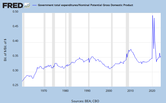
My Graph 1 - Total Gov't Exp/Potential GDP
My first thought is - do you really want to use that profligate spendthrift St. Ronnie as your benchmark? Second thought is - yes, Total Gov't Spending/Potential GDP is dropping like a rock, but it's still higher than almost all of the historical record, and far exceeding values from the Viet Nam era and LBJ's Great Society. In fact, eyeball a line through the local minima, and you can see a return to the trend boundary that is only slightly steeper than those of the Clinton and Carter eras. I don't recall anyone talking about austerity in those days.
Here is Sodowski's excellent other point.
It’s not the level of spending that matters but the change in the level of spending relative to trend.
So, here is my question: What is the right historical time frame to determine your trend and define your context?
I don't think there is a simple one-size-fits all answer. Let's have another look at this data, with a high level trend channel outlined [My Graph 1.1.] The method is simply to connect peak to peak and trough to trough to construct the green lines. The red line extensions are arbitrary estimates. The yellow midine was constructed by taking an average of these boundary values for each date.

My Graph 1.1 - Total Gov't Exp/Potential GDP with Trend Channel Boundaries
This view suggests a couple of things. First, the data oscillates around a line approaching an asymptote somewhere near 0.35. Second, the recent decline is nothing extraordinary - just another excursion from one boundary toward the other. Still, a trend is only a trend until it isn't. The first signal that the trend is caput is a serious violation of the trend boundary. That would require a drop below about 0.315.
Let's look at the change in Total Government Spending without a GDP denominator, expressed as YoY % Change [My Graph 2.]
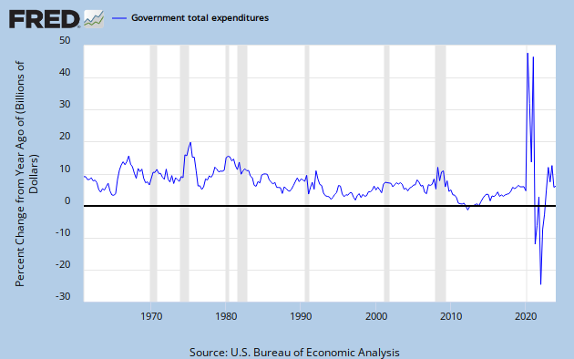
My Graph 2 - Total Government Spending, YoY % Change
What trends do you see here? I see an upward trend in the first 15 to 20 years of the data set, then a long decline. Each of these top level trends also includes alternating sub-trends going either with or against the flow. My Graph 2.1 shows this in detail.

My Graph 2.1 - Total Government Spending, YoY % Change, With Trends
I've placed parallel trend boundaries around what I see as major secular trends. Green lines identify the upward trend and brown lines identify the downward trend. Also included are horizontal lines representing period averages. The purple lines are pre- and post-1981. Blue lines are the Carter and Clinton presidencies. Red is G. W. Bush. Each president's time is considered as year two of his term to year one of the following term, inclusive, since each year's budget is set in the prior year.
The up-trend that started before the beginning of the data set, probably in the 30's, peaked in Q2, '75 at 20.9%. It's followed rather quickly by an anomalous low of 5.4% in Q4, '76. This is the first suggestion that the trend might be ending. The next peak, Q1 to Q3, '80 hits 16.2%, significantly below the prior peak, and consistent with a new downward trend. The death of the old trend is confirmed by the lows of 9.7% at Q1, '81 and 6.2% at Q3, '83
A counter-current decline [not marked] occurs from Q1, '67 to Q3, '73. A counter-current increase, outlined in green, occurs from Q1, '98 to Q3, '08. After that, despite the stimulus and the advent of Obama/Romney/Heritage Foundationcare there is quite a sharp decline in spending growth [not spending, per se.]
What do you make of it? It's the lowest spending growth on record, now hovering near zero. Clearly, this is a big change from the '98 to '08 trend. But that decade was just a counter-current move against the multi-decade declining trend.
These things are close to impossible to identify in real time, but I think it's now pretty clear that there was a sea change ca. 1975-80, though it would be tough to tie it down more precisely. But I don't believe there was a sea-change to greater spending growth in the late 90's, though that move doubled the width of the trend channel. What we've seen since is a move back to the middle of the expanded downward trend channel. You don't have to squint very hard to see a trend center-line tendency throughout the data set. Note also that reversions typically occur at the midline or a channel boundary.
So, is what we've experienced post-recession a new austerity, or simply the continuation of a long-established trend? Or, perhaps, you might see this entire trend exercise as a flight of fancy. What do you think? Why do you think it?
Just to be clear, I am not saying that we don't have austerity. The growth of total government spending has been in decline for three decades. I am saying that austerity is not simply definable in an absolute on/off sense, but exists along a continuum. In my view, austerity is not extreme until spending growth goes negative. Do you agree?
To go back to my original point, GDP is a resultant of many inputs, Monetary policy is one, and fiscal policy is another. To say that anemic GDP growth in an era of relative austerity [and extraordinary monetary policy] disproves the efficacy of fiscal policy is to deliberately look at only a small part of a big picture.
![[Most Recent Quotes from www.kitco.com]](http://www.kitconet.com/charts/metals/gold/tny_au_xx_usoz_4.gif)


6 comments:
Hey.
"I’ve repeatedly criticized Beckworth at his blog for cherry picking short-term time series data to make his points."
Never finished it, but I recently started a post with this line: Beckworth reduces history to a dozen years.
So, yeah.
ART!
Long time, sir. Good to see you.
How's life?
AS you can see, I'm still rattling the pots and pans.
Cheers!
JzB
JB If it does make you 'feel good' that I was offended, please help yourself. But that implies little sense of humor on your part.
Note that the offended I wrote was inside ' ' marks. In other words, no offense at all!
Marcus -
I'm afraid we are misunderstanding each other. I'm bemused and nonplussed by your being "offended," with or without the scare quotes - which in this case did not contribute much to clarity. My intention never is to offend, though that might appear as collateral damage.
If you think I have little sense of humor, then I'm even more bemused and nonplussed. In fact, I might even be minused.
I was quite surprised you took any notice of my post. But thanks for reading and commenting.
Cheers!
JzB
nike shoes
yeezy boost 350
yeezy boost 700
adidas tubular
ferragamo belt
golden goose
golden goose outlet
yeezy boost 350
huaraches
nike kd 11
nike epic react
yeezy boost
yeezy 500
christian louboutin sale
jordan shoes
nike air max
bape hoodie
adidas ultra boost
supreme t shirt
cheap jordans
Post a Comment